

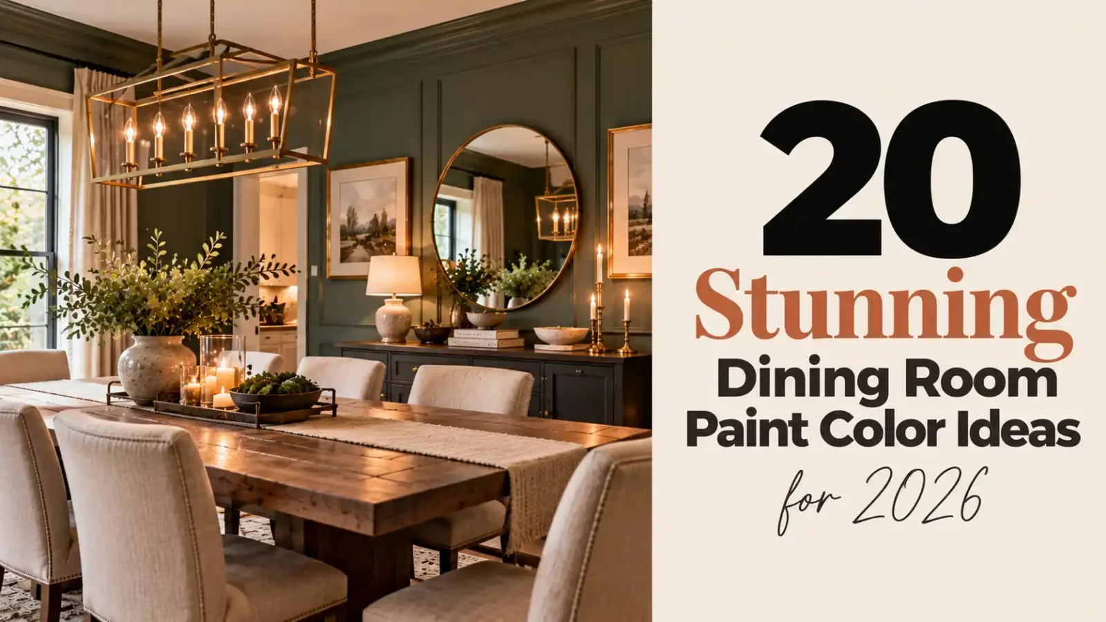
Paint is the fastest and most affordable way to transform a dining room. The right color can make meals feel cozy, make a small room look larger or turn a plain space into a showpiece for dinner parties. The wrong one can leave the room feeling flat or cold, which is why it pays to plan.
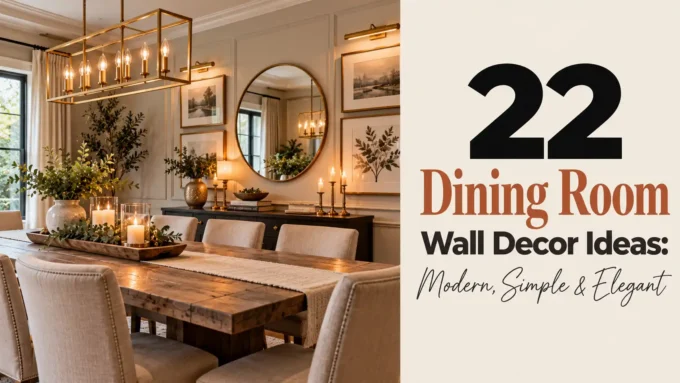
Here are 20 dining room paint color ideas for 2026, from soft neutrals to deep, dramatic shades, plus tips on finishes and styling. Once you choose a color, complete the room with our dining room wall decor ideas and these dining room lighting ideas.
Before choosing, consider these factors:
- Check natural light: north-facing rooms need warmer tones, south-facing rooms can handle cooler ones.
- Test large swatches on two walls and view them morning and night.
- Think about when you use the room most, since evening dining favors deeper colors.
- Consider the colors of adjoining rooms in an open plan.
1. Deep Forest Green
Deep forest green wraps your dining room in instant richness, turning an everyday eating space into a moody, restaurant-like retreat. Shades like Sherwin-Williams Evergreen Fog SW 9130 or Benjamin Moore Essex Green lean sophisticated rather than heavy when you pair them with brass chandeliers, oak tables, and cream linen chairs. This color thrives in dining rooms with generous natural light, where the green shifts from shadowy to luminous through the day. Paint the full room for cocooning drama or use it on one accent wall behind a sideboard if you prefer a lighter touch. Eggshell sheen keeps it elegant without glare.
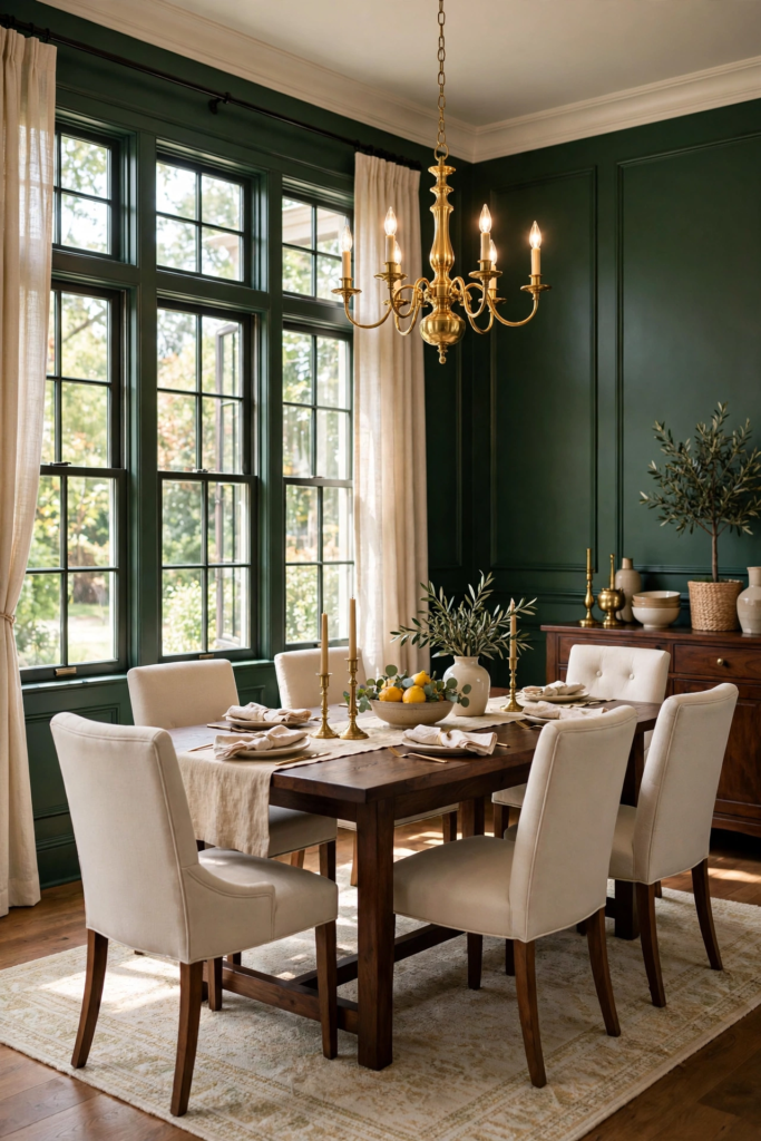
Sample first: quarts or samples cost $5–$12 at Home Depot or Lowe’s, and testing is essential because green reads differently under warm versus cool lighting. Brush a two-foot square on at least two walls and live with it through morning coffee and evening dinner; your overhead lights will warm the color while north-facing windows cool it down. Two coats of satin or eggshell finish usually deliver full, even coverage over a primed surface. Finish the look with natural textures — woven placemats, a jute rug, and trailing greenery on the table — so the walls feel collected, not flat. If the green feels too dark, repeat it in art and add mirrors to bounce light.
2. Warm Creamy White
Warm creamy white is the hardest-working neutral in a dining room, brightening the space while keeping it welcoming instead of clinical. Try Sherwin-Williams Alabaster SW 7008 or Benjamin Moore White Dove OC-17 — both carry soft yellow undertones that glow beside wood tables and candlelight. Unlike stark whites that can feel sterile, a creamy white flatters both traditional and farmhouse dining rooms and lets your furniture, art, and textiles take center stage. It also photographs beautifully, which matters if your dining room doubles as the backdrop for family celebrations. Eggshell finish adds gentle warmth without visible shine. Gallon prices run $35–$75 depending on brand and line.
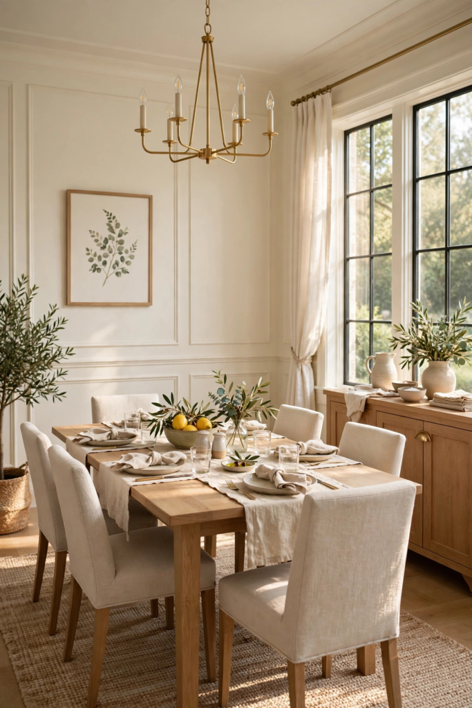
Before committing, swatch-test with $5–$12 samples from Home Depot or Lowe’s, painting large boards you can move around the room at breakfast and after dark. Creamy whites shift noticeably: warm bulbs push them buttery, while cool north light can expose gray or pink casts. Plan on two coats over a stain-blocking primer, especially if you are covering a darker color. Pair warm creamy walls with walnut or oak, black metal chair frames, and layered lighting — a dimmer switch on the chandelier is worth every penny. If the room gets little sun, choose the slightly lighter end of the creamy spectrum to keep corners from going muddy.
3. Navy Blue
Navy blue gives your dining room the confidence of a tailored suit — deep, timeless, and surprisingly easy to live with. Benjamin Moore Hale Navy HC-154 and Sherwin-Williams Naval SW 6244 are the two most requested dining room blues in the United States, and both pair beautifully with white wainscoting, brass fixtures, and a warm wood table. Navy works as a full-room color in spaces with good light, or as a dramatic accent wall behind your buffet. It flatters candlelight like nothing else, making weeknight dinners feel intentional. Use an eggshell or satin sheen to keep the rich pigment looking velvety rather than flat.
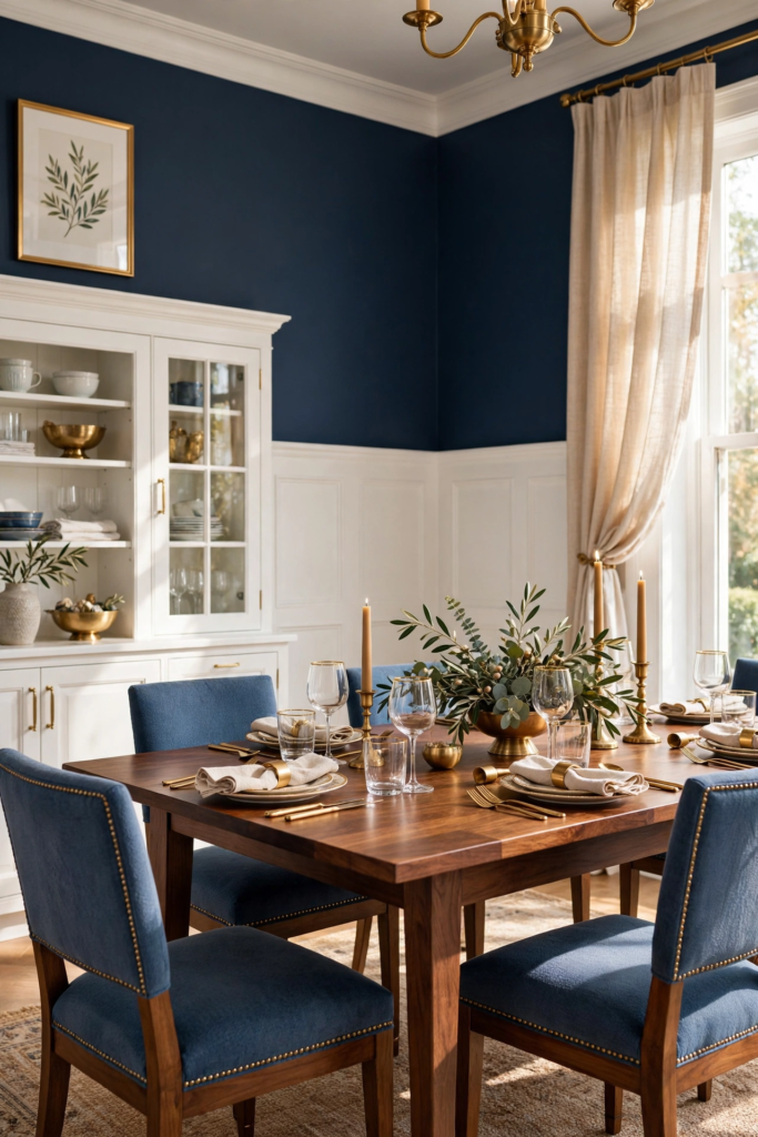
Start with $5–$12 sample pots from Lowe’s or Home Depot and test on two walls, since navy swings between inky and bright depending on light direction and time of day. South-facing rooms warm it toward midnight blue; north-facing rooms keep it crisp and classic. Expect two full coats for even coverage, and use a quality angled brush to cut in around crown molding before rolling. Complete the palette with cream or ivory linens, woven shades, and one metallic moment — a brass chandelier or gold mirror. If your dining room is small, navy on the lower half with white above keeps the drama without shrinking the space.
4. Terracotta and Clay
Terracotta and clay tones bring sun-baked warmth to your dining room, a natural fit for the earthy, artisanal look dominating 2026 design. Sherwin-Williams Cavern Clay SW 7701 and Benjamin Moore Cinnamon Slate 2113-40 both deliver that fired-earth richness without reading orange or dated. These hues glow at dinner time under warm lighting, making them ideal for hosts who gather people around the table often. Pair terracotta walls with light oak, rattan chairs, linen runners, and plenty of greenery for a Mediterranean-inspired dining room. A matte or eggshell finish keeps the color soft and chalky rather than glossy.
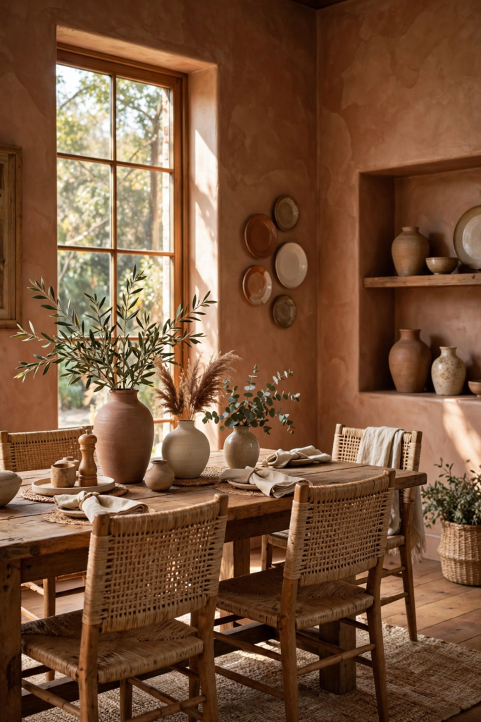
Test with $5–$12 samples from Home Depot, watching how the color deepens after dark and lightens in morning sun — terracotta is one of the most light-reactive dining room paint colors. Two coats of eggshell or satin over primer give you smooth, even saturation; gallons run $35–$75. Depending on finish, a quart covers roughly one hundred square feet — plenty for an accent wall. Because clay tones are strong, balance them with creamy whites on the ceiling and trim to keep the room airy. If a full terracotta room feels bold, try it as an accent wall behind the table and repeat the hue in pottery, napkins, or art.
5. Sage Green
Sage green is the quiet overachiever of dining room paint colors — soft, grayed, and endlessly livable. It sits perfectly between bold and neutral, adding gentle color without demanding attention. Beloved shades include Sherwin-Williams Evergreen Fog SW 9130 at its lighter end, Benjamin Moore Saybrook Sage, and the many soft sage tones stocked at Lowe’s and Home Depot. Sage flatters wood tables, white trim, and brass or black lighting equally well, which makes it one of the easiest colors to decorate around. It reads calm in daylight and cozy under evening lamps. Choose eggshell for walls and semi-gloss for trim.
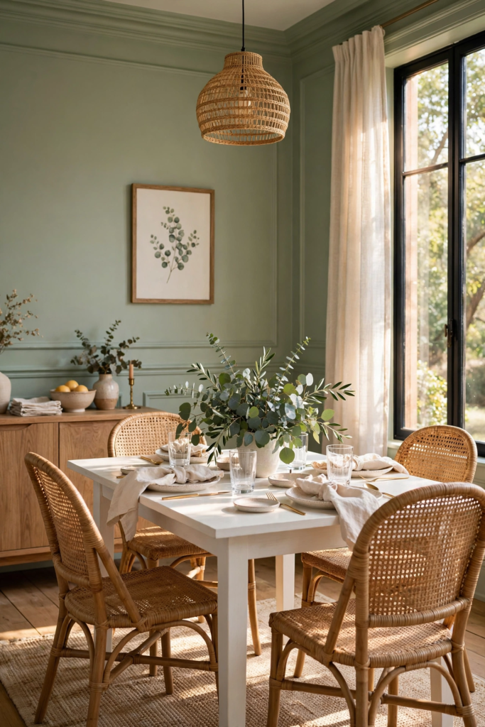
Grab $5–$12 samples and paint test swatches near the window and near the table, since sage shifts from silvery to warm depending on light. Give it two coats over a quality primer — gallons run $35–$75 — and let each coat dry fully so the gray undertones settle true. Sage pairs naturally with creamy whites, warm woods, linen textures, and black accents for a modern organic dining room. If your room faces north, lean toward a slightly warmer sage to avoid a chilly cast. For extra depth, paint the ceiling a half-strength version of the wall color so the whole room feels wrapped.
6. Charcoal Gray
Charcoal gray brings tailored drama to the dining room without the starkness of true black. Benjamin Moore Kendall Charcoal HC-166 and Sherwin-Williams Iron Ore SW 7069 are go-to choices — deep, complex grays with warmth that keeps them inviting at the dinner table. Charcoal flatters marble tabletops, brass candlesticks, and velvet chairs, creating a moody backdrop that makes food and faces the focus. It works in both modern and traditional dining rooms, especially with crisp white trim for contrast. Use a satin or eggshell finish to keep the dark walls from looking chalky. In well-lit rooms it feels rich; in dim rooms, intimate.
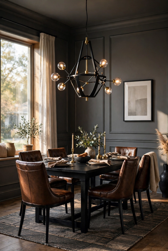
Test $5–$12 samples at different times of day, because charcoal reveals blue, green, or brown undertones depending on your light. North light pulls it cool; warm lamps push it smoky. Plan on two coats — dark colors need full coverage to avoid patchiness — with gallons costing $35–$75. Pair charcoal walls with a light rug, pale art, or a mirror to keep the room from feeling heavy, and repeat the gray in upholstery so it feels intentional. For a high-end touch, paint millwork and trim the same charcoal in semi-gloss for a color-drenched envelope that photographs beautifully.
7. Soft Greige
Soft greige — the blend of gray and beige — remains the most requested neutral for dining rooms in 2026 because it adapts to almost any style. Sherwin-Williams Accessible Beige SW 7036 and Benjamin Moore Revere Pewter HC-172 are the classics: warm enough to feel inviting, gray enough to stay modern. Greige bridges cool and warm furnishings, so your existing table, rug, and chairs will likely work with it. It is especially flattering in open-plan homes where the dining room flows into the living room or kitchen. Stick with eggshell sheen for a soft, even finish that hides minor wall imperfections.
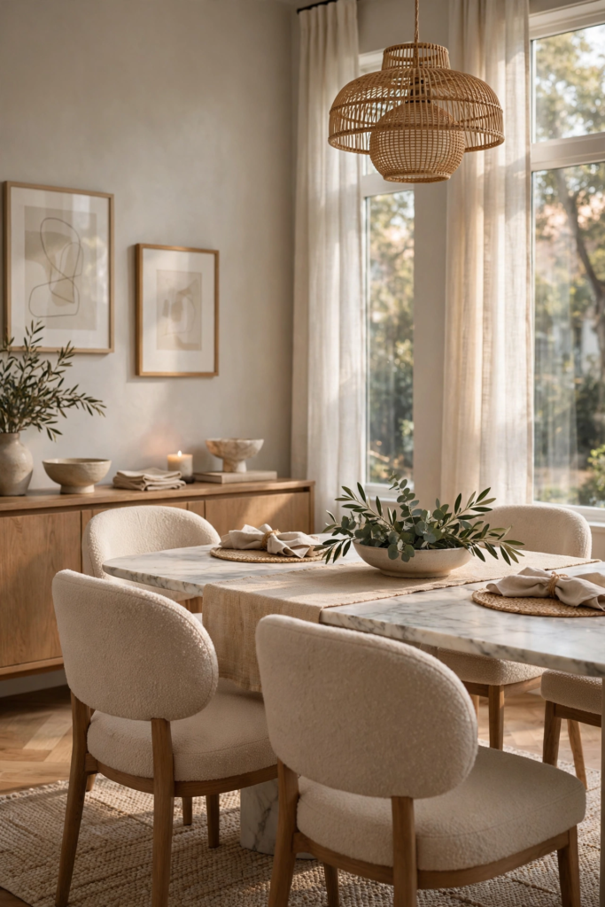
Sample with $5–$12 pots from Home Depot or Lowe’s, testing both morning and evening light — greige famously shifts between its gray and beige sides. Two coats over primer, with gallons at $35–$75, deliver the smooth coverage this neutral deserves. Pair soft greige walls with white trim for a clean look, or warm wood trim for a cozier feel. Layer in texture — bouclé chairs, a wool rug, woven pendants — so the neutral palette feels rich rather than flat. If your room lacks natural light, choose a lighter greige to keep the walls from going muddy in the corners.
8. Black for Maximum Drama
Black walls in the dining room are the boldest move on this list — and one of the most rewarding. Sherwin-Williams Tricorn Black SW 6258 and Behr Cracked Pepper are designer favorites: true, rich blacks that turn an ordinary dining room into a candlelit, speakeasy-style space. Black makes brass, crystal, and art pop like nothing else, and it recedes visually, which can actually make a small dining room feel larger at night. Paint all four walls for total immersion, or try black on the lower wainscoting with a lighter tone above. Satin sheen keeps black walls rich without harsh reflections.
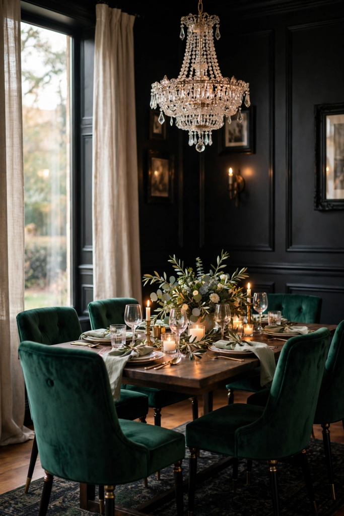
Black demands careful prep: use $5–$12 samples first, and plan on a tinted primer plus two full coats — gallons run $35–$75. Dark walls show every roller mark, so work in small sections and keep a wet edge. Balance the drama with a light ceiling, pale rug, and plenty of layered lighting — picture lights, candles, and a dimmable chandelier. Keep trim crisp white or paint it black too for a seamless envelope. If full black feels like too much, start with one black accent wall behind the table; you can always go further once you see how glamorous it looks at dinner.
9. Burgundy and Oxblood
Burgundy and oxblood bring old-world richness to the dining room — think wine cellars, private clubs, and candlelit holiday tables. These deep reds, like Benjamin Moore’s classic Heritage Red family or Behr’s deep merlot tones, feel luxurious without tipping into bright or kitschy territory. Oxblood pairs beautifully with dark wood furniture, brass accents, and cream or ivory textiles, creating a dining room that feels both historic and current. It is a natural choice for formal dining rooms and for anyone who hosts Thanksgiving or Christmas dinner. Use eggshell or satin sheen to keep the color deep and velvety.
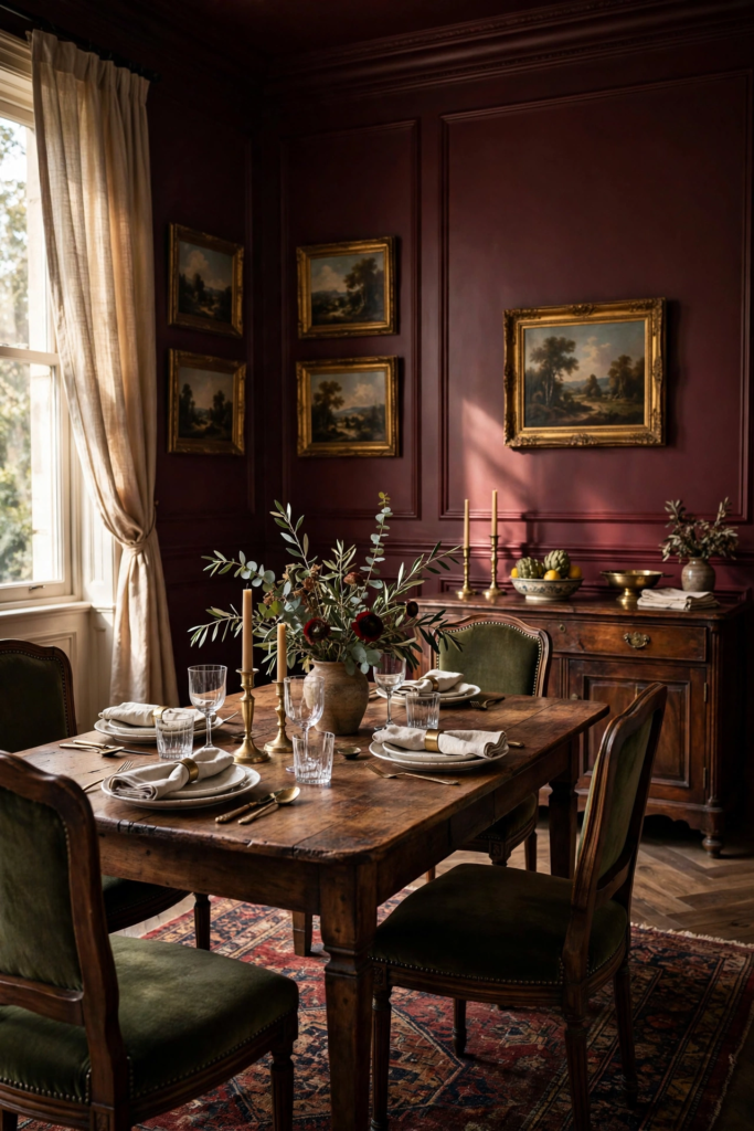
Because red pigments are translucent, plan on a gray-tinted primer and two to three coats — test $5–$12 samples first and budget gallons at $35–$75. Burgundy deepens dramatically after dark, so check your swatch under evening lighting before committing. Balance the intensity with cream ceilings, warm wood, and simple linens; too many competing patterns will fight the walls. If a full burgundy room feels intense, try it on the lower half of the walls or as a single accent wall behind the buffet. Gold or brass mirrors double the candlelight and keep the mood glowing rather than heavy.
10. Butter Yellow
Butter yellow is the happiest color on this list — warm, sunny, and instantly welcoming without the intensity of a bright goldenrod. Benjamin Moore’s soft buttery tones and Behr’s pale yellow classics bring morning light into the dining room even on gray days. This cheerful hue pairs beautifully with white trim, natural wood, and blue or green accents for a fresh cottage or coastal feel. It flatters breakfast nooks and casual dining rooms especially well, making everyday meals feel a little more celebratory. Choose an eggshell finish for softness; flat can look dull in this light-sensitive color.
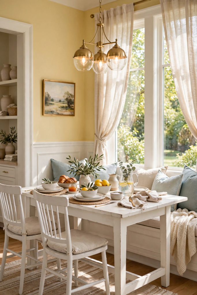
Yellow is notoriously tricky, so $5–$12 samples are non-negotiable — paint large swatches and watch them through a full day. Butter yellow can swing neon in strong sun or dingy in dim corners, so choose a shade with warm, creamy undertones. Two coats over a white primer, with gallons at $35–$75, give the cleanest result. Keep the ceiling bright white to lift the room, and ground the cheerfulness with natural textures like jute, rattan, and linen. If you love the idea but fear commitment, try butter yellow on the ceiling or inside a built-in hutch first.
11. Dusty Blue
Dusty blue is the soft-spoken sibling of navy — muted, grayed, and calming in a dining room. Shades like Benjamin Moore Boothbay Gray HC-165 and Sherwin-Williams’ softer blue-grays bring a breezy, coastal elegance that works in both traditional and modern homes. Dusty blue pairs beautifully with white trim, driftwood tones, and linen upholstery, creating a dining room that feels relaxed yet pulled together. It is light enough for small or dim dining rooms yet colorful enough to avoid the plainness of an all-neutral palette. Eggshell sheen keeps it soft; semi-gloss on trim adds a crisp contrast.
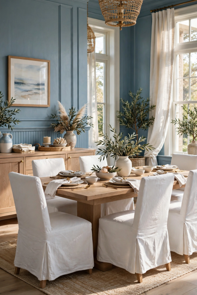
Test with $5–$12 samples from Lowe’s or Home Depot, since dusty blue shifts between gray and blue depending on the light. Morning sun warms it; evening lamps can push it lavender, so check your undertones carefully. Two coats over primer — gallons $35–$75 — give even coverage. Pair dusty blue walls with warm metals like brass or champagne, natural wood, and plenty of white to keep the palette fresh. For a designer touch, repeat the blue in artwork or dinnerware so the walls feel connected to the table. Avoid pairing with cool grays, which can make the room feel flat and washed out.
12. Olive Green
Olive green brings an earthy, grounded sophistication to the dining room — richer than sage, softer than forest green. It has a natural, almost culinary feel that suits a room built around food and gathering. Shades in the olive family pair beautifully with warm woods, leather chairs, brass lighting, and cream textiles, creating a dining room that feels collected and timeless. Olive works especially well in rooms with warm natural light, where its golden undertones glow. Use eggshell on the walls and consider a slightly deeper olive on built-ins or a buffet wall for layered depth.
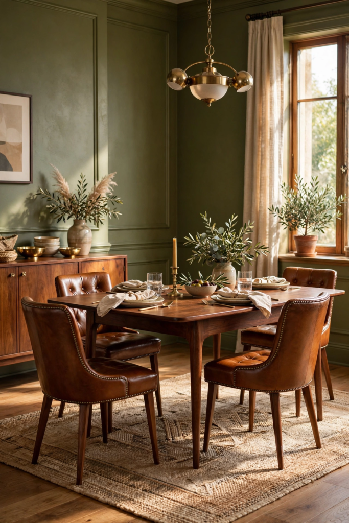
Always test with $5–$12 samples, because olive can read muddy or mustard under the wrong light. Paint swatches on two walls and observe them morning to night; warm bulbs flatter olive, while cool fluorescents can flatten it. Two coats over primer, with gallons at $35–$75, deliver rich, even color. Balance olive walls with plenty of cream or ivory — on the ceiling, trim, and linens — to keep the room fresh. Natural materials like walnut, rattan, and stone are olive’s best friends; avoid stark white furniture, which can look harsh against the earthy tone.
13. Blush Pink
Blush pink has grown up — in a dining room it reads as warm, sophisticated, and quietly glamorous rather than sugary. Soft blush tones pair beautifully with brass, warm wood, and cream upholstery, creating a dining space that glows at candlelight. This color flatters everyone at the table, casting a warm, flattering light on faces that overhead fluorescents never could. Blush works in traditional, modern, and eclectic dining rooms alike, especially when grounded with deeper accents like walnut or black. Choose a muted, dusty blush — never bubblegum — and finish it in eggshell for a soft, romantic glow.
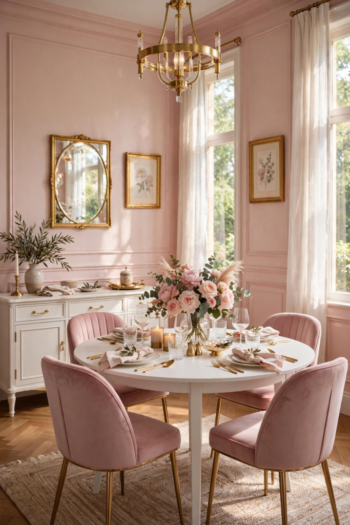
Test $5–$12 samples carefully, since blush shifts pink to peach depending on light and can look washed out in dim rooms. Paint large swatches and view them at dinner hour under your actual lighting. Two coats over a white primer — gallons $35–$75 — keep the color clean and true. Pair blush walls with crisp white trim, warm metallics, and natural textures like linen and oak to keep it sophisticated. If full blush walls feel bold, try the color inside a dining nook, on a single accent wall, or on the ceiling for a subtle rosy glow that surprises guests.
14. Two-Tone Walls With Paneling
Two-tone walls with paneling are the architectural shortcut to a high-end dining room — the paneling adds structure while two colors add depth. The classic formula pairs a deep color below the chair rail with a lighter shade above: think Sherwin-Williams Urbane Bronze SW 7048 below and Alabaster SW 7008 above, or navy below with warm white above. Board-and-batten, beadboard, or picture-frame molding all work beautifully, and the two-tone treatment makes even a builder-basic dining room feel custom. Paint the paneling in satin or semi-gloss for durability and the upper walls in eggshell.
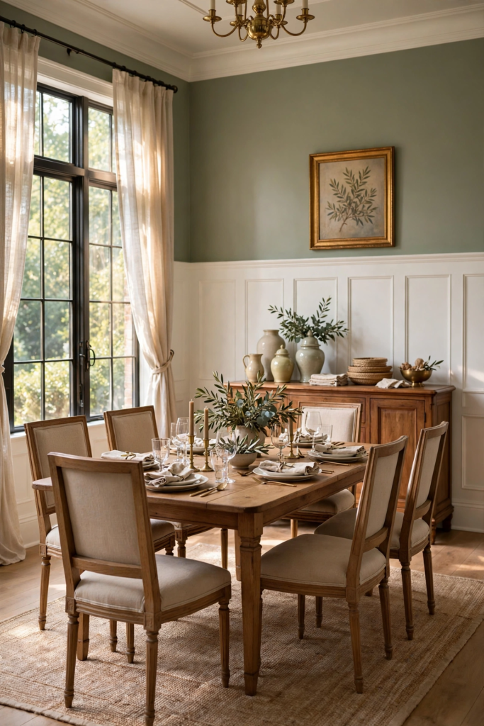
Start with $5–$12 samples of both colors and test them together, since the pairing matters as much as each shade alone. Install or refresh the paneling first, caulk every seam, and sand smooth before painting — prep is what makes this look expensive. Two coats on each section, with gallons at $35–$75, deliver crisp, lasting color. Keep the ceiling and trim bright white to frame the two tones cleanly. For a modern twist, skip the chair rail and run the deep color two-thirds up the wall in a straight color block. This treatment also hides scuffs beautifully in busy family dining rooms.
15. Color-Drenched Rooms
Color drenching — painting walls, trim, ceiling, and even doors in one saturated hue — is the boldest dining room trend of 2026. The technique erases visual boundaries so the room feels larger, calmer, and utterly enveloping. Deep tones like Sherwin-Williams Iron Ore SW 7069 or Benjamin Moore Aegean Teal 2136-40, or a rich forest green, work best, turning the dining room into a jewel-box space. Because there is no white trim breaking up the color, the finish becomes the star: use eggshell on walls and satin or semi-gloss on trim in the same color for subtle contrast. The result feels custom and high-end.
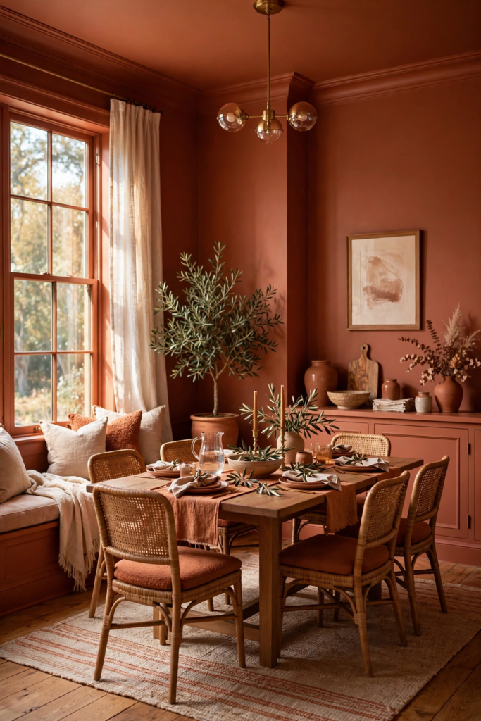
Commit with $5–$12 samples painted across walls, trim, and ceiling, since one color everywhere amplifies every undertone. Budget for extra paint — drenching uses more gallons than a standard job, at $35–$75 each — and plan on two coats throughout. Keep furniture and textiles in contrasting tones so the room does not feel flat: cream chairs, a light rug, and warm metallics pop against a drenched backdrop. Good lighting is essential, so layer a dimmable chandelier with wall sconces or candles. If full drenching feels intense, drench just the walls and trim while leaving the ceiling white.
16. Painted Ceiling Accent
A painted ceiling accent — the so-called fifth wall — adds surprise and polish to a dining room without repainting every wall. Keep the walls a calm neutral like Benjamin Moore White Dove OC-17 or Sherwin-Williams Accessible Beige SW 7036, then paint the ceiling a soft blue, warm terracotta, or even a deep navy for drama. The eye travels upward, making the room feel taller and more finished, and guests always notice. This trick works beautifully over a statement chandelier, where the color frames the fixture. Use flat or matte paint on the ceiling to hide imperfections and avoid glare.
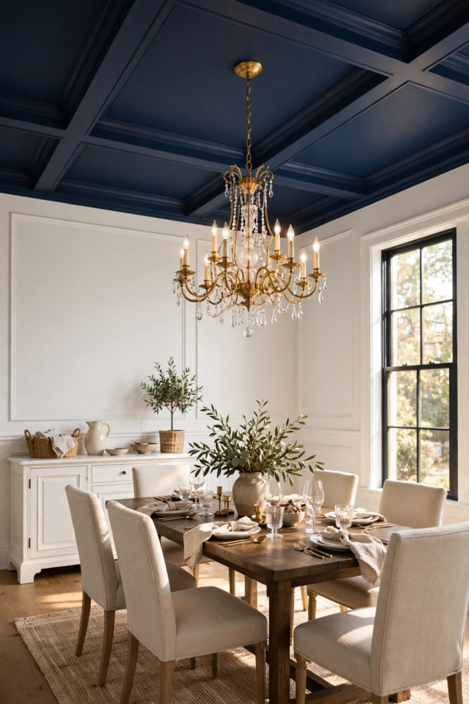
Test $5–$12 ceiling samples by painting a large board and holding it overhead in daylight and at night — colors read darker overhead than you expect. One gallon at $35–$75 usually covers an average dining room ceiling with two coats. Cut in carefully along the wall line with painter’s tape for a razor-sharp edge, and use a roller with an extension pole for even coverage. Pair a colored ceiling with simple, light walls so the accent stays the star. For extra cohesion, repeat the ceiling color in small doses — napkins, art, or a runner — to tie the whole dining room together.
17. Warm Taupe
Warm taupe is the cozy middle ground between gray and brown — a dining room wall color that feels like a warm hug. It carries more depth than greige and more warmth than gray, making it ideal for traditional and transitional dining rooms. Taupe pairs beautifully with cream trim, dark wood furniture, and brass or bronze fixtures, creating a layered, inviting space. It flatters both candlelight and daylight, shifting subtly through the day without ever feeling flat. Choose a taupe with warm undertones rather than purple ones, and finish it in eggshell for a soft, livable glow.
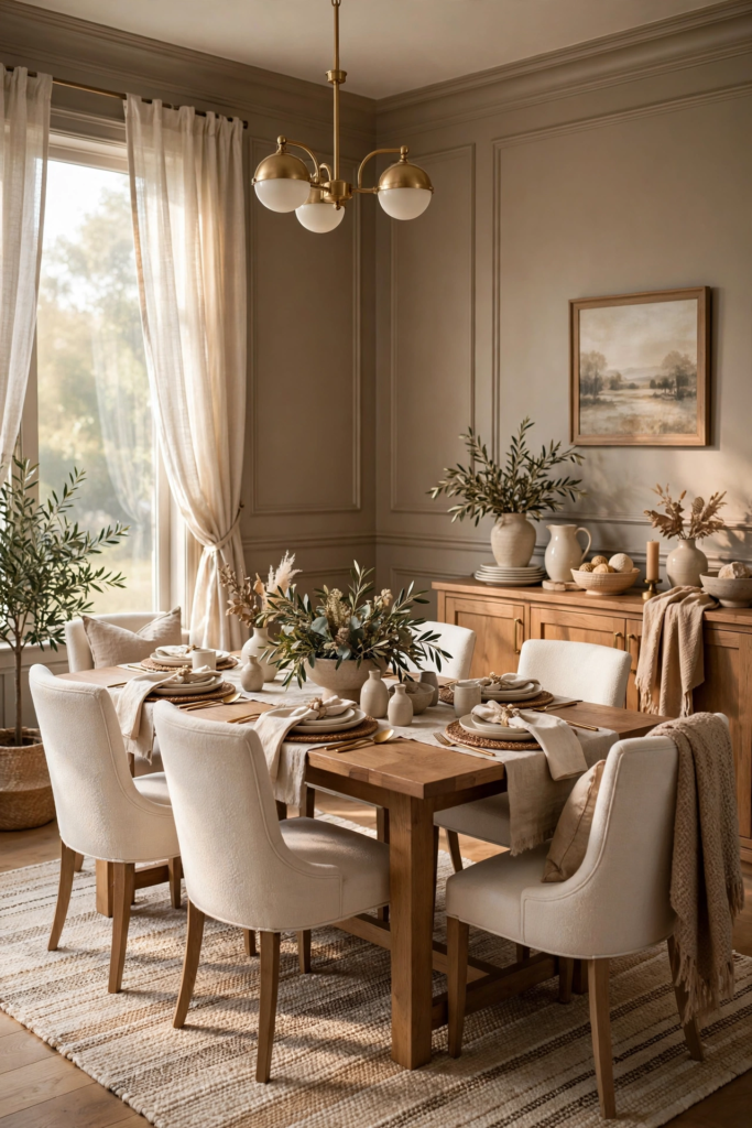
Sample with $5–$12 pots from Home Depot or Lowe’s, because taupe’s undertones — pink, purple, or golden — make or break the result. Paint swatches beside your flooring and furniture, and check them morning and evening. Two coats over primer, with gallons at $35–$75, give smooth, even coverage. Pair warm taupe walls with ivory linens, natural wood, and textured neutrals like bouclé or wool to build a rich, tonal dining room. Avoid cool gray accents, which clash with taupe’s warmth. If your room is dark, choose a lighter taupe so corners stay luminous rather than muddy.
18. Plum and Aubergine
Plum and aubergine bring jewel-toned drama to the dining room — rich, wine-dark purples that feel luxurious and a little mysterious. These shades pair beautifully with brass, gold, and warm wood, creating a dining room that glows under candlelight. Plum works as a full-room color in well-lit spaces or as a single accent wall behind the table in smaller rooms. It flatters both traditional furniture and modern silhouettes, and it makes white dinnerware and crystal pop. Choose a plum with warm red undertones rather than cool blue ones for the most flattering, food-friendly effect. Eggshell keeps it velvety.
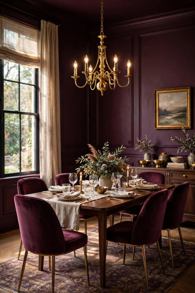
Test $5–$12 samples at different times of day, because plum swings between brown, red, and purple depending on light. Warm evening light flatters it most; cool daylight can expose gray casts. Plan on a tinted primer and two coats — gallons run $35–$75 — since deep purples need full coverage. Balance plum walls with cream ceilings, ivory linens, and warm metallics to keep the mood rich rather than heavy. Repeat the color in small doses, like velvet chairs or art, so it feels intentional. Avoid pairing with bright reds or oranges, which compete rather than complement.
19. Soft Mushroom Brown
Soft mushroom brown is the understated neutral gaining serious momentum in 2026 dining rooms — a grayed, earthy brown that feels calm and organic. It sits between greige and taupe, with a natural warmth that flatters wood furniture, linen, and stone. Mushroom brown creates a cozy, cocooning dining room without the heaviness of dark chocolate brown, and it pairs beautifully with cream trim and brass accents. It works in both modern organic and traditional spaces, especially when layered with tonal neutrals. Choose eggshell sheen for a soft finish that keeps the earthy color looking refined.
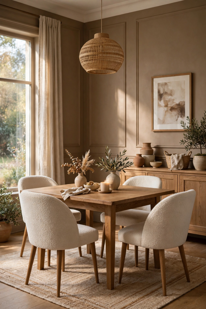
Always swatch-test with $5–$12 samples, since mushroom brown can lean pink, gray, or green depending on light and undertones. Paint test boards and move them around the room from morning to night. Two coats over primer, with gallons at $35–$75, deliver even, rich coverage. Pair mushroom walls with ivory or cream trim, natural textures like jute and wool, and warm wood tones for a layered neutral dining room. If the color feels flat, add contrast with black chair frames or a dark wood table. Keep the ceiling bright to lift the earthy palette.
20. Classic White With Black Trim
Classic white walls with black trim deliver crisp, graphic contrast that makes a dining room feel tailored and timeless. Paint the walls Benjamin Moore White Dove OC-17 or Sherwin-Williams Alabaster SW 7008, then define the architecture — window frames, door casings, baseboards — in Sherwin-Williams Tricorn Black SW 6258. The black outlines act like eyeliner for the room, sharpening every detail and giving even a simple dining room a designer edge. This high-contrast look suits modern farmhouse, transitional, and contemporary dining rooms. Use satin or semi-gloss on the black trim for a crisp, durable finish.
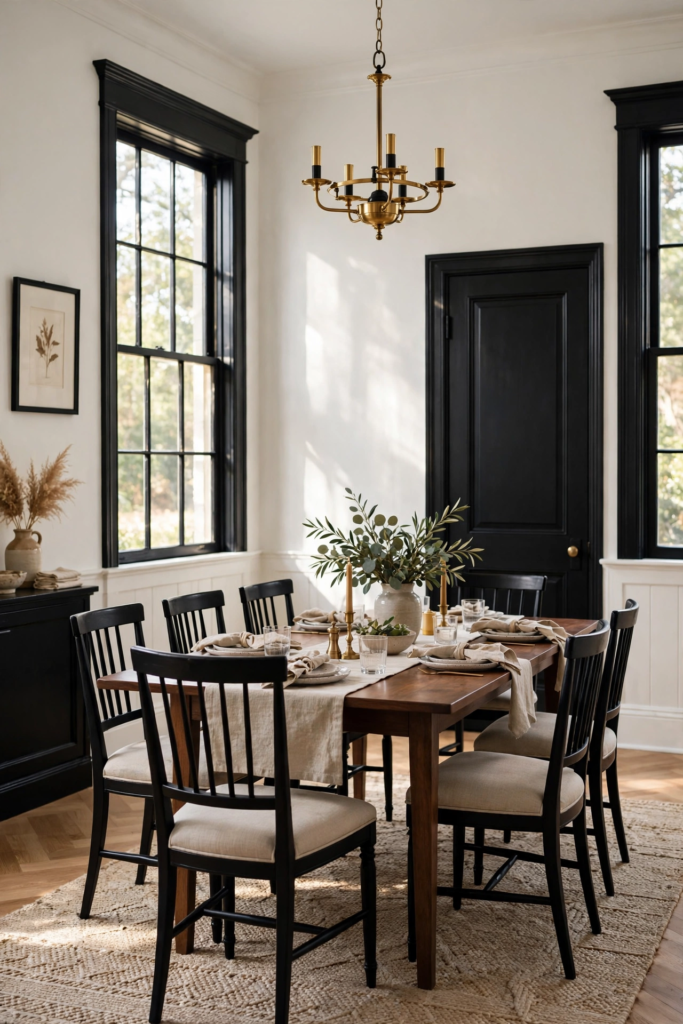
Test $5–$12 white samples first, since the white you choose sets the whole mood — warm whites feel cozy, cool whites feel crisp. The black trim needs meticulous prep: sand, caulk, and apply two coats of semi-gloss over primer for sharp lines, with gallons at $35–$75. Use painter’s tape and a steady hand where black meets white. Keep furniture and textiles simple so the architecture stays the star — natural wood, black chairs, and linen work beautifully. This look also photographs exceptionally well, making your dining room shine in listing photos if you ever sell.
How Lighting Changes Dining Room Paint Colors
Lighting changes everything about how a dining room paint color looks — the same shade can read three different ways from morning to night. North-facing windows cast cool, bluish light that intensifies blues and grays while dulling warm tones. South-facing windows flood the room with warm golden light that enriches reds, yellows, and earthy hues. East light is bright and cool in the morning, west light warm and amber in the evening. That is why designers insist you test paint at different times of day. A color that looks perfect at noon can feel entirely different under your chandelier at dinner.
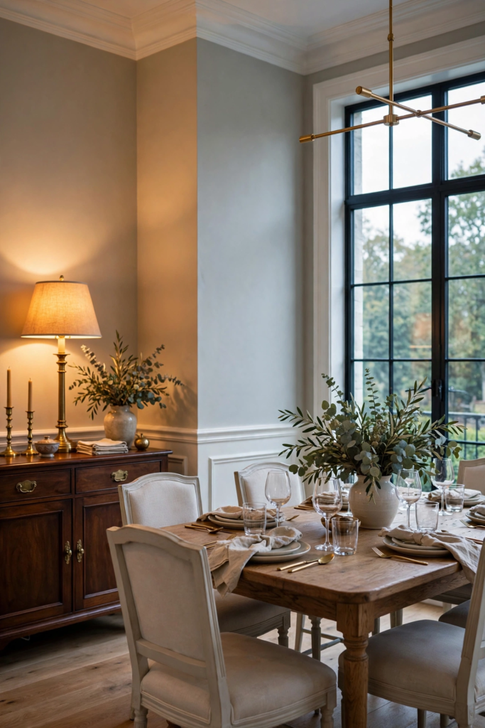
Artificial light matters just as much. Warm white bulbs around 2700K flatter reds, yellows, and wood tones, making dining rooms feel cozy and inviting. Cool daylight bulbs near 5000K sharpen blues and grays but can make warm colors look washed out. If you have dimmers — and every dining room should — test your swatches at full brightness and dimmed low, since dimming warms the light noticeably. LED, incandescent, and halogen each render color slightly differently, so test under the exact bulbs you will use. When in doubt, choose the paint color that looks best at dinner hour, when you actually use the room.
How to Pair Dining Room Paint Color Ideas With Furniture
Pairing paint with furniture starts with identifying your fixed pieces — the table, chairs, and any built-ins you are keeping. If your table is warm wood, lean toward wall colors with warm undertones: creamy whites, sage, terracotta, or olive. Cool gray or black furniture pairs best with crisp whites, navy, or dusty blue. When your furniture is mixed, a versatile neutral like Sherwin-Williams Accessible Beige SW 7036 or Benjamin Moore Revere Pewter HC-172 bridges everything. Pull one accent color from your rug or art and repeat it in small doses — napkins, candles, or a runner — to make the whole room feel intentional.
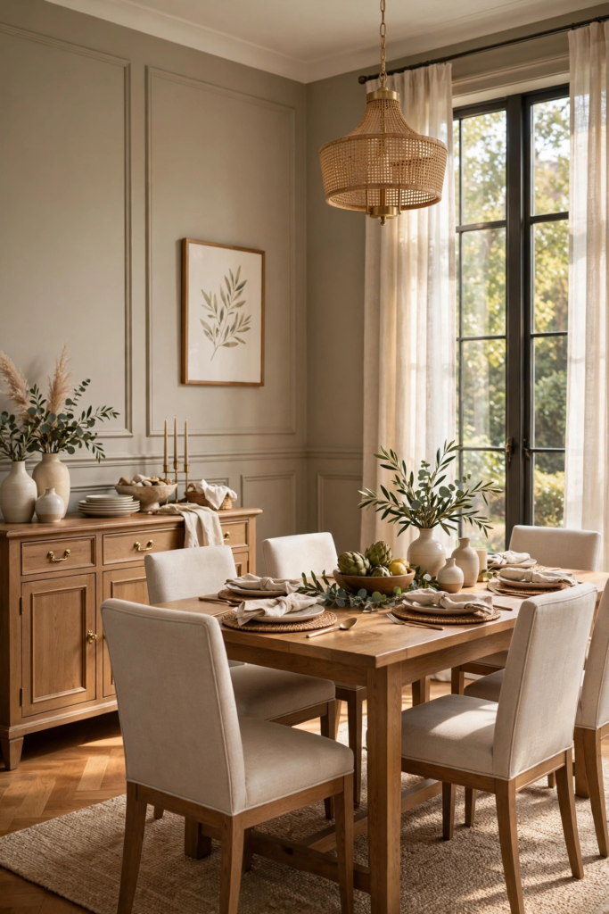
Consider contrast as well as coordination. Dark walls like charcoal or navy look stunning against a light oak or white table, while pale walls let a dark walnut table take center stage. Match your metals too: brass and gold warm up cool wall colors, while black or chrome keeps bold colors feeling modern. If you are buying new furniture after painting, bring paint swatches to the store — phone photos lie about color. And remember the 60-30-10 rule: sixty percent dominant wall color, thirty percent secondary furniture tones, ten percent accent. It keeps any dining room palette balanced.
How to Choose Dining Room Paint Color Ideas Step by Step
Choosing a dining room paint color is easier with a clear process. First, define the mood: cozy and intimate calls for deep tones like forest green or burgundy; bright and airy calls for creamy white or soft greige. Second, assess your light — note which direction your windows face and how much sun the room gets. Third, take inventory of fixed elements: flooring, table, and trim colors that must coordinate. Fourth, narrow to three candidates and buy $5–$12 samples from Home Depot or Lowe’s. Never choose from a tiny chip alone; large swatches reveal undertones that chips hide.
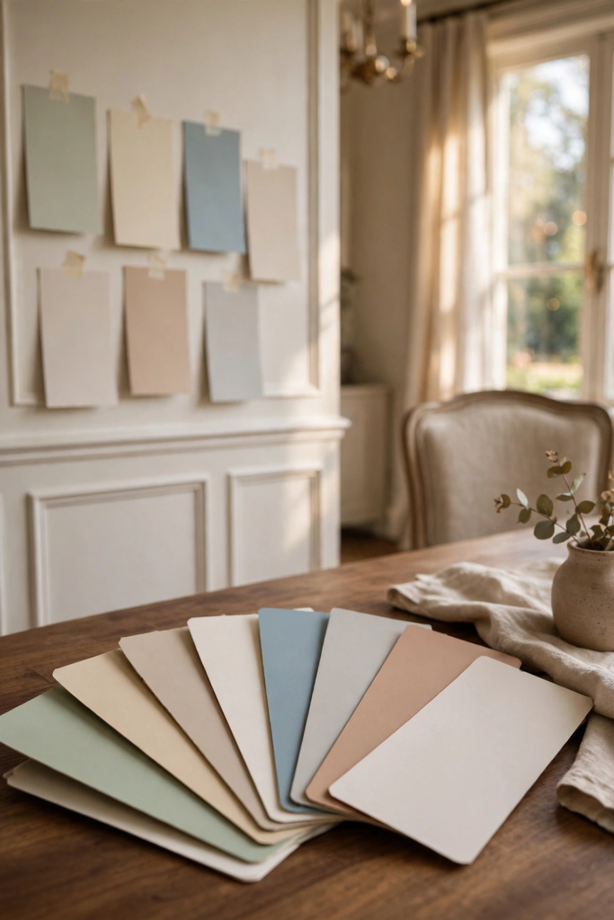
Fifth, paint large test swatches on at least two walls and live with them for two full days, checking morning, noon, and evening. Sixth, view the swatches next to your furniture, rug, and trim — not in isolation. Seventh, pick your sheen: flat or matte for low-traffic formality, eggshell for everyday dining rooms, satin for wipeable durability, semi-gloss for trim. Eighth, calculate paint: one gallon covers about 350 square feet, and most dining rooms need two gallons plus primer for two coats. Buy all your paint at once so the color mix matches, then enjoy the transformation.
- Look at your fixed elements: flooring, table, chairs and rug.
- Decide the mood you want: calm, cozy, dramatic or bright.
- Pick three sample colors and paint large swatches.
- Check them in daylight and in the evening with lights on.
- Choose a finish: eggshell for walls, satin or semi-gloss for trim.
Final Thoughts on Dining Room Paint Color Ideas
The best dining room paint color is the one that makes you want to linger at the table a little longer. Whether you choose the enveloping depth of forest green, the timeless ease of warm white, or the bold drama of black, the right color turns everyday meals into occasions. Remember that paint is the most forgiving design decision you can make — a few gallons and a weekend completely transform the room. Trust the testing process, observe your light, and choose the shade that feels like home at dinner hour. Your dining room should reflect how you actually live and gather.
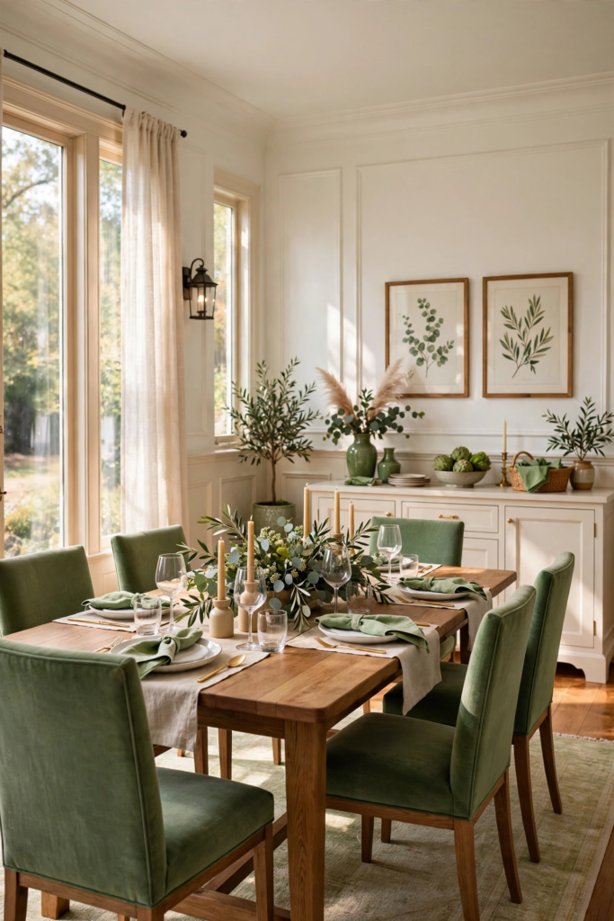
If you are still deciding, start with the colors on this list that match your light and furniture, then narrow with samples. Deep tones reward good lighting and bold hosts; soft neutrals flatter every style and never go out of fashion. Do not be afraid of a dark or saturated dining room — with layered lighting and the right sheen, moody colors feel welcoming rather than heavy. And once the walls are done, style the table: fresh greenery, candles, and textiles in tones that echo your paint. That is how a painted dining room becomes the heart of the home.
Frequently Asked Questions About Dining Room Paint Color Ideas
What is the most popular dining room paint color for 2026? Deep, nature-inspired tones lead the way — forest green, warm terracotta, and rich navy top designer lists, alongside timeless warm whites like Sherwin-Williams Alabaster SW 7008. What sheen works best? Eggshell for walls in most dining rooms, satin if you need extra wipeability, and semi-gloss on trim. Should the dining room match the living room? Not necessarily, but in open plans the colors should harmonize — pull from the same undertone family. How much paint do I need? One gallon covers about 350 square feet; most dining rooms need two gallons for two coats.
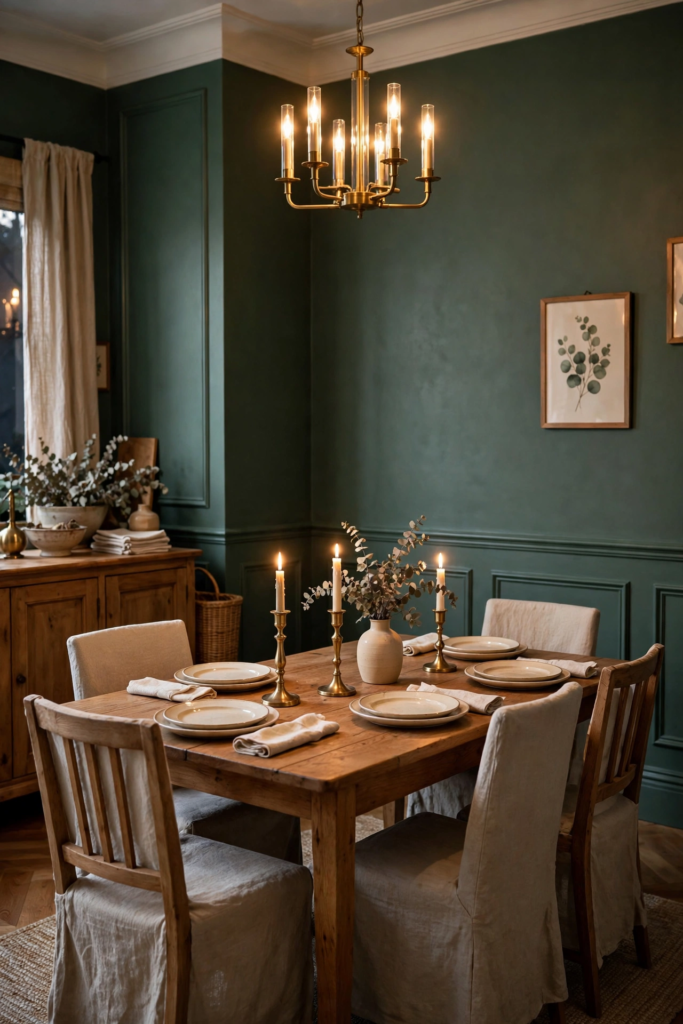
Can I use dark colors in a small dining room? Absolutely — deep navy, charcoal, or forest green can make a small dining room feel intimate and even larger at night, especially with mirrors and good lighting. Do I need primer? Yes, especially when covering dark colors or painting new drywall; a quality primer means truer color and fewer coats. How do I test colors? Buy $5–$12 samples, paint large swatches on two walls, and observe them for two days in natural and artificial light. Glidden, Behr, Sherwin-Williams, and Benjamin Moore all sell affordable sample sizes at Home Depot and Lowe’s.
What is the best paint color for a dining room?
Warm whites, sage, forest green and navy are among the most versatile. The best choice depends on natural light, the size of the room and the mood you want.
Should a dining room be light or dark?
Both can work. Dark colors feel cozy and dramatic, especially for evening meals. Light colors make small or dim rooms feel bigger and brighter.
What paint finish is best for a dining room?
Eggshell or matte works well for walls because it hides imperfections. Use satin or semi-gloss on trim and wainscoting for durability.
What are trending dining room paint color ideas for 2026?
Deep greens, earthy terracotta, mushroom brown, dusty blue and color-drenched rooms are trending for 2026.
Can I paint a dining room black?
Yes. Black dining rooms look chic and intimate. Balance them with warm lighting, light table linens and metallic accents.




Leave a comment