

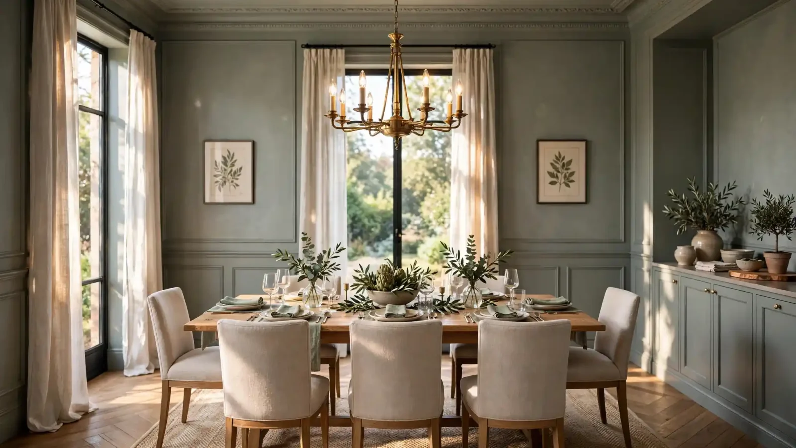
Choosing the right dining room paint colors is one of the fastest ways to change how your entire home feels, because color sets the mood for every meal and holiday dinner. Dining room paint colors also affect how appetizing food looks, how spacious the room feels, and whether the space reads formal or comfortably casual. Before buying paint, consider your natural light, your furniture finishes, and the undertone family you want to live with for years. We rounded up 22 beautiful dining room paint colors from trusted brands like Sherwin-Williams, Benjamin Moore, and Behr, with real color names and gallon prices so you can repaint with total confidence.
The secret to picking dining room paint colors that never disappoint is understanding undertones and light. A warm beige can glow golden in south-facing sun but turn muddy facing north, while a crisp navy looks rich by daylight and dramatic under evening lamps. Always test large swatches on at least two walls and observe them at breakfast, lunch, and dinner before you commit. Consider your dining table wood tone too, since warm oak pairs best with warm wall undertones and cool walnut loves cooler paint shades. This guide walks you through cozy neutrals, moody greens, classic blues, and bold accent shades so every dining room paint color choice feels intentional.
Budget matters, so we included pricing for every paint line mentioned here. A gallon of Behr Marquee runs about $48 to $55 at Home Depot, Benjamin Moore Regal Select costs roughly $75 to $85, and Sherwin-Williams Duration lands near $70 to $85 at full price. Most standard dining rooms need only two gallons for two coats, which keeps the project under $200 including primer and supplies. We also note the best sheen for each color, because eggshell and satin finishes handle the splatters and scuffs of daily family meals. Grab a sample quart first, and let us help you find dining room paint colors you will love for a decade.
1. Warm Beige Dining Room Paint Colors That Feel Cozy
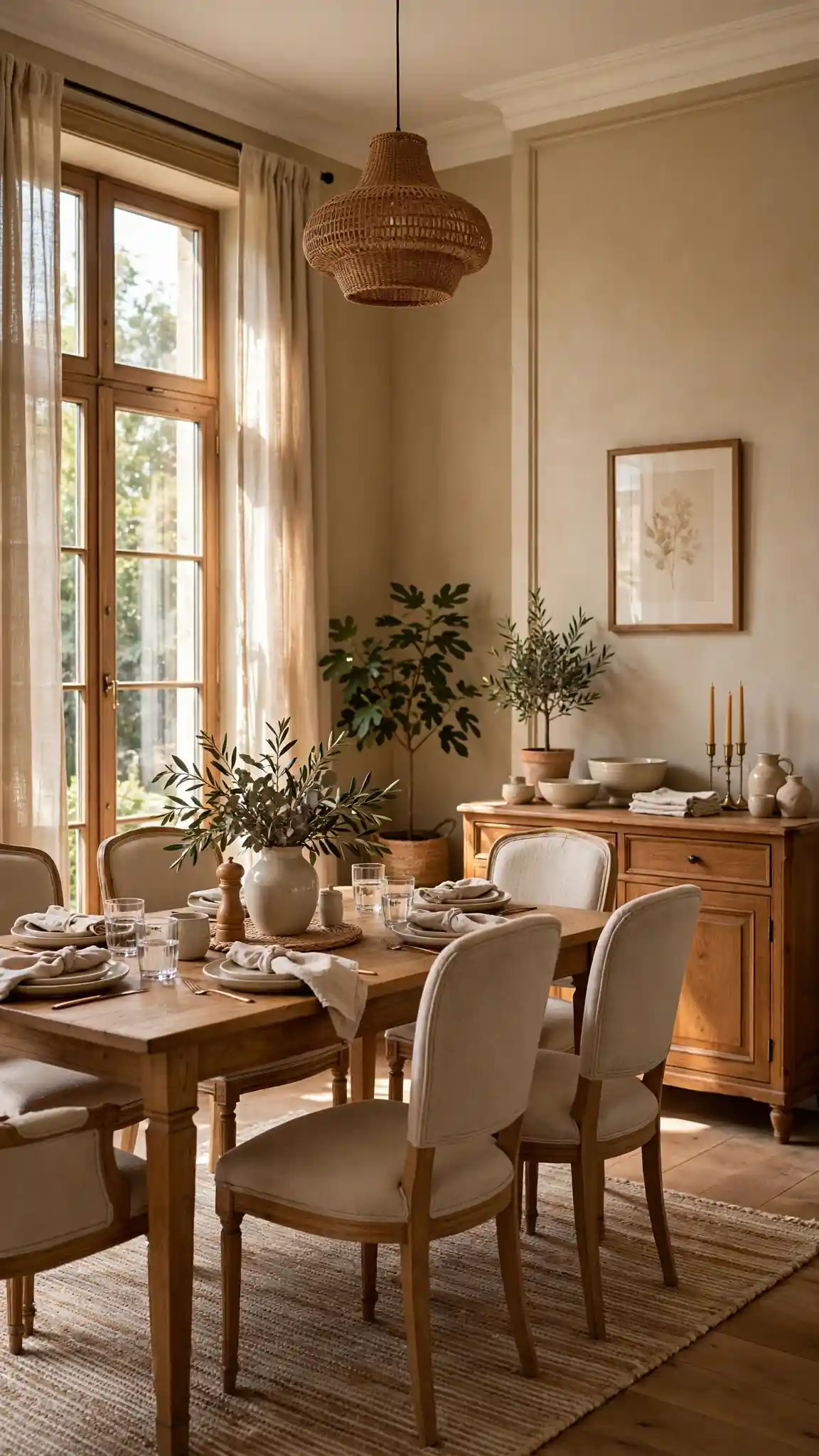
Sherwin-Williams Accessible Beige (SW 7036) is the undisputed champion of cozy dining room paint colors, a warm greige that leans beige without ever looking yellow, pink, or dated. It flatters oak and walnut dining tables, plays nicely with both brass and matte black hardware, and shifts beautifully from golden morning light to warm lamplight at dinner. With a light reflectance value near 58, it keeps smaller dining rooms feeling open while still adding genuine warmth. Expect to pay about $70 to $80 per gallon for Duration interior at Sherwin-Williams stores, and plan on two gallons for a typical 12 by 14 foot room with two coats.
Test Accessible Beige on two walls, one beside the window and one behind your table, because undertones shift dramatically with light direction. Pair it with bright white trim like Extra White for a crisp tailored frame, and choose an eggshell finish so the walls wipe clean after messy family dinners. If the beige reads too light in a large room, step one shade deeper to Balanced Beige (SW 7037) for extra coziness. It also makes a perfect backdrop for gallery walls and sideboard styling. Pro tip: buy a quart sample and live with it through three evenings before committing to full gallons.
2. Moody Forest Green for an Enclosed, Intimate Feel
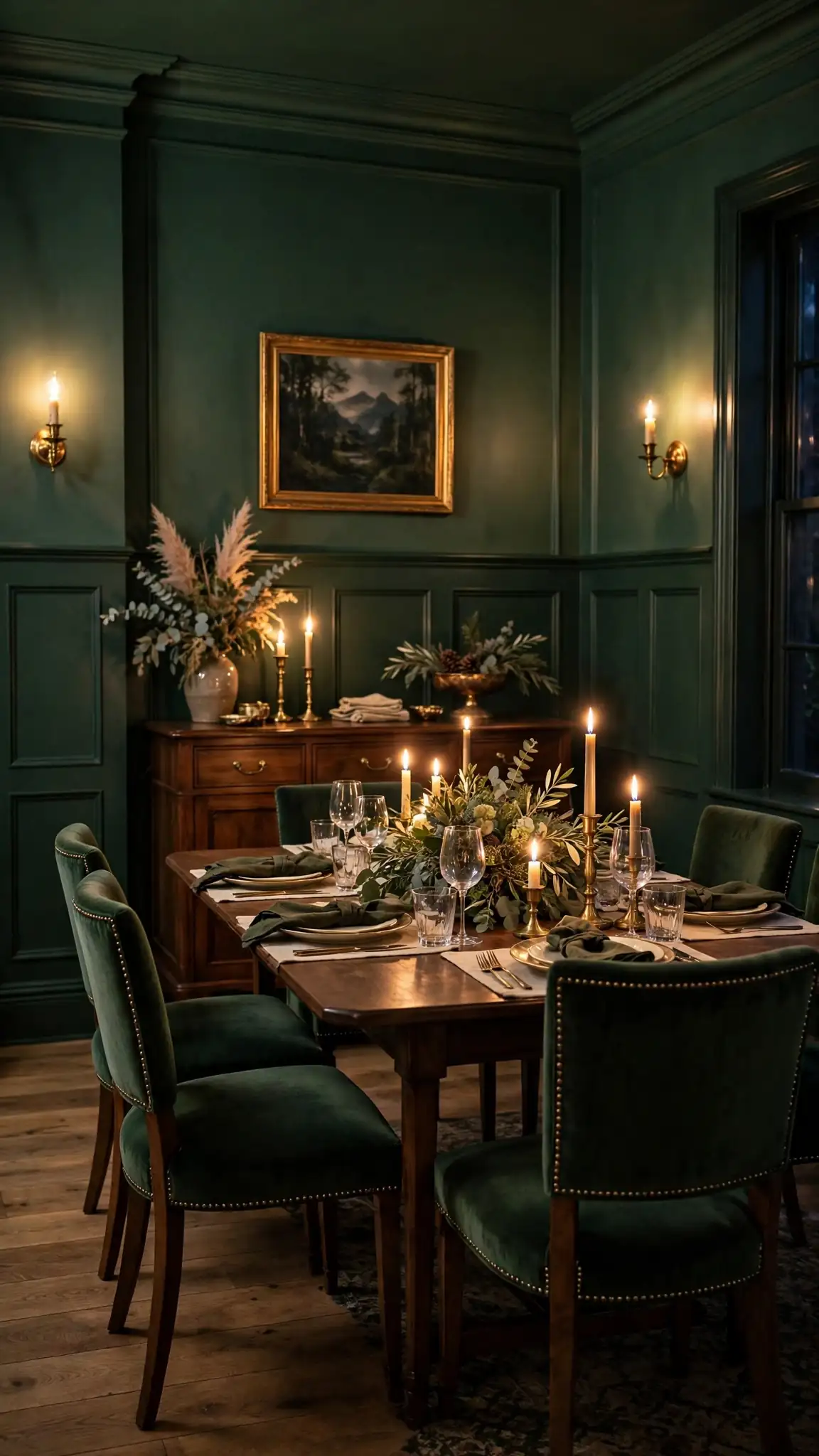
Sherwin-Williams Retreat (SW 6207) brings the drama of a moody forest green without tipping into near-black territory, making it one of the most flattering dark dining room paint colors for evening entertaining. It wraps the room in a calm, cocoon-like feeling that makes candlelight and brass sconces absolutely glow. This shade pairs gorgeously with natural wood, leather dining chairs, and creamy linens, giving the space a collected, designer look. A gallon of Emerald interior runs about $85 to $95, while the budget-friendly SuperPaint version costs closer to $60 to $70 at Sherwin-Williams stores during their frequent 30 percent off sales.
Dark greens demand good lighting, so plan for a statement chandelier plus dimmable sconces to keep the room from feeling cave-like. Balance the depth with a light area rug and pale upholstery on at least half your chairs. Satin sheen adds a soft glow that keeps dark walls from looking flat. If Retreat feels too bold, test Dried Thyme (SW 6186) one step lighter for a similar mood with more visibility. Sample it behind your buffet, where the green will frame your serving pieces beautifully. Pro tip: paint the ceiling the same green for a seamless, enveloping color-drench that feels expensive.
3. Classic Navy Blue That Never Goes Out of Style
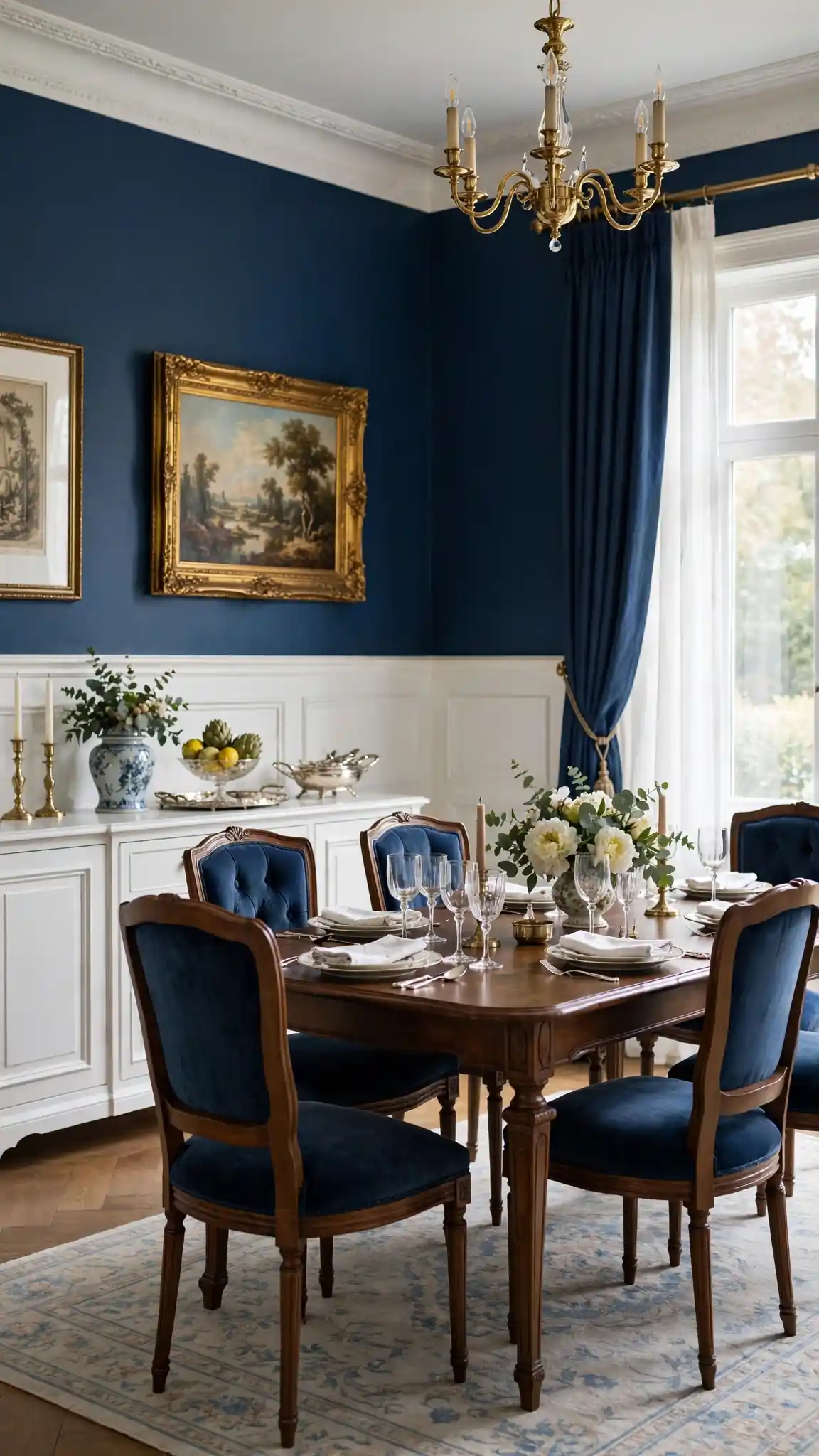
Benjamin Moore Hale Navy (HC-154) is the gold standard of blue dining room paint colors, a true navy with just enough gray to stay sophisticated rather than primary. It gives dining rooms instant formality and depth, making white wainscoting, marble tabletops, and silver serving pieces look like a million dollars. Navy is surprisingly versatile, working with coastal, traditional, farmhouse, and modern decor alike. Expect to pay roughly $75 to $85 per gallon for Regal Select at independent paint retailers or Benjamin Moore stores, with Aura running closer to $85 to $95 for its superior one-coat coverage in deep tones.
Because navy absorbs light, keep ceilings and trim bright white to maintain contrast and airiness. Add warmth with wood tones, woven textures, and brass or gold lighting fixtures that pop against the blue. An eggshell finish offers the best balance of richness and washability for dining spaces. If Hale Navy feels too dark for a windowless room, try Van Deusen Blue (HC-156), which reads a touch lighter and dustier. Always sample deep colors at night too, since they look very different under warm bulbs. Pro tip: use Hale Navy on a single accent wall behind the buffet if full-room navy feels like too much commitment.
4. Rich Terracotta for Mediterranean Warmth
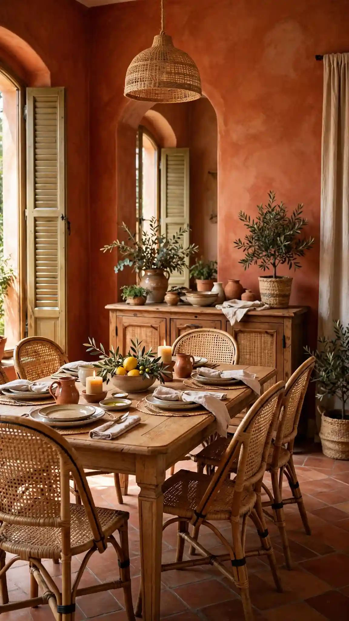
Sherwin-Williams Cavern Clay (SW 7701) is a baked-clay terracotta that fills dining rooms with sun-warmed Mediterranean energy, even on gray winter evenings. It is a bold but livable shade that flatters terracotta tile, dark wood beams, rattan chairs, and handmade pottery collections. Terracotta dining room paint colors make food look especially appetizing, which is a real bonus in a space built around meals. A gallon of SuperPaint costs about $60 to $70, and Cashmere interior at $65 to $75 gives an ultra-smooth, buttery finish that suits this earthy color beautifully.
Terracotta has strong orange undertones, so balance it with creamy whites, sage greens, and natural fibers to keep the room from feeling too fiery. It looks stunning with arched doorways, plaster textures, and black iron lighting for a Spanish-revival feel. Choose eggshell sheen to soften the color’s intensity and make touch-ups invisible. If Cavern Clay feels too saturated, sample Redend Point (SW 9081), a muted clay that is easier to live with long term. Test it against your flooring first, since busy floors can clash. Pro tip: repeat the terracotta in small doses, like napkins or artwork, to make the walls feel intentional.
5. Soft Greige That Works With Everything
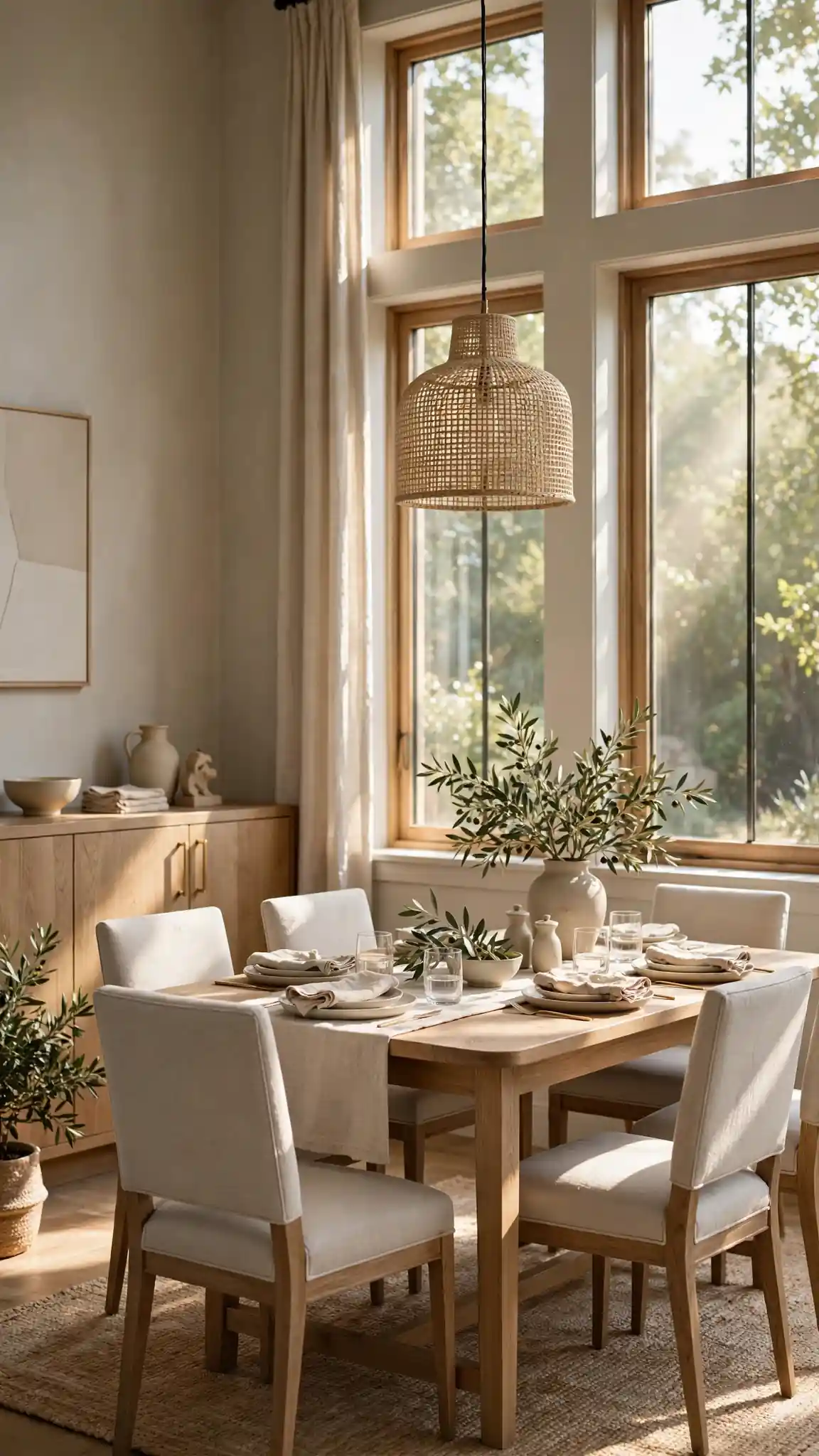
Sherwin-Williams Agreeable Gray (SW 7029) is the most popular greige in America for a reason: it is a chameleon that reads warm gray in north light and soft beige in south light, never fighting your furniture. Among neutral dining room paint colors, it is the safest choice for open floor plans, since it bridges the kitchen, living room, and dining area without jarring transitions. It lets bold art, patterned rugs, and statement lighting take center stage. Duration interior runs about $70 to $80 per gallon, though the 40 percent off sales at Sherwin-Williams stores drop it closer to $50 for patient shoppers.
Agreeable Gray pairs beautifully with white trim, natural oak, linen upholstery, and nearly any metal finish from chrome to oil-rubbed bronze. Use it when you want the architecture and furnishings to shine rather than the wall color itself. A satin finish adds subtle life to this quiet shade and stands up to chair-back scuffs. In very dark rooms it can read slightly flat, so add layered lighting with a dimmer on the chandelier. If it looks too gray on your walls, nudge warmer to Accessible Beige instead. Pro tip: paint an entire open-concept main floor in Agreeable Gray for a seamless, larger-feeling home.
6. Dramatic Charcoal Gray With Modern Edge
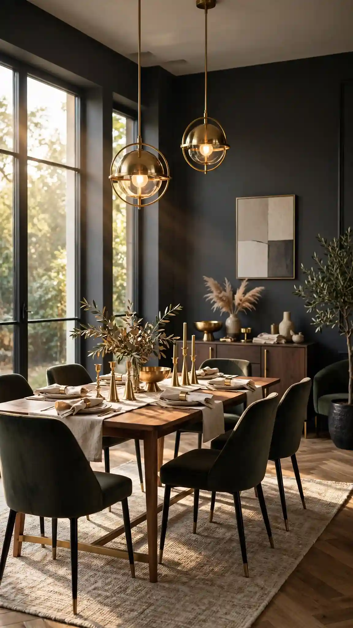
Benjamin Moore Wrought Iron (2124-10) is a soft black-charcoal that gives dining rooms a sleek, modern edge without the harshness of pure black. It makes white trim, glass tabletops, and metallic accents look razor sharp, and it turns an ordinary chandelier into a sculptural focal point. Charcoal dining room paint colors are perfect for contemporary homes and for anyone who loves entertaining after dark, when the walls recede and the table setting takes over. Regal Select costs about $78 to $88 per gallon, and the rich pigment covers well in two coats over a gray-tinted primer.
Charcoal walls need contrast to avoid feeling heavy, so keep ceilings white, floors light, and add mirrors to bounce light around the room. A matte or eggshell finish looks most sophisticated on dark walls, hiding roller marks better than higher sheens. Pair Wrought Iron with cognac leather, walnut, and brushed brass for warmth that keeps the gray from feeling cold. If full-room charcoal intimidates you, try it on the ceiling only for a surprising, cozy canopy effect. Sample it in evening light first, since it deepens after dark. Pro tip: ask the store to tint your primer gray so the charcoal covers in two coats instead of three.
7. Creamy Warm White for Timeless Elegance
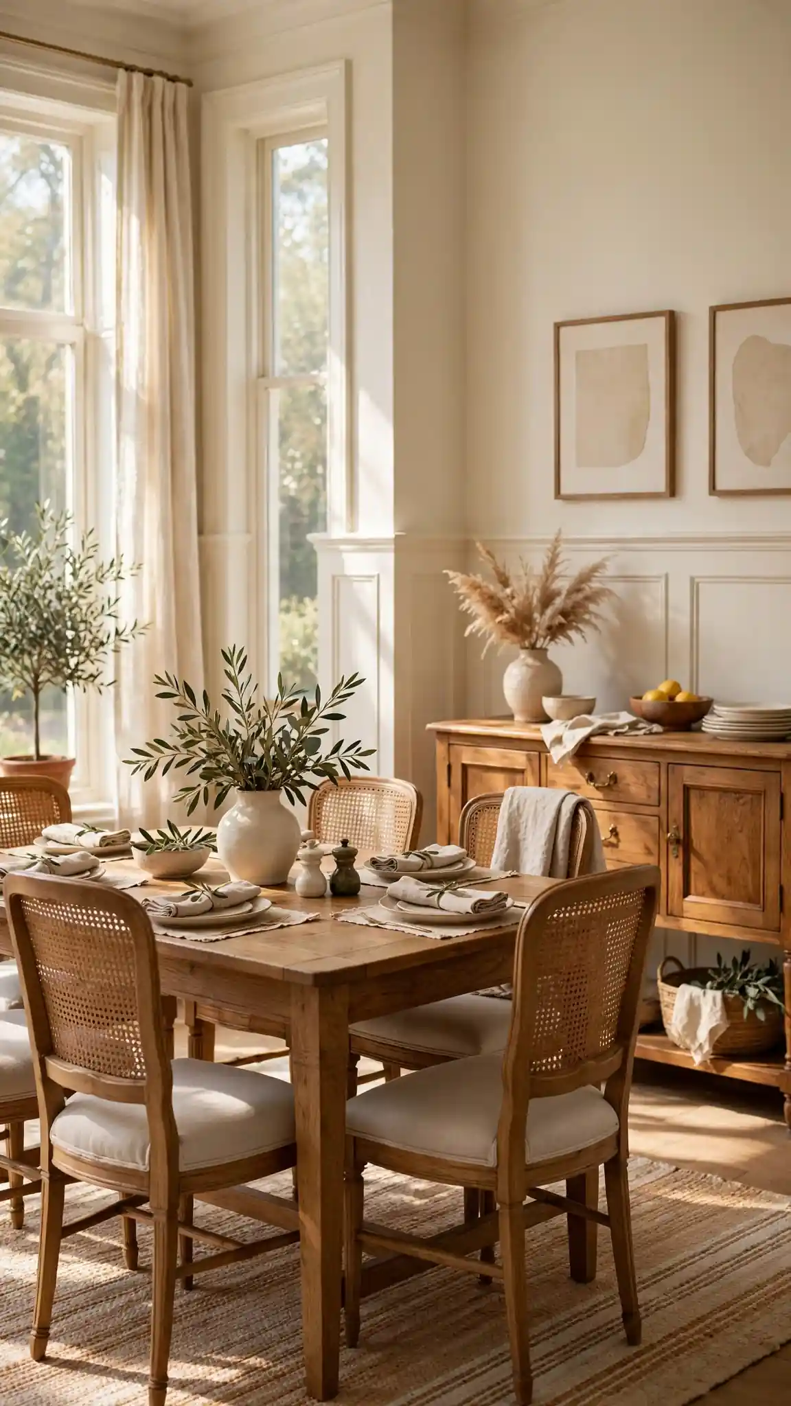
Sherwin-Williams Alabaster (SW 7008) is a creamy warm white that keeps dining rooms feeling bright and timeless without the sterile chill of stark white. It has the softest yellow undertone, which makes wood furniture glow and candlelight feel even warmer. White dining room paint colors are ideal for small or dark dining nooks, since they reflect every bit of available light. A gallon of Duration Home interior costs about $68 to $78, while the excellent-value Emerald Designer Edition at Lowe’s runs roughly $60 to $70 for comparable performance in light shades.
Creamy whites show every scuff, so choose satin sheen on walls for wipeability and semi-gloss on trim for contrast and durability. Layer texture to keep white rooms interesting: a jute rug, linen curtains, woven pendants, and mixed wood tones all prevent the space from feeling flat. Alabaster pairs with literally any accent color, making it the perfect backdrop if you redecorate seasonally. Avoid pairing it with cool gray furniture, which can make the walls look dingy by comparison. Test it against your trim white first. Pro tip: paint the ceiling the same creamy white to erase harsh lines and make low ceilings feel taller.
8. Calming Sage Green for a Relaxed Gathering Space
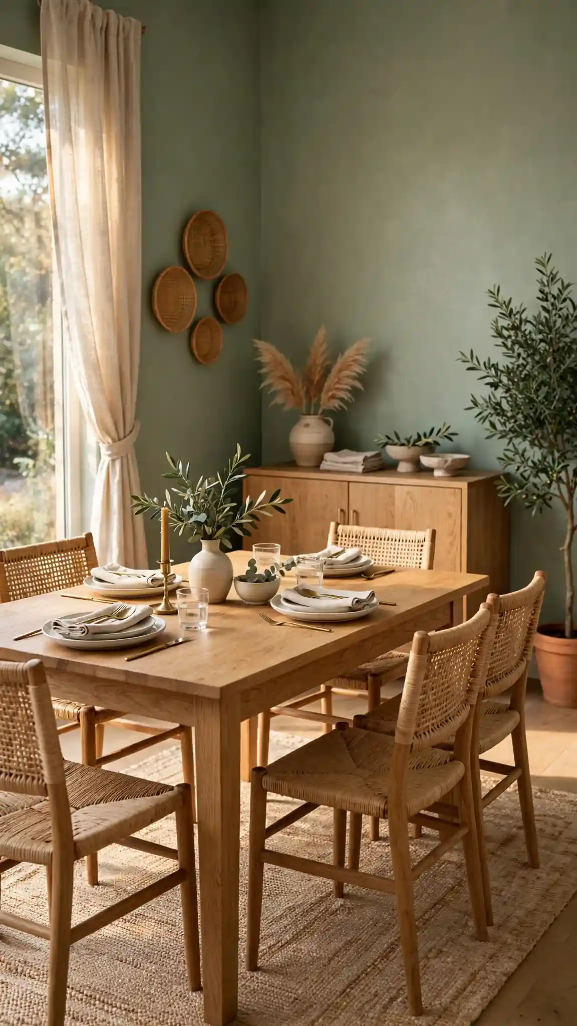
Benjamin Moore Saybrook Sage (HC-114) is a muted, gray-green sage that turns dining rooms into calm, garden-inspired gathering spaces. It is soft enough to function as a neutral but interesting enough to give the room real personality, pairing beautifully with cream upholstery, natural oak, and black accents. Green dining room paint colors like this one have a naturally relaxing effect, which makes long holiday dinners feel unhurried. Regal Select in this shade costs about $75 to $85 per gallon at Benjamin Moore retailers, and its excellent hide means two coats usually suffice over light-colored walls.
Sage green loves natural materials, so style it with wooden bowls, linen runners, eucalyptus centerpieces, and woven light fixtures for an organic modern look. An eggshell finish keeps the color soft and velvety. If Saybrook Sage reads too gray in your light, try October Mist (CC-550), which is slightly warmer and fresher. This shade also works beautifully in dining rooms that open to the kitchen, creating a seamless flow. Add contrast with dark-stained chairs or a black chandelier to keep it from feeling washed out. Pro tip: echo the sage in your table linens to make the whole room feel professionally designed.
9. Inky Black Accent for Maximum Drama
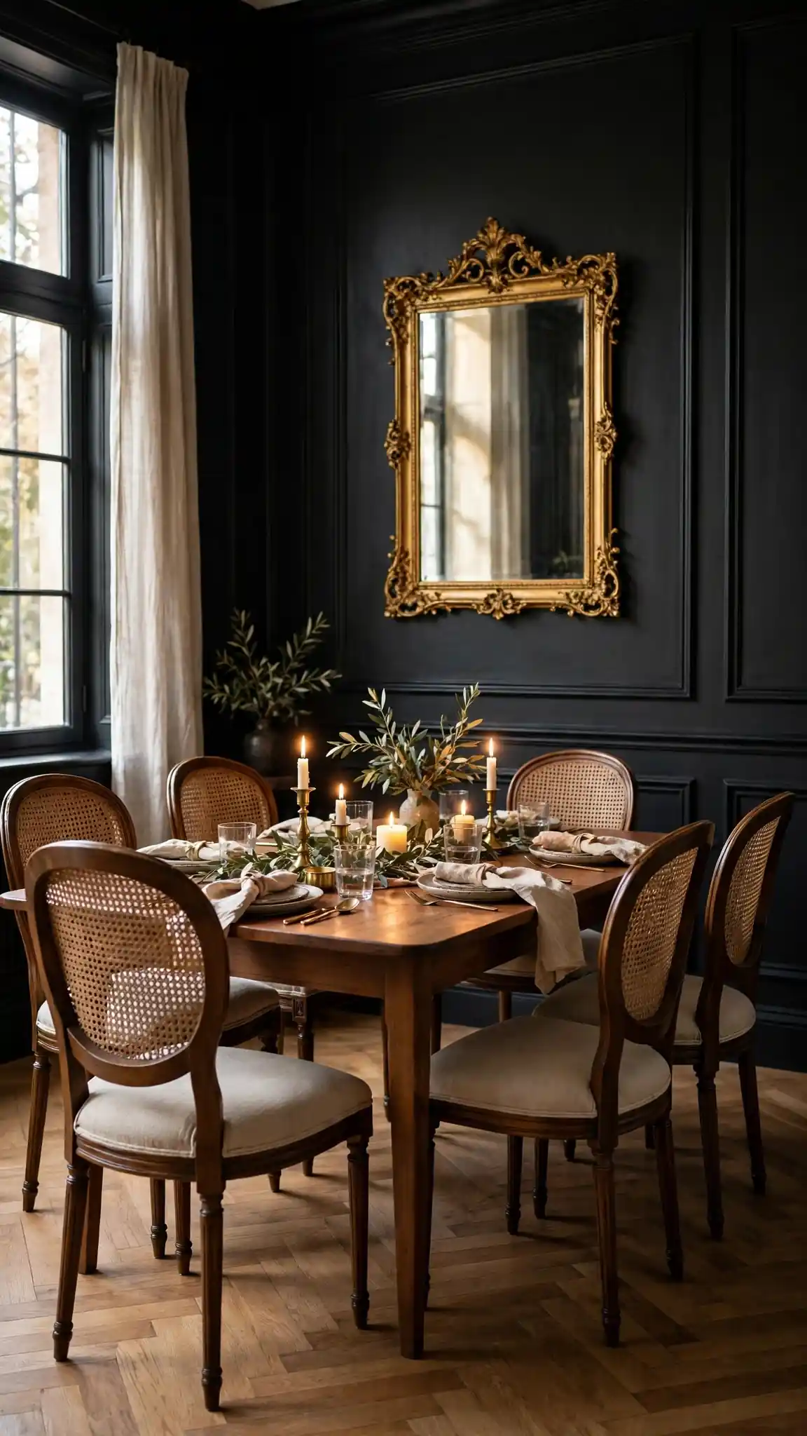
Sherwin-Williams Iron Ore (SW 7069) is a deep charcoal-black that creates the most dramatic dining room paint colors possible, turning an ordinary room into a moody, restaurant-like retreat. Used on all four walls it feels daring and enveloping; used on one accent wall behind the buffet it adds depth without overwhelming the space. Black walls make artwork, mirrors, and metallic finishes look gallery-worthy, and they make candlelight absolutely magical. Emerald interior in Iron Ore costs about $85 to $95 per gallon, though waiting for a 30 to 40 percent off sale at Sherwin-Williams stores cuts that significantly.
Black walls demand intentional lighting, so install a dimmable statement chandelier and add picture lights or sconces to wash the walls with warm light. Keep the ceiling and trim bright white for crisp definition, and balance the darkness with a light rug and pale chair upholstery. Matte or flat finishes look most luxurious on black, though eggshell is more practical for wipe-downs. If pure Iron Ore feels too intense, try Urbane Bronze (SW 7048), a warmer dark bronze with similar depth. Prime with tinted gray primer first. Pro tip: black dining rooms photograph beautifully, so this is a great pick if you love sharing your home on social media.
10. Dusty Blue for a Calm, Coastal Feel
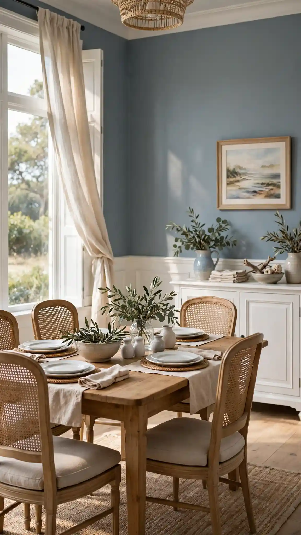
Sherwin-Williams Slate Tile (SW 7624) is a dusty, desaturated blue-gray that brings calm coastal energy to dining rooms without screaming beach theme. It pairs effortlessly with white shiplap, natural rattan, driftwood tones, and brushed nickel fixtures for a relaxed yet polished look. Blue dining room paint colors in this muted family are proven appetite-neutral, neither stimulating nor suppressing, making them safe for everyday family meals. SuperPaint in Slate Tile runs about $60 to $70 per gallon, and Duration at $70 to $80 gives better scrubbability for homes with young kids.
Dusty blues shift with light, so sample on the wall that gets the most daylight and the one that gets the least before deciding. Pair Slate Tile with warm wood to keep the cool tone from feeling chilly, and add texture through linen, jute, and ceramic pieces. An eggshell finish keeps the color soft and sophisticated. If it reads too gray, step toward Rainwashed (SW 6211) for a slightly greener coastal feel. This shade also works well in dining rooms with water views or lots of greenery outside the windows. Pro tip: use the same dusty blue on interior doors for a cohesive, custom-looking detail.
11. Warm Taupe With Understated Luxury
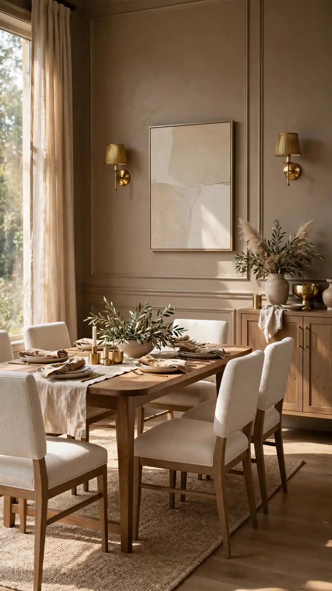
Behr Toffee Crunch (N230-4) is a warm, mid-tone taupe that gives dining rooms an understated, luxurious feel somewhere between brown and gray. It flatters both traditional cherry furniture and modern walnut pieces, and it makes brass and gold accents look richer. Taupe dining room paint colors are workhorses for busy families, hiding minor scuffs far better than pale shades. The best part is the price: Behr Marquee one-coat paint costs about $48 to $55 per gallon at Home Depot, so you can do a whole dining room for under $150 including supplies.
Warm taupe can go muddy in north-facing rooms, so test it at different times of day and consider adding plenty of warm lighting. Pair it with cream trim rather than bright white for a softer, more expensive-looking contrast. Satin sheen suits taupe well, giving the walls a subtle glow that reads upscale. If Toffee Crunch feels too brown, try Behr Perfect Taupe (N210-3) for a grayer take. Style with ivory linens, amber glass, and dark wood for a rich, layered look. This color also hides the wear of chair backs beautifully. Pro tip: buy Marquee during Home Depot’s paint sales around holidays to save an extra 20 percent.
12. Rich Burgundy for Old-World Romance
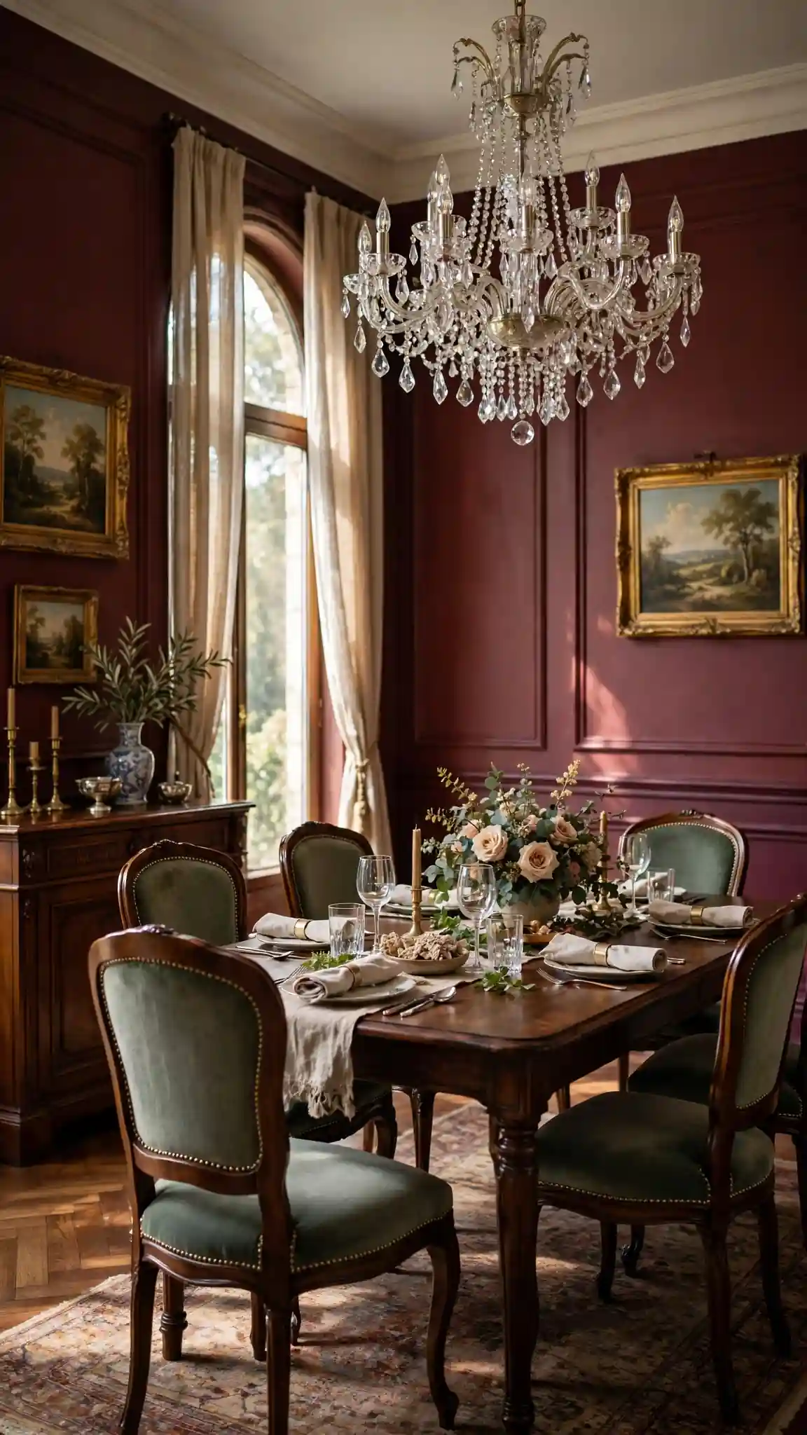
Benjamin Moore Caliente (AF-290) is a rich, blue-based burgundy that wraps dining rooms in old-world romance, perfect for formal spaces and holiday entertaining. It makes crystal, silver, and candlelight look extraordinary, and it pairs surprisingly well with modern black-and-white art for a collected feel. Red-based dining room paint colors are known to stimulate appetite and conversation, which is exactly what you want around a dinner table. Aura interior in Caliente costs about $85 to $95 per gallon, and its color-lock technology keeps the deep red from fading in sunny rooms.
Burgundy is bold, so balance it with generous white trim, a light ceiling, and plenty of warm lighting to keep the room inviting rather than heavy. It looks stunning with dark wood antiques, Persian rugs, and velvet upholstery in jewel tones. Use eggshell sheen for depth without excessive shine. Because reds are notorious for poor coverage, always use a gray-tinted primer and expect three thin coats for a flawless finish. If Caliente feels too intense, try New London Burgundy (HC-61) for a dustier, more muted take. Sample it at night under your chandelier. Pro tip: carry the burgundy onto the ceiling in a small dining room for a jewel-box effect that feels intentional and luxe.
13. Golden Mustard for Cheerful Energy
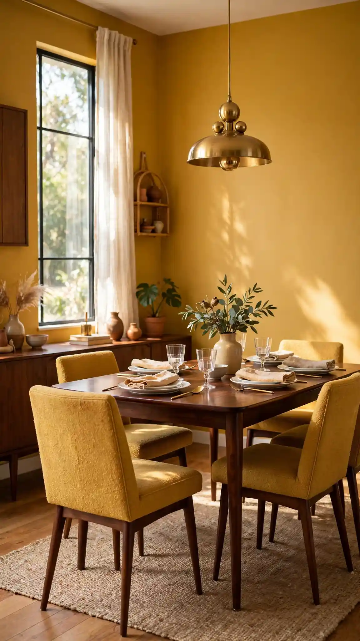
Behr Warm Butterscotch (P220-6) is a golden mustard that fills dining rooms with cheerful, sunshiny energy, even in windowless spaces. It is a confident color that pairs beautifully with dark walnut, black metal, and crisp white trim for a mid-century modern feel. Yellow-based dining room paint colors are proven mood lifters, making breakfast feel brighter and weeknight dinners more festive for the whole family. Behr Premium Plus in this shade costs only about $35 to $42 per gallon at Home Depot, making it the most budget-friendly way to make a big color statement.
Mustard walls need strong contrast to look chic rather than dated, so anchor the room with a dark rug, black chandelier, and plenty of white to break up the gold. It looks fantastic with green plants, which pop dramatically against the yellow. Choose eggshell sheen to keep the color rich but not glossy. If Warm Butterscotch feels too bold, try Behr Honey Glow (P210-4) one step softer. This shade is especially great in north-facing dining rooms that need artificial warmth. Keep artwork simple and graphic. Pro tip: repeat the mustard in just two or three accessories so the walls feel like a deliberate design choice.
14. Earthy Olive Green for Organic Warmth
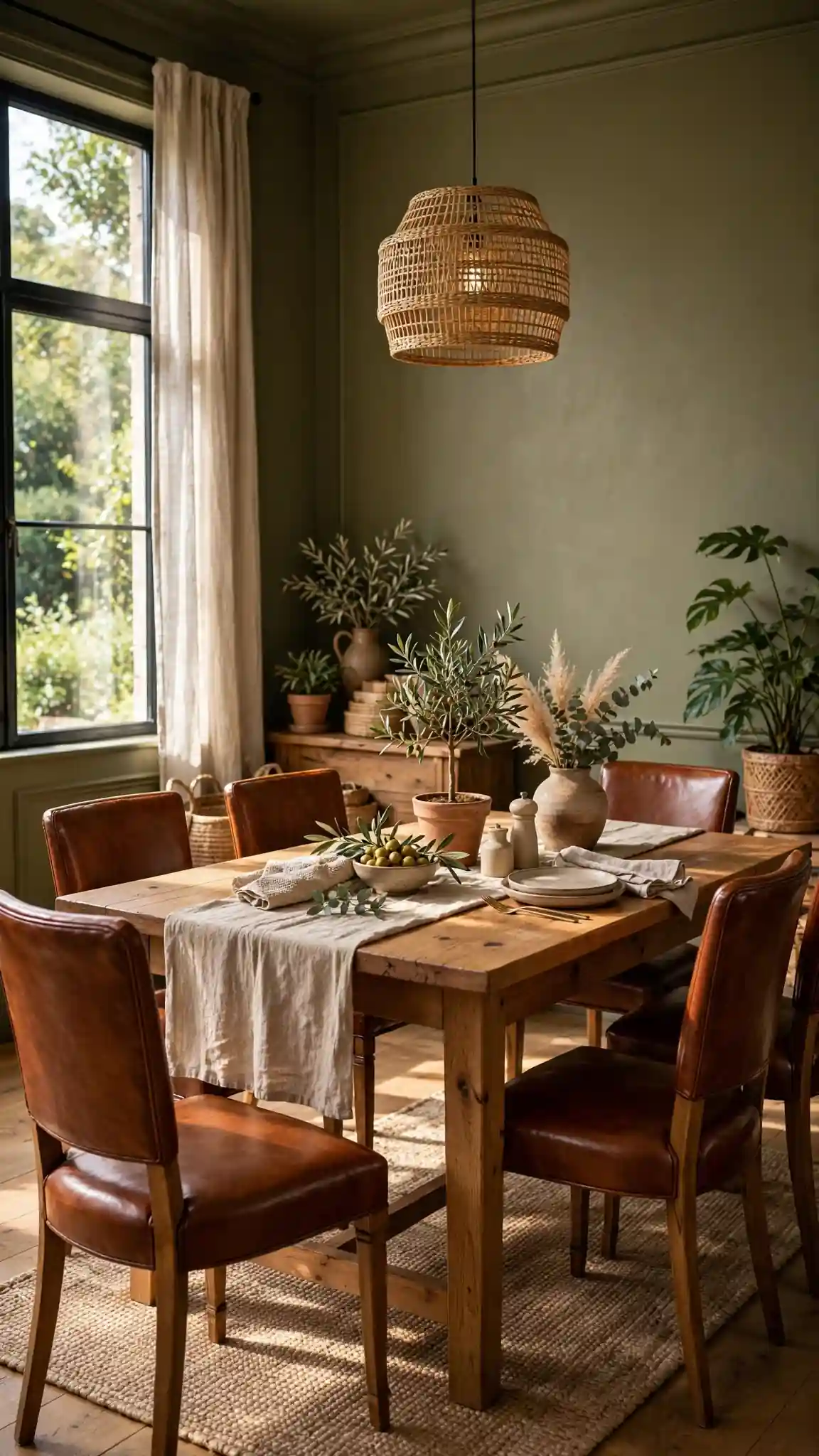
Sherwin-Williams Rural Green (SW 6451) is an earthy olive with warm undertones that gives dining rooms an organic, grounded warmth. It sits beautifully between the trendy sage greens and the moody forest greens, working with rustic farmhouse tables as well as sleek modern sideboards. Olive dining room paint colors pair gorgeously with cognac leather, brass, natural linen, and terracotta accents for a collected global look. SuperPaint in Rural Green costs about $60 to $70 per gallon, while Emerald at $85 to $95 offers the richest pigment depth for this complex shade.
Olive green can read muddy in poor light, so make sure your dining room has adequate warm lighting before committing. It looks best with creamy white trim rather than stark white, which keeps the palette feeling natural. An eggshell finish suits olive’s organic character. If Rural Green feels too dark, sample Clary Sage (SW 6178) for a lighter, fresher take in the same family. Style with wooden serving boards, dried botanicals, and woven pendants to lean into the earthy vibe. This color also camouflages everyday wear remarkably well. Pro tip: paint your dining chairs in a deeper olive for a tonal, designer look.
15. Pale Cool Gray for a Clean, Modern Backdrop
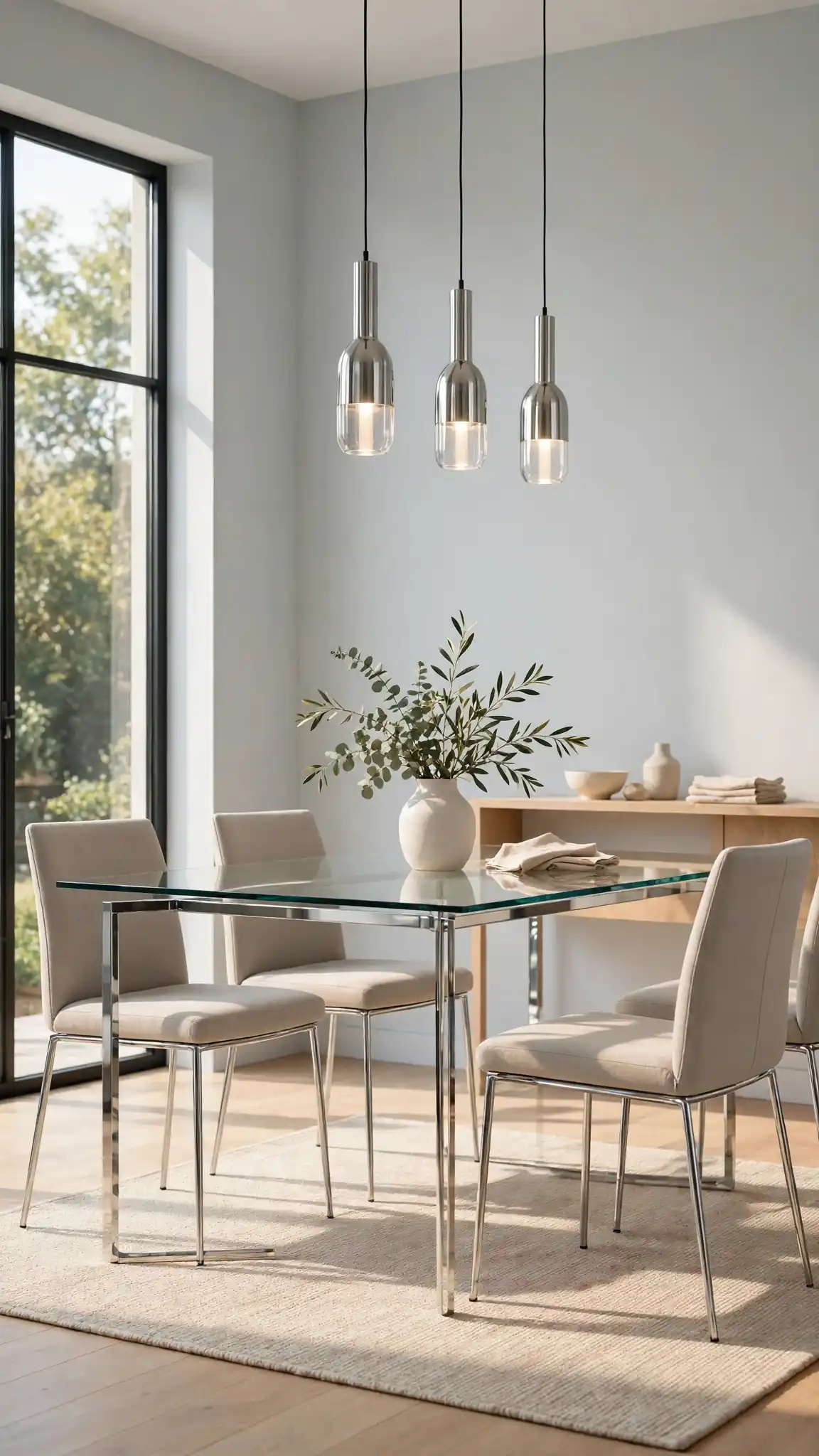
Sherwin-Williams Light French Gray (SW 0055) is a pale cool gray that gives dining rooms a clean, modern backdrop without feeling cold or industrial. It has just enough blue undertone to feel fresh, making white trim, chrome fixtures, and glass tabletops look crisp and intentional. Cool gray dining room paint colors like this one are perfect for contemporary homes and for rooms with warm wood floors that need balancing. A gallon of Duration interior costs about $70 to $80, though Sherwin-Williams stores run 30 to 40 percent off sales several times a year that bring it under $55.
Pale gray needs warmth from furnishings to avoid feeling sterile, so add wood tones, textured fabrics, and warm metallics like brass or champagne bronze. It is an ideal backdrop for colorful art, since nothing competes with your gallery wall. Choose satin sheen for subtle reflectivity that keeps the walls from looking flat. In north-facing rooms, sample carefully, as cool grays can turn icy without enough warm light. Pair it with a bold rug to anchor the space. This shade also makes small dining rooms feel larger and airier. Pro tip: use Light French Gray on walls and pure white on the ceiling for maximum brightness.
16. Soft Warm White That Flatters Everyone
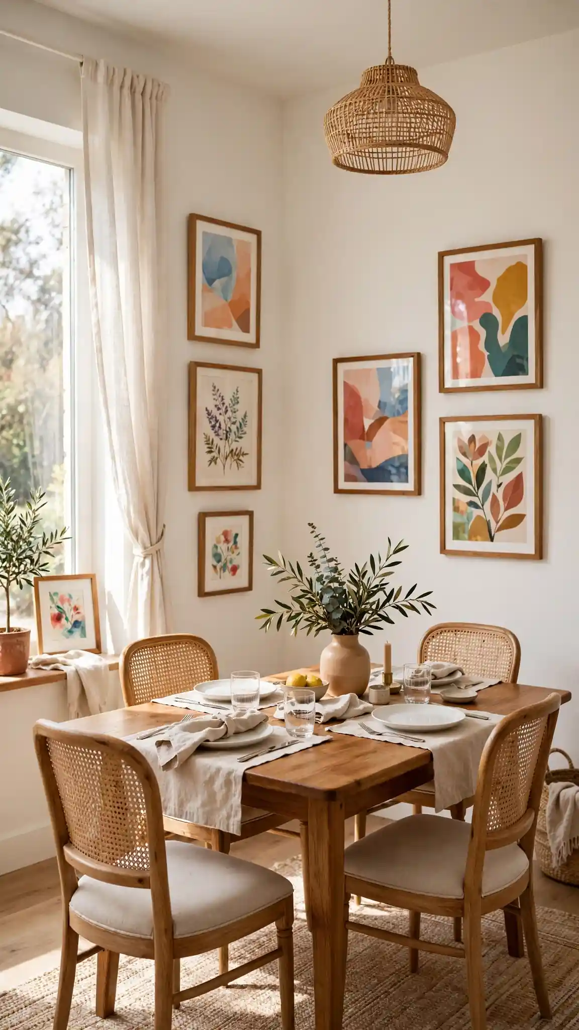
Benjamin Moore White Dove (OC-17) is the designer-favorite warm white, soft enough to feel cozy but clean enough to read as truly white. It flatters every skin tone, which matters in a room built around dinner parties, and it makes wood furniture, colorful art, and patterned rugs all look their best. Among white dining room paint colors, White Dove is the most forgiving, hiding its warm undertone gracefully in any light. Regal Select costs about $75 to $85 per gallon, while Ben interior at $55 to $65 is a smart budget alternative with the same beloved color.
White Dove looks best with slightly brighter white trim, like Chantilly Lace, for gentle contrast that keeps the room from feeling one-note. Layer in texture through curtains, rugs, and upholstery so the white feels rich rather than empty. Satin sheen on walls resists scuffs from chair backs. Because it is so popular, sample it against your specific flooring, as undertones vary by light. It also photographs beautifully for listing photos if you plan to sell. Avoid cool LED bulbs, which fight the warm undertone. Pro tip: paint built-in hutches or buffets in White Dove for a seamless, custom-millwork look.
17. Deep Teal for Jewel-Toned Sophistication
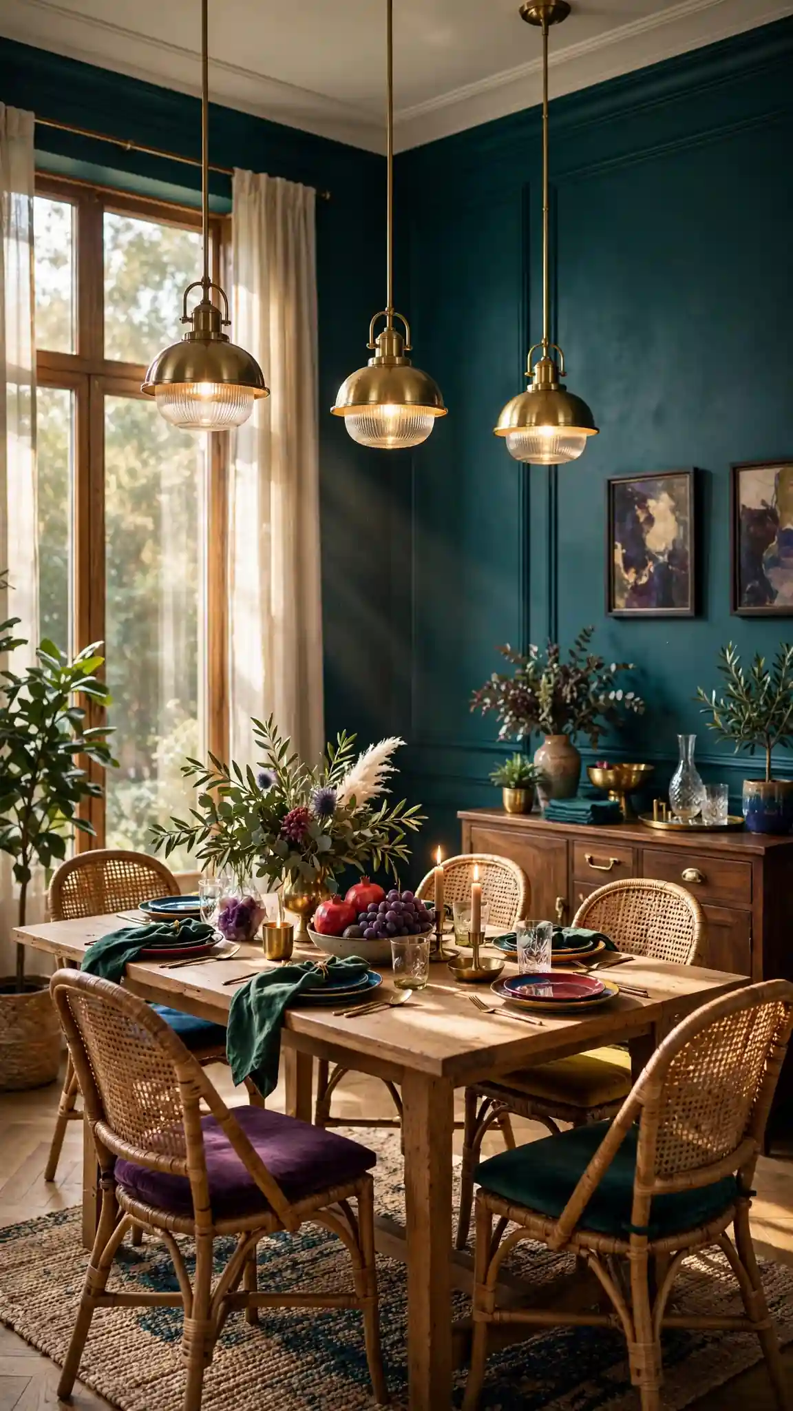
Sherwin-Williams Oceanside (SW 6496) is a deep, saturated teal that brings jewel-toned sophistication to dining rooms, sitting perfectly between blue and green. It feels both coastal and formal, pairing stunningly with rattan, brass, white coral-inspired decor, and dark wood. Teal dining room paint colors make white dinnerware and glassware pop on open shelving, turning everyday dishes into display pieces. Emerald interior in Oceanside runs about $85 to $95 per gallon, with its rich pigment delivering excellent coverage in two coats over properly primed walls, so the deep color looks truly flawless.
Deep teal absorbs light, so plan for layered lighting: a bold chandelier, buffet lamps, and dimmers for evening ambiance. Balance the intensity with natural textures like jute, linen, and light wood to keep the room grounded. Eggshell sheen gives teal walls a soft, velvety richness. If Oceanside feels too saturated, try Rainstorm (SW 6230), a dustier teal that is easier to live with. This color looks spectacular with gold-framed mirrors that bounce light around the room. Sample it on the wall opposite your windows. Pro tip: use teal on lower wainscoting with warm white above for classic two-tone elegance.
18. Delicate Blush Pink for Soft Romance
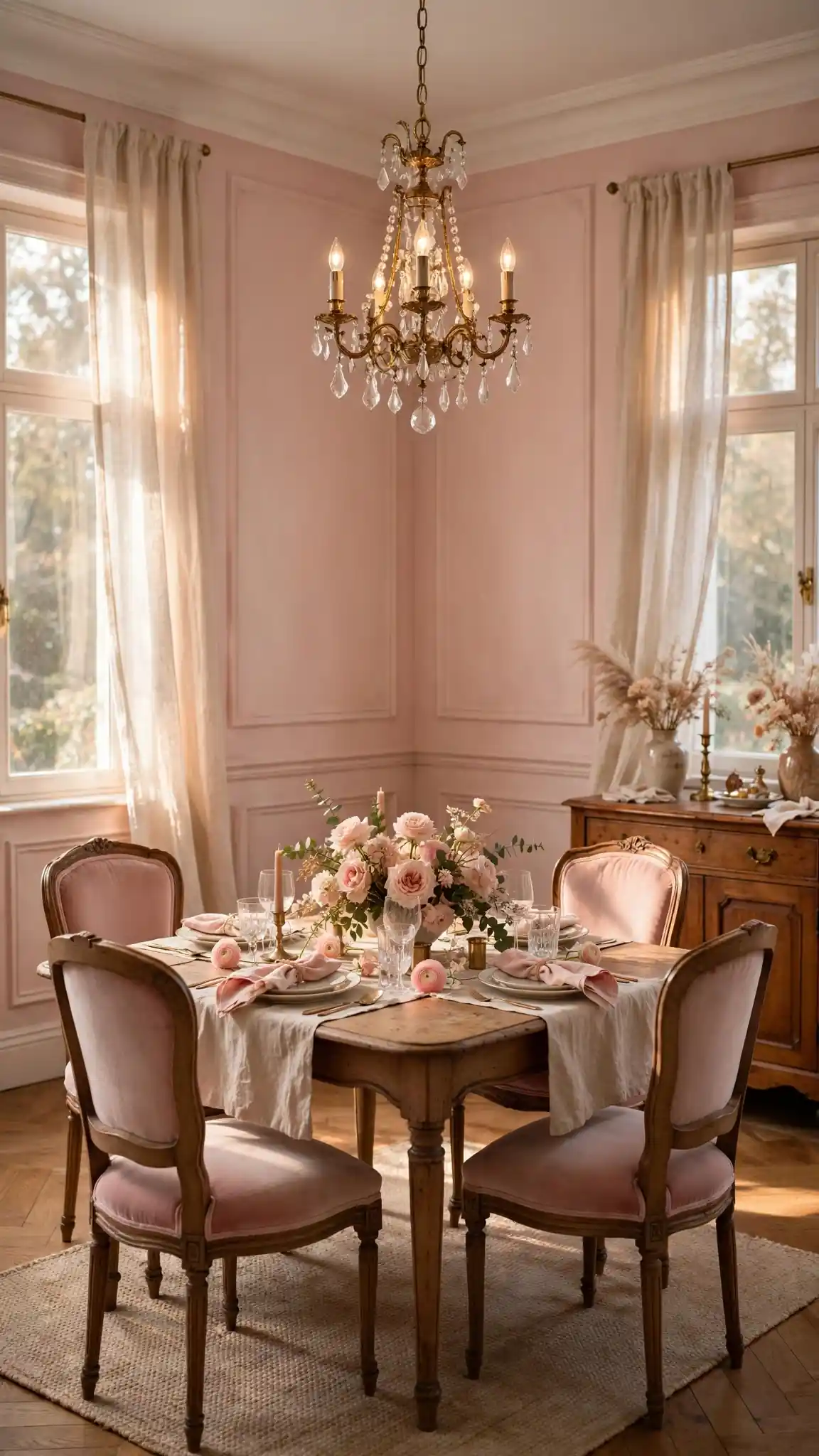
Benjamin Moore First Light (2102-70) is a delicate blush pink with warm peachy undertones that gives dining rooms soft, romantic warmth without feeling juvenile. It glows beautifully in candlelight and flatters both modern brass fixtures and vintage crystal chandeliers. Blush dining room paint colors pair wonderfully with cream, sage, charcoal, and natural wood, making them surprisingly versatile for grown-up spaces. Regal Select in First Light costs about $75 to $85 per gallon, and the soft pigment covers easily in two coats over white primer, even in rooms with bold previous colors.
Blush pink needs grounding to stay sophisticated, so anchor it with dark wood, black accents, or a bold patterned rug. It looks stunning with green plants, which pop against the pink. Choose eggshell sheen for a soft, powdery finish. If First Light feels too pink, try Pink Damask (OC-72), which reads more neutral beige with a rosy whisper. This shade is lovely in dining rooms used for leisurely weekend brunches. Keep the ceiling bright white to maintain airiness. Avoid pairing blush with cool grays, which can make it look muddy. Pro tip: blush walls make everyone look great in photos, a fun bonus for holiday hosting.
19. Chocolate Brown for Rich, Cozy Depth
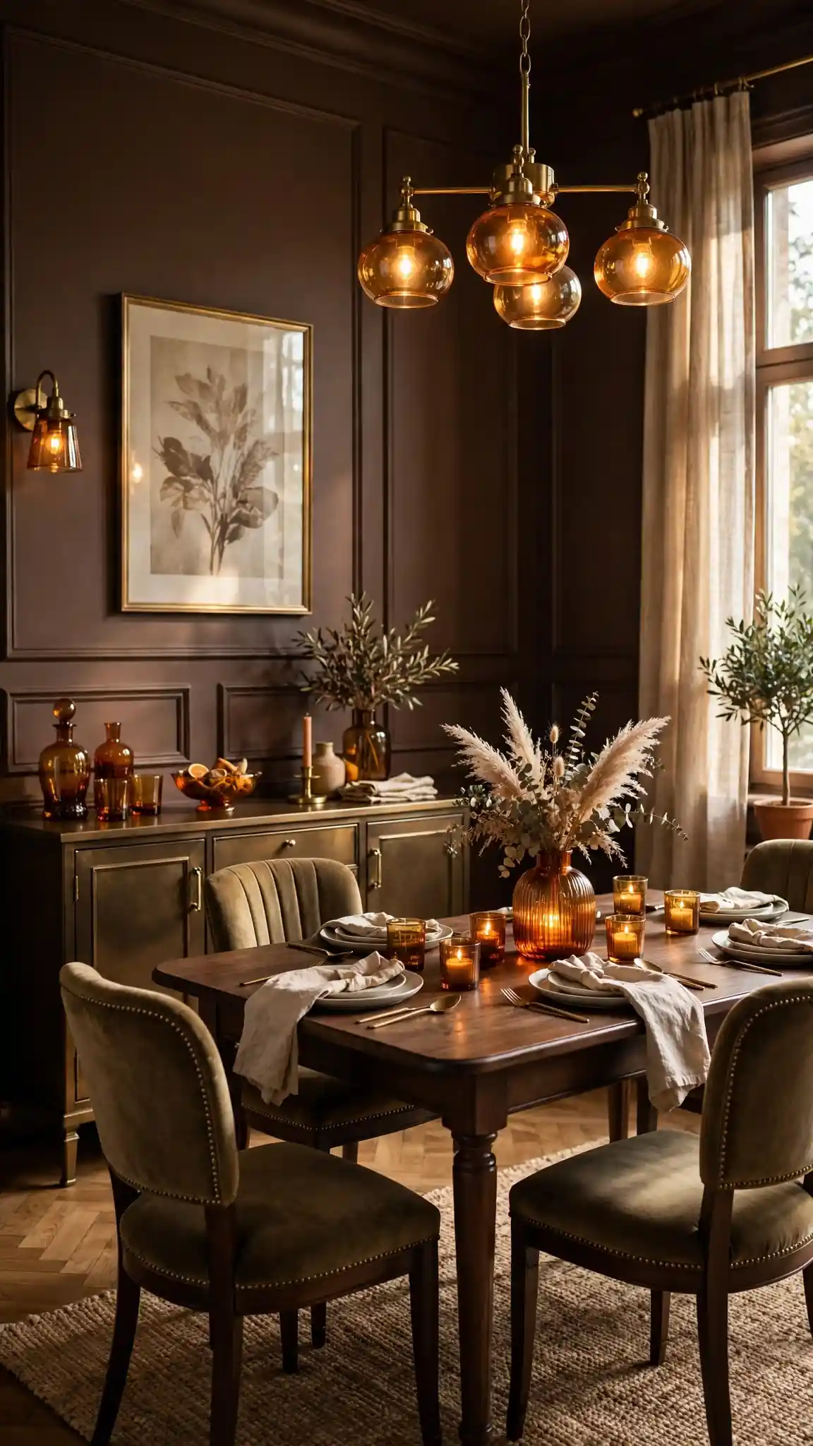
Benjamin Moore Branchport Brown (HC-72) is a rich chocolate brown that wraps dining rooms in cozy, library-like depth. It is a warm, enveloping neutral that makes brass, amber glass, and cream upholstery look incredibly luxurious. Brown dining room paint colors are wonderfully forgiving, hiding scuffs and wear while creating an intimate atmosphere perfect for long dinners. Aura interior in Branchport Brown costs about $85 to $95 per gallon, and its superior hide is worth it for deep browns that need fewer coats over primer, saving you real time on painting day.
Chocolate walls need plenty of warm light and contrast to stay inviting, so keep trim creamy white and add mirrors or metallic accents to reflect light. It pairs beautifully with cognac leather chairs, walnut tables, and Persian rugs in warm tones. Use eggshell sheen for wipeable richness. Because dark browns show roller marks, work in small sections and maintain a wet edge. If Branchport Brown feels too dark, try Alexandria Beige (HC-77) for similar warmth with more lightness. Always use tinted primer under dark browns. Pro tip: chocolate walls make a dining room feel like a private club, perfect for wine lovers.
20. Modern Slate Gray With Cool Confidence
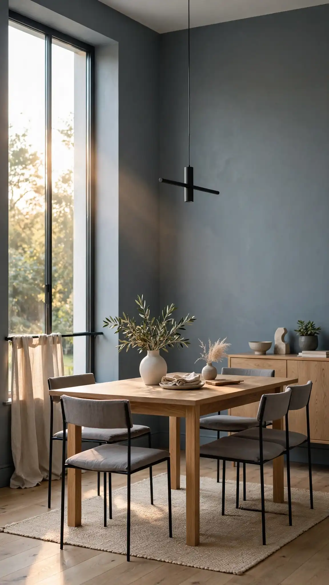
Sherwin-Williams Grays Harbor (SW 6236) is a mid-tone slate gray with cool blue undertones that gives dining rooms modern confidence. It is deep enough to feel intentional but light enough to work in rooms with average daylight, making white trim and stainless or chrome accents look sharp. Gray dining room paint colors in this slate family pair well with concrete, glass, and minimalist furniture for a contemporary look. SuperPaint in Grays Harbor costs about $60 to $70 per gallon at Sherwin-Williams stores, an excellent value for the coverage you get.
Slate gray can feel chilly, so warm it up with wood tones, textured fabrics, and warm-white lighting at 2700 to 3000 Kelvin. It makes colorful art pop dramatically, so it is ideal for art lovers. Satin sheen adds subtle dimension that keeps mid-tone grays from looking flat. If Grays Harbor reads too blue, try Mindful Gray (SW 7016), which is warmer and more neutral. This shade works well in open floor plans, bridging kitchen and living areas. Add a statement rug with warm tones to balance the cool walls. Pro tip: slate gray dining rooms look fantastic with black-framed windows and doors.
21. Luxurious Plum for Unexpected Elegance
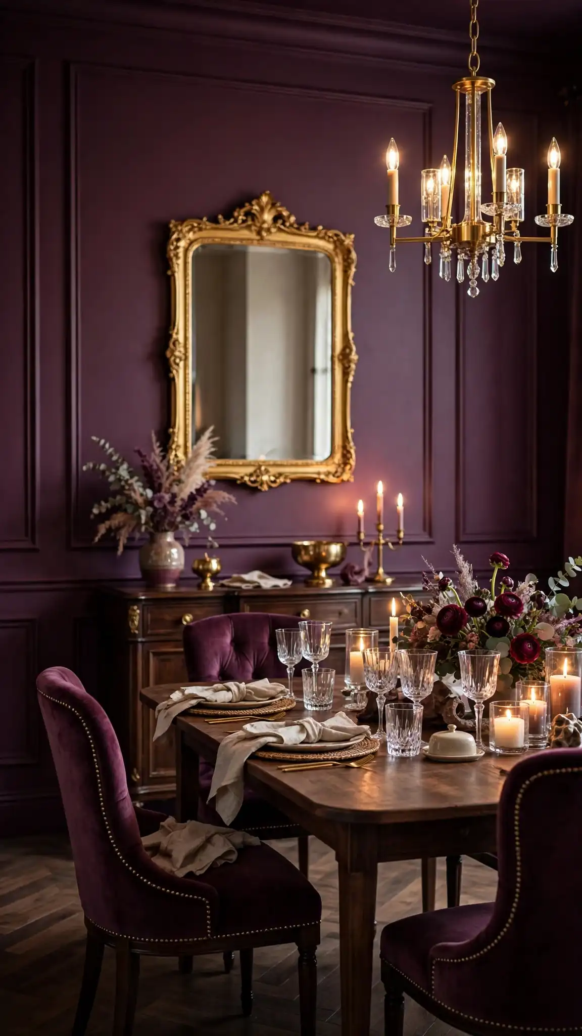
Benjamin Moore Brinjal (AF-435) is a deep, smoky plum that brings unexpected elegance to dining rooms, richer than gray but softer than black. It has a sophisticated, wine-like quality that makes gold mirrors, crystal, and cream upholstery look utterly luxurious. Purple-based dining room paint colors are rare enough to feel truly custom, giving your home a designer edge guests will remember. Aura interior in Brinjal costs about $85 to $95 per gallon, and its color-lock technology keeps the complex plum undertones true even in bright daylight, so the color never shifts unexpectedly.
Plum walls need warm lighting and confident styling, so pair them with brass, velvet, dark wood, and plenty of candlelight for maximum glamour. Keep the ceiling white and the trim creamy to prevent the room from feeling too enclosed. Eggshell sheen enhances plum’s velvety depth. Because deep colors need solid coverage, use a gray-tinted primer and plan for two to three coats. If Brinjal feels too bold, try Shadow (2117-30), a dustier purple-gray that is easier to live with. Sample it behind your dining table at night. Pro tip: plum walls make red wine and candlelight look incredible, a natural fit for dinner parties.
22. Color-Drenched Dining Room Paint Colors for a High-End Look
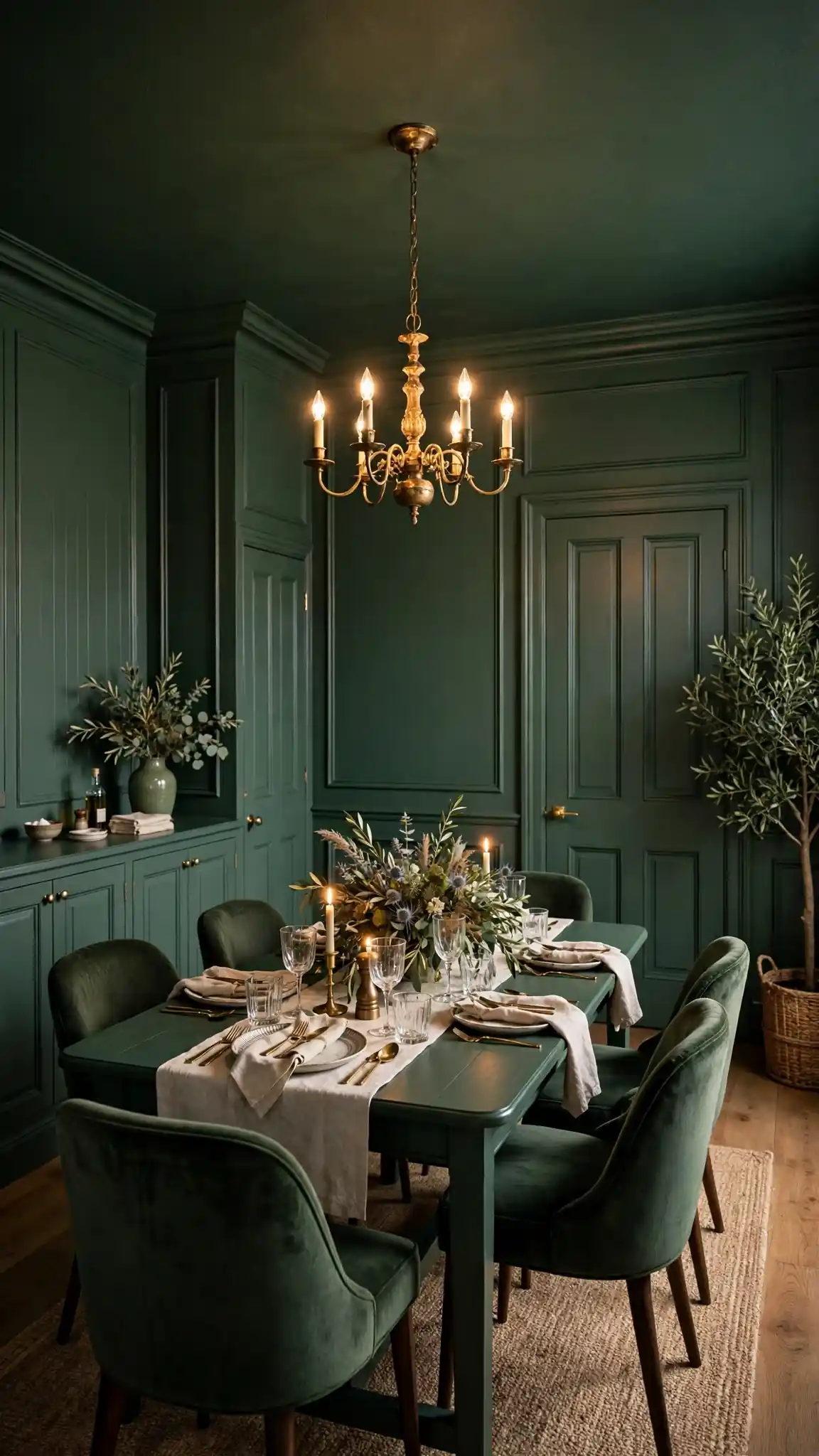
Color drenching, painting the walls, trim, ceiling, and even doors in one saturated shade, is the designer-favorite way to use bold dining room paint colors with total confidence. Wrapping a dining room in a single color like Sherwin-Williams Evergreen Fog (SW 9130) or Benjamin Moore Knoxville Gray (HC-160) erases visual boundaries, making the space feel larger, calmer, and remarkably high-end. This technique works with any of the dining room paint colors in this guide, from moody greens to warm taupes. Budget about 20 percent more paint than usual, since trim and doors drink up extra gallons, roughly $180 to $260 total for quality paint.
For the best color-drenched result, use the same color in different sheens: eggshell or matte on walls, satin on trim and doors, and flat on the ceiling for subtle dimension. Keep the flooring and rug lighter to ground the room, and let furniture and art provide contrast. This approach hides architectural flaws beautifully, since there are no trim lines to highlight crooked edges. If full drenching feels scary, start with walls plus trim and leave the ceiling white. Test your chosen color on a large board first. Pro tip: color drenching photographs like a magazine spread, so it is perfect if you love a cohesive, curated home.
Final Thoughts
The best dining room paint colors are the ones that make you want to linger at the table, and now you have 22 proven shades to choose from. Whether you fell for the cozy warmth of Accessible Beige, the moody drama of Hale Navy, or the enveloping richness of a color-drenched plum, remember that undertones and lighting matter more than trends. Always sample your top two or three dining room paint colors on large swatches, live with them through different times of day, and check them against your table, flooring, and trim before buying gallons. A $6 sample quart is the cheapest insurance against a $200 repaint regret.
Once you have chosen, invest in quality paint and the right sheen, since dining room walls take real abuse from chair backs, serving trays, and enthusiastic toddlers. Two gallons of a premium line like Benjamin Moore Regal Select or Sherwin-Williams Duration will cover most dining rooms beautifully, and a weekend is all it takes to transform the space. These dining room paint colors work with the furniture you already own, so there is no need for a full room makeover. Pick your shade, grab a roller, and get ready to host the best-looking dinners on the block.
FAQs
Choosing paint always raises questions, so we gathered the most common ones about dining room colors in one place. From sheen selection and primer choices to how much paint you actually need for a standard room, these quick answers will help you shop and paint with total confidence. Each answer draws on real painter recommendations and the color specs featured in this guide.
If your dining room has unusual light, an open floor plan, or bold existing furniture, the sampling advice in the sections above will help you fine-tune any of these picks. Remember that undertones shift with daylight and bulbs, so always test large swatches before buying gallons for the whole room. When in doubt, start with the versatile neutrals in sections one, five, and seven.
What is the most popular dining room paint color right now?
Warm greige shades like Sherwin-Williams Accessible Beige (SW 7036) top every popularity list, because they work with any furniture style and flatter both daylight and lamplight. These versatile dining room paint colors bridge traditional and modern decor effortlessly. Soft sage greens are the fastest-rising trend for 2026.
Should dining room walls be dark or light?
It depends on your room's size and natural light. Light colors like White Dove open up small or dark dining rooms, while deep shades like Hale Navy or Iron Ore add drama and intimacy to larger, well-lit spaces. When in doubt, sample both a light and a dark option on your walls and live with them for three days.
What paint finish is best for dining room walls?
Eggshell is the sweet spot for most dining rooms, offering a soft glow that hides imperfections while still wiping clean. Choose satin in high-traffic family dining areas for extra scrubbability, and reserve semi-gloss for trim and doors. Avoid flat finishes on dining walls, since they mark easily and are hard to touch up.
How much paint do I need for a standard dining room?
A typical 12 by 14 foot dining room needs about two gallons for two coats on the walls, assuming average 8-foot ceilings. Dark colors over light walls may need a third gallon or a tinted primer. Buy all your gallons at once and box them together so the color stays perfectly consistent across every wall.
Which dining room paint colors work best with dark wood furniture?
Warm neutrals like Accessible Beige, White Dove, and Toffee Crunch let dark wood furniture shine without competing. These classic dining room paint colors create beautiful contrast with walnut and cherry tones. For drama, deep greens like Retreat or navy like Hale Navy make dark wood look rich and intentional.
Are accent walls still in style for dining rooms?
Single accent walls are giving way to color drenching, where walls, trim, and ceiling share one saturated shade for a seamless, high-end look. If you love contrast, try two-tone wainscoting with a deep color below and warm white above instead. Both approaches feel fresher than the lone accent wall of the 2010s.


Leave a comment