

Cabinet color sets the tone for the entire kitchen. Pairing two colors, or a color with wood, adds depth and personality that a single shade cannot achieve. The right combination can make a kitchen feel classic, modern, cozy or bold.
These 21 kitchen cabinet color combinations are designer favorites that work in real homes. For more inspiration, see our two tone kitchen cabinets, our wood kitchen cabinets ideas and these dark kitchen cabinets ideas.
Combining cabinet colors:
- Pair one bold color with one neutral.
- Use darker colors on lower cabinets or the island.
- Repeat each color elsewhere in the room.
- Tie colors together with hardware and countertops.
1. Navy and White
Navy and white is the pairing designers reach for when you want timeless but never boring. A deep navy like Benjamin Moore Hale Navy or Sherwin-Williams Naval on the lower cabinets grounds the room, while crisp white uppers keep everything bright and airy. This combination works in kitchens as small as 80 square feet because the white reflects daylight upward and the navy adds depth. Add brushed brass pulls from Home Depot at roughly $4 to $8 each, and the whole space reads custom without a custom budget. From coastal colonials to modern farmhouses, navy and white adapts to almost any American home style.
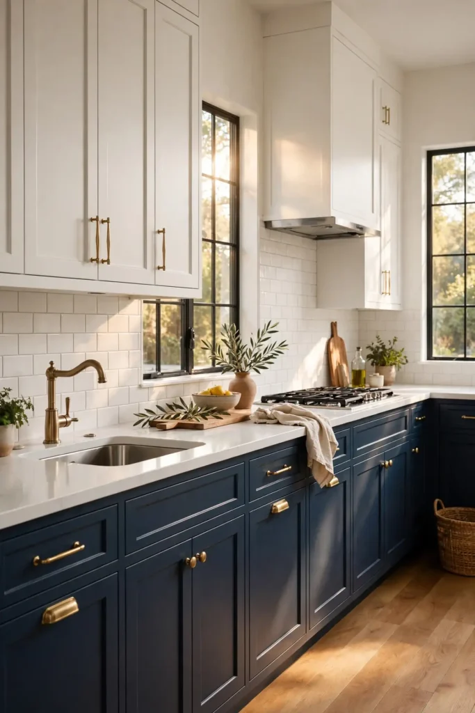
To try it yourself, paint only the island or the lower cabinets navy and keep the rest white. Order three or four sample quarts from Sherwin-Williams at about $8 each and brush each onto a two-foot square of poster board. Tape the boards to your cabinets and study them through a full day of changing light. Choose a satin or semi-gloss finish so fingerprints wipe off with a damp cloth. Pair the palette with honed white quartz counters, a classic subway tile backsplash, and warm under-cabinet lighting near 3000K so the navy stays rich instead of flat.
2. Sage and Cream
Sage and cream gives you a kitchen that feels calm, organic, and quietly current. Soft sage greens like Sherwin-Williams Evergreen Fog or Benjamin Moore Saybrook Sage bring nature indoors without shouting, while warm cream cabinets keep the room from feeling cold. Designers love this combo for open-concept homes because it bridges the kitchen and living areas without a harsh visual break. Matte black hardware adds a modern edge for about $3 to $6 per pull at Lowe’s, and butcher-block counters deepen the natural feel. The palette photographs beautifully and suits craftsman, cottage, and transitional homes alike.

Start by sampling two sage tones side by side on your existing cabinet doors before committing. Paint a hidden door or a primed board at least 24 inches wide so you can judge the undertone. Sage can lean gray, blue, or yellow depending on your light, so check it morning, noon, and night. Keep the cream on the perimeter cabinets and use sage on the island for a designer two-tone effect. A warm white backsplash, wood open shelves, and a single trailing plant on the counter complete the look for under $50 in accessories.
3. Black and White Oak
Black and white oak delivers drama without darkness when you get the balance right. Flat-black lowers or a black island, painted in Benjamin Moore Onyx or Sherwin-Williams Tricorn Black, contrast gorgeously with the honeyed grain of white oak uppers or open shelving. Designers specify this pairing for clients who want a high-contrast, gallery-like kitchen that still feels warm. The natural oak keeps the black from reading cold, while honed marble or quartz counters bridge the two. Unlacquered brass fixtures from Amazon, roughly $60 to $120 for a faucet, add a glow that ties everything together.
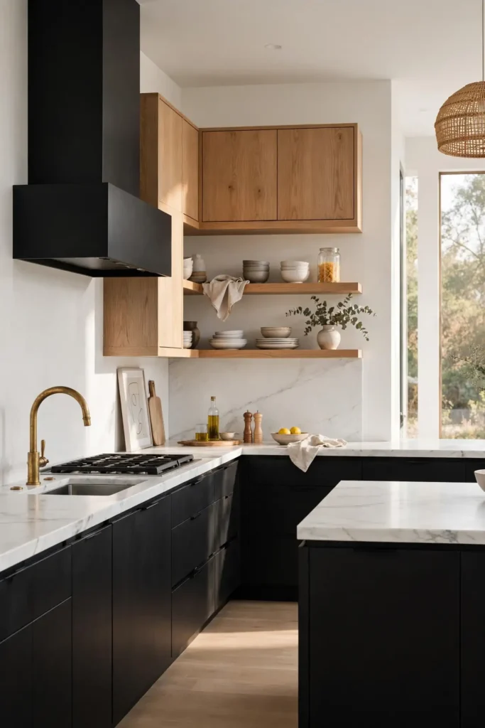
Plan the proportions carefully: keep black to about one-third of the cabinetry so the room stays balanced. White oak rift-sawn veneer doors cost more than painted maple, so price both options at a local cabinet shop before deciding. If you are painting existing cabinets, sand, prime with a bonding primer, and apply two coats of cabinet enamel in satin. Keep walls a warm white like Benjamin Moore White Dove so the black does not swallow the room. Add oak floating shelves beside the range hood to repeat the wood and soften the contrast.
4. Forest Green and Walnut
Forest green and walnut is the rich, library-like combination designers use when a kitchen should feel established and luxurious. Deep greens like Sherwin-Williams Pewter Green or Benjamin Moore Essex Green pair beautifully with the chocolate tones of real walnut cabinetry or a walnut island. The duo reads expensive because both materials have depth that flat paint alone cannot fake. Brass or aged-bronze hardware, about $5 to $10 per knob at Home Depot, picks up the warmth in the walnut grain. This palette shines in larger kitchens with plenty of natural light and suits traditional, transitional, and moody modern homes.

Use green on the painted cabinets and reserve walnut for the island, range hood surround, or floating shelves to control cost. Real walnut runs $12 to $18 per board foot at lumber yards, so veneer doors are a smart compromise. Sample the green against your actual walnut piece, since the wood’s undertone shifts how the paint reads in real light. Choose a low-sheen enamel so the green looks velvety rather than plastic. Finish with creamy quartz counters, a zellige-style backsplash, and 2700K to 3000K lighting that makes both materials glow warmly together.
5. Gray and White
Gray and white remains a designer staple because it works in nearly every American kitchen, from 1960s ranches to new construction. A mid-tone gray like Sherwin-Williams Repose Gray or Benjamin Moore Coventry Gray on lowers, paired with bright white uppers, creates a clean, layered look that never feels flat. Designers lean on this combo when a client wants resale-friendly: it appeals to buyers and photographs well for listings. Polished nickel pulls, about $3 to $7 at Lowe’s, keep the palette crisp. White quartz counters and a white subway backsplash complete the fresh, airy envelope.

Pick your gray carefully, because undertones decide the mood. Hold a sample board against your countertop and flooring; pink or blue casts appear instantly. Warm grays flatter oak floors, while cooler grays suit gray-veined stone. Keep the white a touch warm, like Benjamin Moore Simply White, to avoid a sterile lab feeling. Paint in satin for easy cleaning, and repeat the gray on a painted pantry door or banquette for cohesion. Two LED under-cabinet strips per run of uppers, around $25 each at Amazon, keep the white glowing beautifully all day.
6. Blue and Wood
Blue and wood is the combination that makes a kitchen feel both collected and current. Dusty and denim blues, such as Benjamin Moore Van Deusen Blue or Sherwin-Williams Bracing Blue, sing against the warmth of oak, maple, or pine. Designers use this pairing to add personality without wallpaper or bold art, since the color lives in the architecture itself. A white oak island with blue perimeter cabinets is the classic layout, but reversing it works in smaller kitchens. Matte black or aged-brass hardware both work, typically $4 to $9 per piece at Home Depot.

Start with one blue sample painted on a large board and live with it for three days. Blues shift dramatically between north and south light, so judge accordingly. If your wood is orange-toned, choose a blue with gray in it to calm the contrast. Keep counters light, like a warm white quartz at about $60 to $90 per square foot installed, so the blue stays the star. A handmade-look backsplash and a runner rug in natural fibers finish the collected feel. Seal painted cabinets with two enamel coats for a wipeable, kid-proof surface.
7. Terracotta and Cream
Terracotta and cream brings sunbaked warmth into the kitchen, a favorite of designers styling Spanish, Mediterranean, and boho homes. Clay tones like Sherwin-Williams Cavern Clay or Benjamin Moore Terracotta Tile feel earthy and handmade against creamy cabinets in shades like Benjamin Moore Natural Cream. The combination flatters Saltillo tile floors, plaster-look walls, and rustic wood beams. Oil-rubbed bronze hardware, about $4 to $8 per pull at Lowe’s, deepens the artisanal mood. Because terracotta is naturally saturated, it works best as an accent: an island, a range alcove, or a bank of tall pantry cabinets.
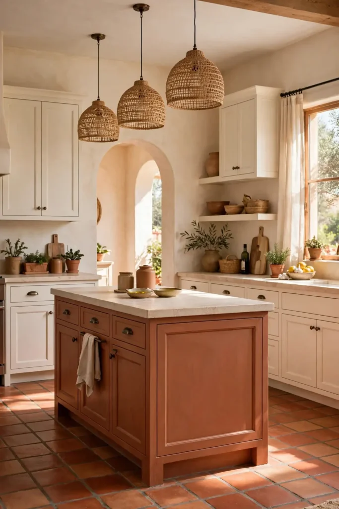
Test terracotta in your actual light before committing, since it can swing orange or pink. Paint a two-foot board and prop it against your backsplash for a full day. Pair it with unglazed ceramic knobs or aged bronze for a handcrafted feel, and keep counters light, such as a creamy limestone-look quartz. Designers warn against pairing terracotta with cool gray floors, which fight its warmth. Add woven pendant shades around $80 to $150 each at Target and a few terra-cotta pots with herbs to echo the color and keep the scheme feeling intentional.
8. Olive and Black
Olive and black is the moody, modern combination designers choose for clients who want edge without gloom. Earthy olives like Benjamin Moore Backwoods or Sherwin-Williams Oakmoss carry yellow-green depth that keeps black accents from feeling harsh. The classic move is olive perimeter cabinets with a black island, or olive lowers paired with black window frames and hardware. Matte black pulls at roughly $3 to $6 each from Amazon sharpen the look, while white oak counters or shelves add needed lightness. The palette suits industrial lofts, modern farmhouses, and anyone who loves a kitchen with attitude.
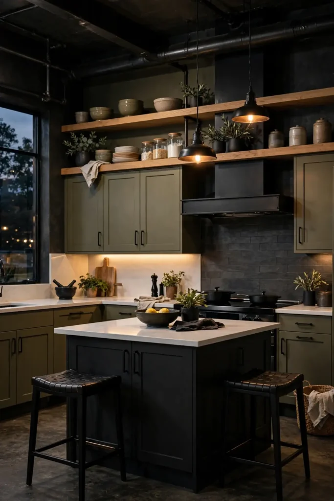
Use olive as the dominant color and black as the punctuation so the room stays inviting. Order sample quarts and paint full door fronts rather than small swatches, since olive reads differently at scale. Balance the darkness with warm white walls, generous 3000K under-cabinet lighting, and at least one light element, such as a white quartz counter or a pale runner. Designers caution that olive can look muddy in dim north-facing rooms, so add a dimmable pendant over the island. Keep the ceiling bright white to bounce light downward into the darker palette.
9. White and Walnut Island
A white kitchen with a walnut island is the two-tone formula designers call nearly foolproof. Crisp white perimeter cabinets in Benjamin Moore White Dove or Sherwin-Williams Alabaster keep the room bright, while a rich walnut island becomes the warm, furniture-like centerpiece. This layout gives you the resale safety of white with the custom feel of real wood exactly where guests gather. Waterfall walnut panels or a thick butcher-block top elevate it further, typically adding $1,500 to $3,000 to the island cost. Brass pendants above complete the layered, collected look designers photograph again and again.

Plan your island first, since it drives the budget. Real walnut cabinetry costs significantly more than painted maple, so get a line-item quote before finalizing. If solid walnut is too steep, walnut veneer doors deliver the same look for less. Keep the white cabinets in a satin enamel that wipes clean, and seal a walnut butcher-block top with food-safe mineral oil monthly. Pair the island with counter stools in a contrasting material, like black metal or woven cane at $80 to $200 each from Target. Repeat a touch of walnut on open shelves so the island feels connected, not random.
10. Greige and Taupe
Greige and taupe is the layered neutral combination designers use when white feels too stark and gray feels too cold. Greige, the blend of gray and beige seen in Sherwin-Williams Agreeable Gray, pairs with deeper taupe islands in Benjamin Moore Smokey Taupe for quiet dimension. The result reads warm, tailored, and expensive, especially with brushed-nickel hardware at about $4 to $8 per piece from Home Depot. Because both tones are neutrals, the combo welcomes any countertop: white quartz, honed marble, or warm butcher block. It is a favorite for open floor plans where the kitchen must blend with beige-toned living spaces.

Layer at least two distinct tones so the palette reads intentional rather than muddy. Sample both colors on large boards against your flooring, since beige undertones clash with pink-gray stone. Keep walls a clean warm white to separate the cabinet tones from each other. Designers often add texture here instead of color: a handmade-look backsplash, woven barstools, and linen cafe curtains. If you are repainting, a bonding primer plus two coats of acrylic enamel in satin gives a factory-smooth, scrubbable finish. Finish with 3000K lighting that flatters warm neutrals perfectly.
11. Pink and Green
Pink and green is the playful, botanical combination designers love for clients with personality. Think soft blush pinks like Benjamin Moore Pink Damask or Farrow & Ball-inspired tones from Behr, set against leafy greens such as Sherwin-Williams Retreat. The pairing echoes a garden, so it feels joyful rather than juvenile when the tones stay muted. Designers deploy it in breakfast nooks, pantry walls, or a statement island rather than across a whole kitchen. Unlacquered brass hardware, roughly $6 to $12 per knob at Amazon, adds vintage charm. White counters keep the colors from competing with each other.
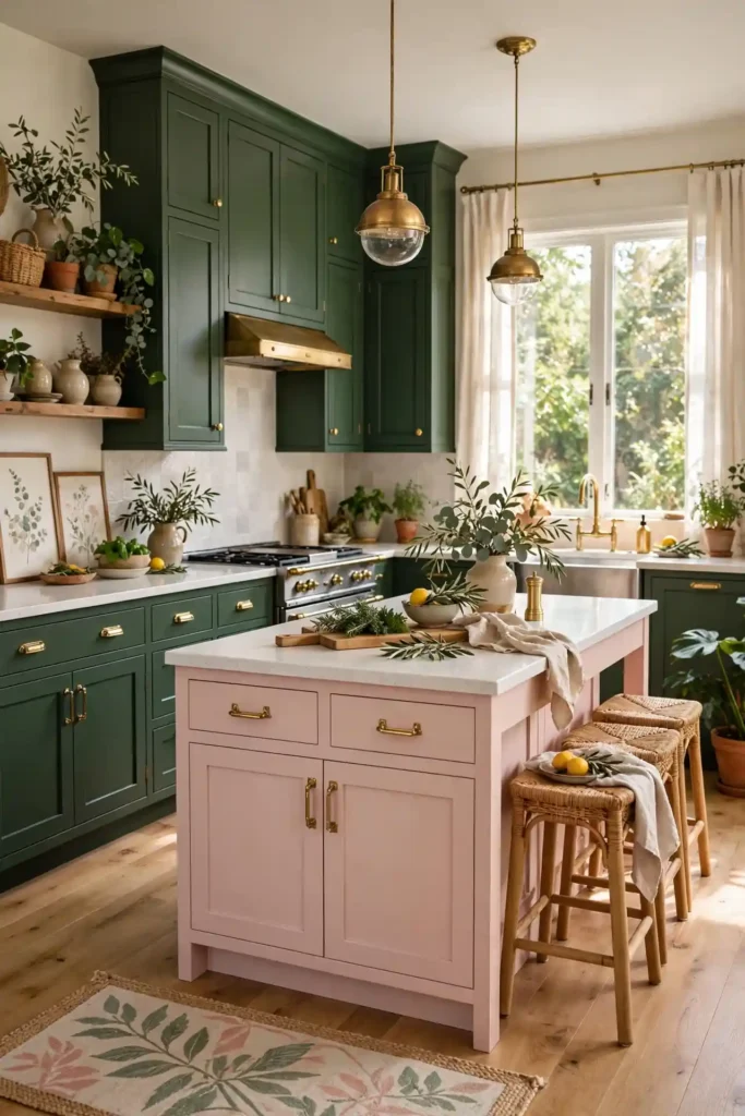
Commit to one hero color and let the other play support. A blush island with deep green perimeter cabinets, or green lowers with a pink plaster range hood, both work. Sample both tones together on one board, since pink shifts green’s reading and vice versa. Keep floors and walls neutral, a warm white or pale oak, so the duo has room to breathe. If pink feels risky, start with removable touches: blush barstools at about $100 each from Target or a pink runner. Designers note this combo photographs beautifully for social media, making it a darling of design-forward homes.
12. Burgundy and Cream
Burgundy and cream delivers old-world richness that designers reach for in traditional and European-style kitchens. Deep wine tones like Benjamin Moore Wines and Roses or Sherwin-Williams Fine Wine bring drama, while creamy cabinets in Benjamin Moore White Down soften the intensity. The combination flatters marble counters, ornate range hoods, and antique brass fixtures, and it glows under warm lighting. Aged-brass or bronze hardware at about $5 to $10 per piece from Lowe’s reinforces the classic mood. Because burgundy is saturated, designers usually limit it to an island, a hutch, or lower cabinets.
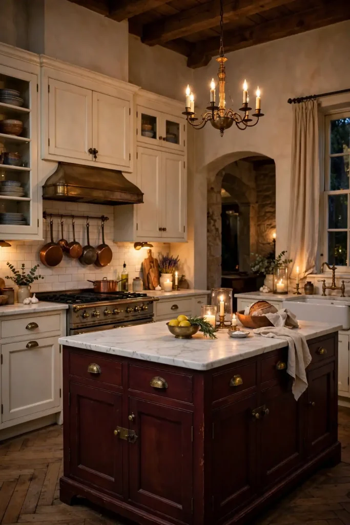
Balance the depth with plenty of cream and light-reflecting surfaces. Keep uppers, ceiling, and backsplash in warm whites so the burgundy reads as an accent, not a cave. Sample the wine tone on a large board next to your countertop, since it can clash with cool gray veining. Choose a satin enamel finish that shows the color’s depth without glare. Designers often pair this palette with a patterned cement-look floor tile to add old-world character at $4 to $9 per square foot. Two warm pendant lights over the island, near 2700K, make the burgundy feel candlelit and inviting.
13. Light Gray and Navy
Light gray and navy is the tailored, menswear-inspired combination designers specify for crisp, polished kitchens. Pale grays like Benjamin Moore Gray Owl or Sherwin-Williams Big Chill on the perimeter keep things airy, while navy lowers or an island in Sherwin-Williams Naval add tailored contrast. The pairing suits shaker cabinetry beautifully, since the simple door profile lets the color blocking do the talking. Polished nickel hardware at roughly $4 to $8 per pull from Home Depot sharpens the preppy feel. White quartz counters and a light grout backsplash keep the palette fresh rather than heavy.
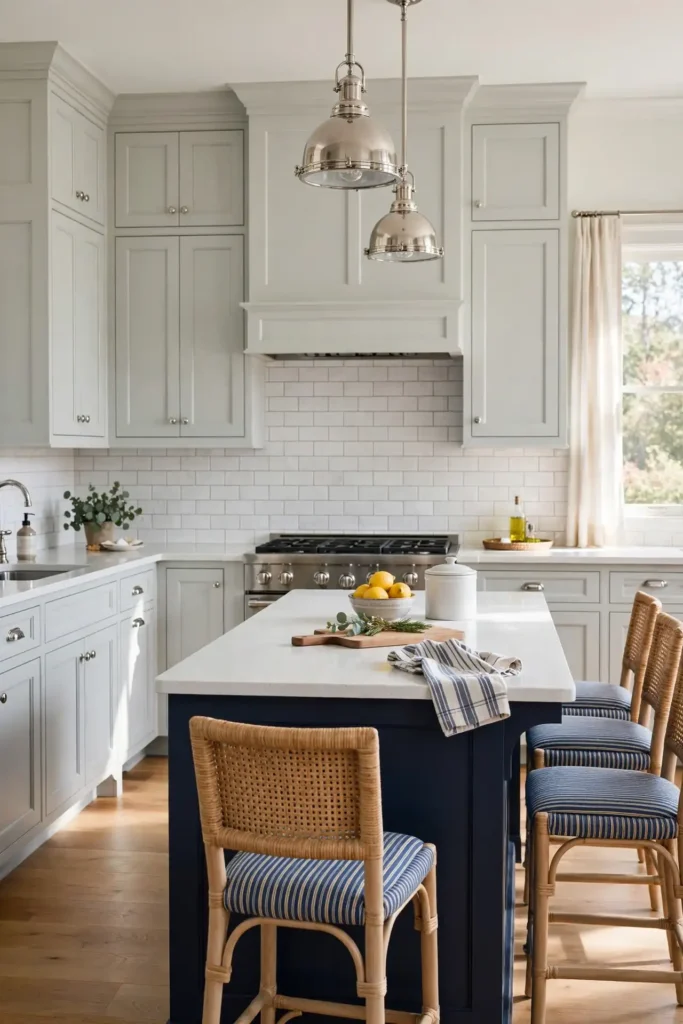
Decide which color leads before you buy paint. In smaller kitchens, let light gray dominate with navy on just the island; in larger spaces, navy lowers with gray uppers feels balanced. Sample both tones together, because the gray’s undertone shifts how the navy reads. A gray with blue undertones harmonizes, while a warm greige creates lively tension. Designers recommend satin finishes throughout for a soft, low-glare sheen. Add a navy runner or navy barstools, about $90 to $150 each at Target, to echo the dark tone. Keep lighting near 3000K so both colors look true.
14. Mustard and White
Mustard and white is the cheerful, retro-leaning combination designers use to inject energy without going neon. Golden mustards like Sherwin-Williams Curry or Benjamin Moore Dijon add vintage warmth, while bright white cabinets keep the look clean and current. Designers often deploy mustard on a single island or a run of lower cabinets in eclectic, mid-century, and Scandinavian-inspired kitchens. Black or matte-brass hardware, about $3 to $7 per piece at Lowe’s, grounds the sunny tone. White oak floors and white quartz counters let the mustard be the star without visual competition.
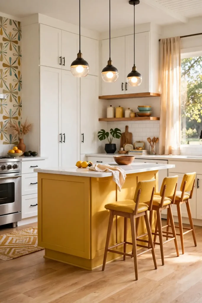
Use mustard as a controlled pop, roughly twenty percent of the cabinetry, so it energizes rather than overwhelms. Sample it on a large board in your actual light, since mustard swings from golden to ochre quickly. Pair it with warm white walls rather than cool ones, which can make mustard look muddy. Designers suggest a satin enamel finish for wipeability in busy family kitchens. Echo the tone in small doses: a mustard runner, amber glass pendants around $70 each at Target, or ochre ceramics on open shelves. Keep the ceiling bright white to lift the whole composition.
15. Teal and Wood
Teal and wood is the vibrant yet grounded combination designers love for coastal and eclectic kitchens. Jewel-toned teals like Benjamin Moore Aegean Teal or Sherwin-Williams Oceanside bring watery depth, while warm wood tones in oak, maple, or walnut keep the palette earthy. Designers often pair teal lower cabinets with a natural wood island, or teal uppers against walnut floating shelves. Brushed-gold hardware at about $5 to $10 per pull from Amazon bridges the cool teal and warm wood beautifully. White counters and a simple backsplash keep the duo from feeling busy.

Sample teal in both daylight and evening light, since jewel tones deepen dramatically after dark. A teal with gray undertones reads sophisticated; one with green undertones reads tropical, so choose based on your home’s mood. Keep teal to one cabinet zone and let wood carry the rest for balance. Designers recommend sealing wood elements with a matte polyurethane so they stay honeyed, not orange. If you are repainting, two coats of satin enamel over bonding primer give a durable finish. Add woven textures and a few plants to complete the coastal-eclectic story without themed decor.
16. Black and White
Black and white is the high-contrast classic designers return to because it simply never dates. Crisp white uppers in Benjamin Moore Chantilly Lace paired with matte-black lowers in Sherwin-Williams Tricorn Black create a graphic, tailored kitchen that suits modern, farmhouse, and transitional homes alike. Designers love how forgiving the palette is: it hides nothing, so clean lines and good lighting carry the design. Stainless appliances blend seamlessly, and either brass or black hardware works, typically $4 to $9 per piece at Home Depot. A white marble-look quartz counter unifies the two extremes.
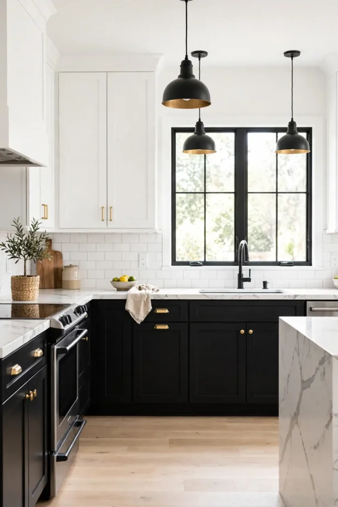
Manage the contrast so the black feels intentional, not heavy. In kitchens under 120 square feet, keep black to the island or lower cabinets on one wall only. Repeat black in at least three places, such as the faucet, pendant shades, and barstools, so it reads as a scheme. Designers insist on layered lighting here: 3000K under-cabinet strips plus pendants prevent the black from flattening. Use satin or semi-gloss enamel on the black for easy wipe-downs. A light floor, pale oak or white tile, keeps the composition balanced and bright.
17. Mushroom and Oak
Mushroom and oak is the soft, earthy neutral combination designers specify when beige feels dated. Mushroom tones like Benjamin Moore Thunder or Sherwin-Williams Loggia sit between taupe and gray, pairing gorgeously with the golden grain of white oak. Designers use this duo for serene, organic kitchens that feel warm without any yellow cast. Champagne-bronze hardware at roughly $5 to $9 per pull from Lowe’s complements both materials. The palette flatters limestone-look counters, handmade tile backsplashes, and linen textiles. It is especially popular in new builds where buyers want warmth without committing to strong color.
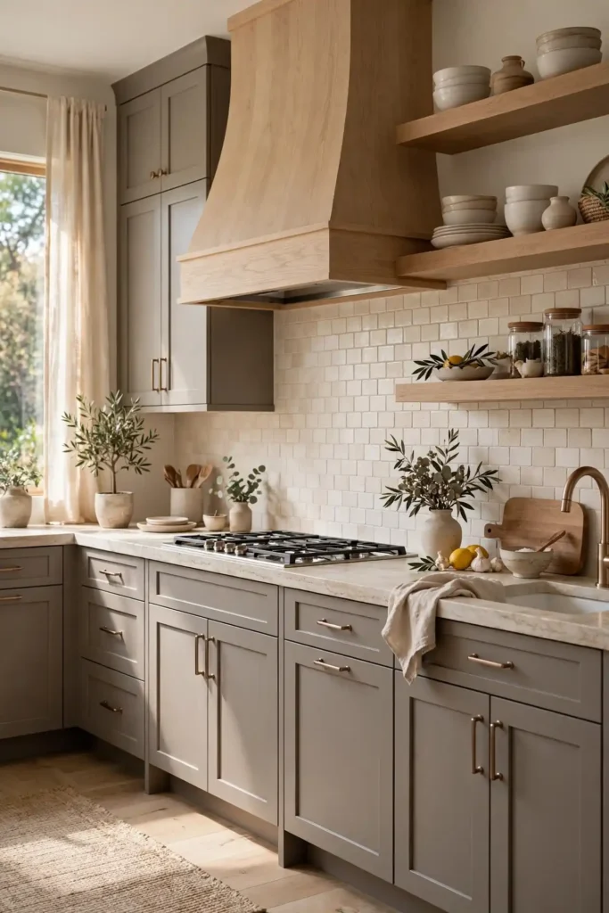
Get the mushroom tone right by sampling against your oak, since undertones make or break the pairing. A mushroom with pink undertones can clash with orange oak, so look for balanced, greige-leaning tones. Keep walls a soft warm white to let the cabinet colors stand out. Designers often repeat the oak on range hoods or open shelving so the wood feels woven through the design. If repainting, use a high-quality acrylic enamel in satin for a smooth, durable coat. Finish with 3000K lighting and natural-fiber stools, about $100 to $180 each at Target, to deepen the organic mood.
18. Plum and Gray
Plum and gray is the unexpected, sophisticated combination designers use when a client wants color with restraint. Dusty plums like Benjamin Moore Vintage Wine or Sherwin-Williams Candidly Cranberry bring quiet drama, while warm grays keep the palette grounded and livable. Designers typically assign plum to the island or a single run of tall cabinets, letting gray carry the perimeter. Brushed-nickel or champagne hardware at about $4 to $8 per piece from Home Depot keeps the mood refined. White quartz counters and pale walls prevent the plum from overwhelming the room.
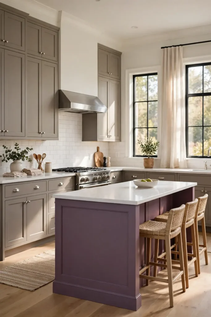
Treat plum as the accent and gray as the workhorse. Sample the plum on a full door front, since deep tones intensify at scale. A plum with brown undertones reads cozy and traditional; one with purple undertones reads bolder and more modern. Designers caution against pairing plum with cool blue-grays, which can look muddy together; warm grays are safer. Use satin enamel for a soft sheen that shows the color’s depth. Echo the plum in small touches, like velvet barstools around $120 each at Target or a plum runner, so the island feels connected to the room.
19. Sky Blue and Cream
Sky blue and cream is the breezy, nostalgic combination designers reach for in cottage, coastal, and vintage-inspired kitchens. Soft sky blues like Benjamin Moore Breath of Fresh Air or Sherwin-Williams Upward feel light and happy against creamy cabinets in Benjamin Moore White Dove. Designers love this duo for smaller kitchens because both tones reflect light and make tight spaces feel larger. Polished nickel or chrome hardware at about $3 to $6 per pull from Lowe’s enhances the fresh, airy mood. Butcher-block or white quartz counters and a beadboard backsplash complete the charming, collected look.
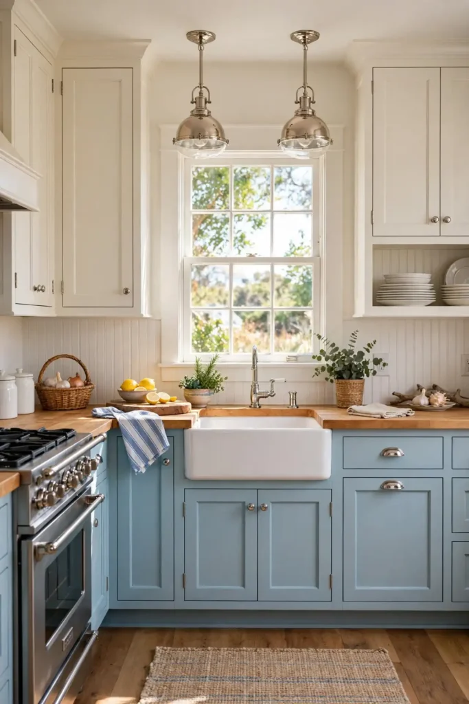
Keep the blue soft and the cream warm so the palette stays sophisticated, not nursery-like. Sample both colors together on large boards in your actual daylight, since sky blue can turn icy under cool LEDs. Designers often put sky blue on lowers and cream on uppers, or use blue for a statement pantry and cream elsewhere. Choose a satin enamel finish that wipes clean easily. Add vintage touches: a farmhouse sink, schoolhouse pendants around $60 to $100 each at Target, and open shelves with white dishware. The result feels timeless, sunny, and effortlessly welcoming.
20. Green and Brass
Green and brass is the jewel-box combination designers specify when a kitchen should feel rich and polished. Emerald and bottle greens like Sherwin-Williams Greenblack or Benjamin Moore Salamander pair with unlacquered brass hardware and faucets for a look that glows. Designers love how brass, about $6 to $14 per knob at Amazon, picks up the warmth hidden in deep green paint. White marble or marble-look quartz counters keep the palette luxurious, while dark floors ground it. The combination suits traditional, art-deco, and moody transitional kitchens, especially in homes with generous natural light.
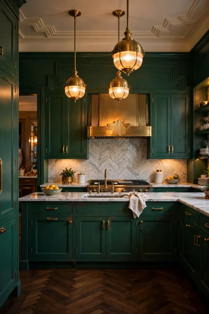
Commit fully to the green, since timid doses look accidental. Paint the full perimeter or at least all lowers in the deep tone, and let brass repeat in at least three places: hardware, faucet, and pendants. Sample the green on a large board next to your countertop, because green shifts dramatically against white versus gray stone. Designers recommend a satin finish that shows depth without shine. If unlacquered brass patina worries you, choose lacquered brass for a consistent glow. Add warm 2700K to 3000K lighting so the green stays lush after dark instead of turning black.
21. Balance With Countertops
Balancing cabinet colors with countertops is the step designers say makes or breaks a two-tone kitchen. The rule is simple: let one element lead and the other support. Bold cabinets call for quiet counters, so pair navy, forest green, or black cabinetry with white or lightly veined quartz at about $60 to $90 per square foot installed. Neutral cabinets can handle busier stone, such as a dramatic marble with strong veining. Designers always sample the countertop slab next to the actual cabinet color, never from memory, because undertones reveal themselves only side by side.
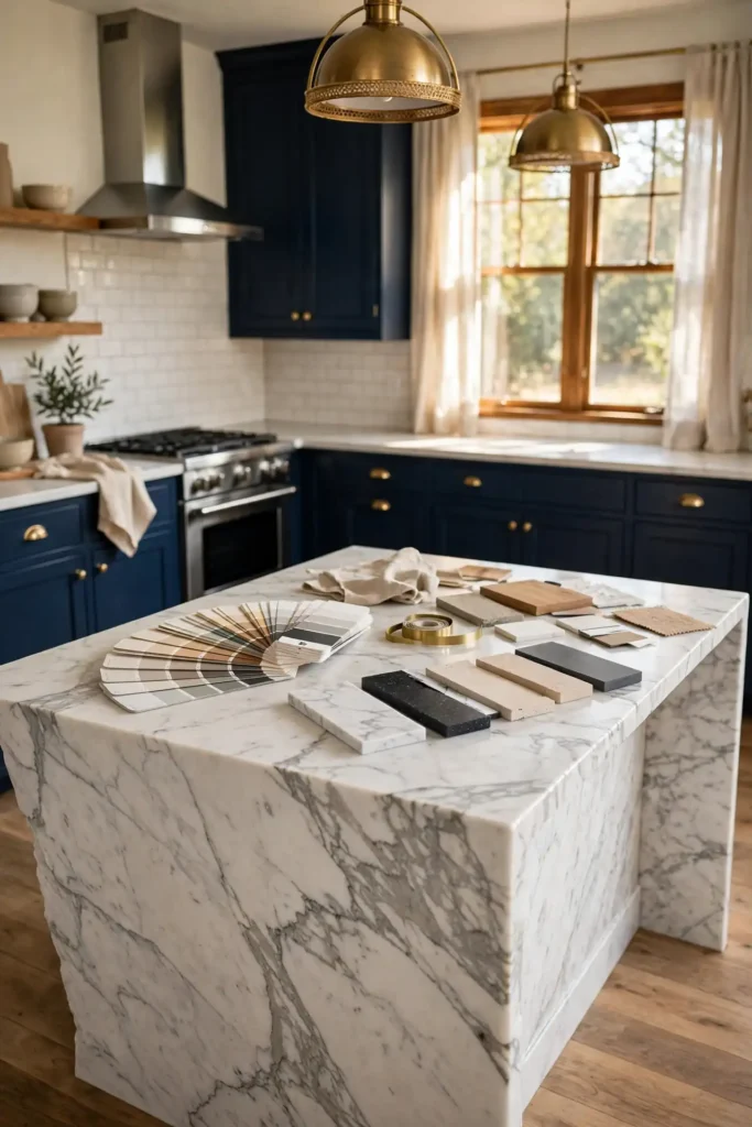
Bring home full-size samples before you commit. Most stone yards lend twelve-inch squares, and paint stores sell sample quarts for around $8. Lay the stone sample flat, stand the painted board upright like a cabinet door, and view the pairing in morning and evening light. Designers warn against matching undertones blindly: warm cabinets with cool gray stone is the most common clash. If you already have counters, choose cabinet colors that echo a vein or fleck in the stone. A honed finish softens bold pairings, while polished stone adds formality to quiet palettes.
How to Choose Kitchen Cabinet Color Combinations
Choosing kitchen cabinet color combinations gets easier when you follow the order designers use. First, lock in your fixed elements: flooring, countertops, and appliances, since those are expensive to change. Next, study your light: north-facing rooms need warmer colors, while south-facing rooms handle cooler tones. Designers then pick a dominant color for about sixty percent of the cabinetry, a secondary tone for thirty percent, and an accent for the final ten percent. This sixty-thirty-ten formula keeps two-tone kitchens balanced. Finally, sample everything together before buying a single gallon of paint.
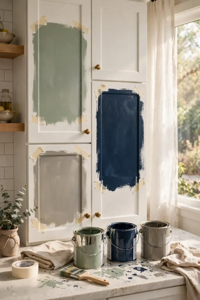
Make the decision process concrete and low-risk. Order sample quarts at about $8 each from Sherwin-Williams or Benjamin Moore and paint two-foot boards, not tiny swatches. Tape them to your actual cabinets for three full days, checking morning, noon, and night. Photograph the boards with your phone, since cameras reveal clashes your eyes miss. Designers also advise living with the palette digitally: upload a photo of your kitchen to a free visualizer from Home Depot or Lowe’s. If you hesitate between two tones, the lighter one is usually the safer whole-kitchen choice.
Test samples on large boards and view them in your kitchen at different times of day. Colors on small chips often look very different on large cabinet doors.
Where to Place Each Color
Where you place each color matters as much as the colors themselves, and designers follow a few reliable patterns. The most popular layout puts the darker or bolder color on lower cabinets and the lighter tone on uppers, which keeps the room feeling open. Islands are the natural home for accent colors: a navy, green, or walnut island anchors the room while white perimeters stay bright. Tall pantry walls in a deep tone create a furniture-like moment, especially in open floor plans. Designers caution against splitting colors randomly across walls, which looks accidental rather than designed.

Map your layout before ordering paint or doors. Sketch your kitchen and shade each cabinet run with its planned color, or mark painter’s tape on the actual cabinets. Keep the bold color to roughly one-third of the total cabinetry so it reads as an accent. Repeat each color at least twice, such as a navy island plus navy barstools, so the scheme feels intentional. Designers also consider sightlines: the color visible from the living room should be the calmer one. If your kitchen is under 100 square feet, confine the dark tone to the island alone for the safest result.
Hardware and Finishes
Hardware and finishes are the jewelry of your cabinet color combination, and designers choose them to either bridge or sharpen the palette. Warm metals like brass and champagne bronze flatter greens, blues, and warm woods; cooler metals like polished nickel and matte black suit grays, whites, and modern schemes. Bar pulls read contemporary, knobs read traditional, and mixing both is fine when the finish matches. Expect to pay $3 to $12 per piece at Home Depot or Lowe’s, with a typical kitchen needing forty to sixty pieces. Finish matters too: satin enamel hides fingerprints better than high gloss.
Coordinate finishes across the whole kitchen, not just the cabinets. Designers match the faucet finish to the hardware for cohesion, or deliberately contrast, such as black hardware with a brass faucet, for a collected look. Choose cabinet paint in satin or semi-gloss acrylic enamel, which scrubs clean and resists moisture. Order one sample pull in each finalist finish and hold it against your painted board before buying in bulk. Count every door, drawer, and pull-out twice, then add ten percent extra for mistakes. Install hardware after paint fully cures, about two to three weeks, to avoid dents.
When it comes to kitchen cabinet color combinations, the best results come from balancing style, comfort and everyday function.
How to Plan Kitchen Cabinet Color Combinations Step by Step
Planning your kitchen cabinet color combinations step by step removes the guesswork designers never skip. Step one: photograph your kitchen in daylight and note fixed elements like flooring and counters. Step two: collect inspiration and identify the exact paint colors, writing down brand and color code. Step three: order sample quarts, about $8 each, and paint two-foot boards of each candidate. Step four: tape boards to cabinets and observe for three days in changing light. Step five: choose hardware finishes by holding samples against your boards. Step six: buy paint only after every pairing is approved.
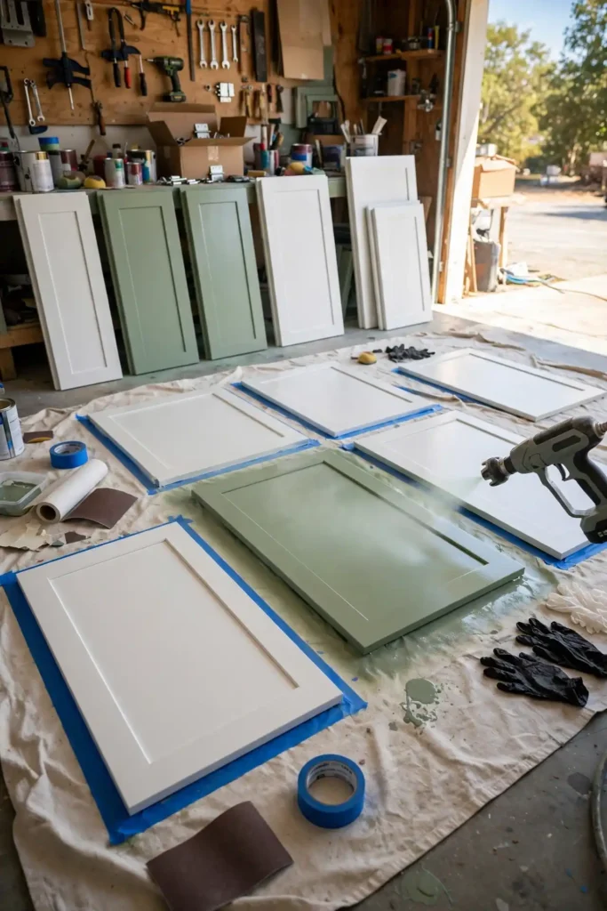
Execute the plan in the right sequence to save money and stress. Finalize colors before ordering custom doors, since painted finishes add two to four weeks to lead times. If you are repainting existing cabinets, budget a full weekend: one day for degreasing, sanding, and priming, and one for two enamel coats. Rent a paint sprayer for about $75 per day from Home Depot for a factory-smooth result. Designers keep a labeled jar of each touch-up color for future chips. Photograph your final boards and keep the paint codes in your phone so future repairs match perfectly.
- Note floor and countertop undertones.
- Choose a main neutral and an accent color.
- Decide where each color goes.
- Test samples on large boards.
- Select hardware to tie colors together.
Final Thoughts on Kitchen Cabinet Color Combinations
The kitchen cabinet color combinations designers love most share one trait: confidence with restraint. Whether you choose navy and white, forest green and walnut, or a soft mushroom and oak, the winning kitchens commit to a clear palette and repeat it thoughtfully. You do not need the boldest colors to get a designer look; you need the right colors for your light, your fixed finishes, and your life. Sample generously, trust the sixty-thirty-ten balance, and let hardware and lighting do the quiet supporting work. A well-planned palette will look current for a decade, not a season.
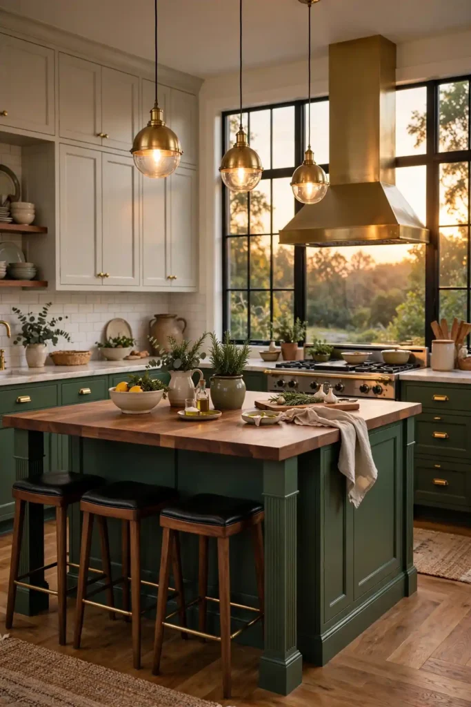
Start small if a full repaint feels daunting. Paint the island first and live with it for a month before touching the perimeter. Designers say the island is the lowest-risk place to experiment, since it is one contained piece you can repaint easily. Keep your sample boards and paint codes, invest in quality enamel, and give the paint three weeks to cure before judging the final color. When every choice is deliberate, from the cabinet color to the knob finish, your kitchen stops looking assembled and starts looking designed. That is the real designer secret.
Save these ideas and follow along for more kitchen inspiration.
Frequently Asked Questions About Kitchen Cabinet Color Combinations
Choosing kitchen cabinet color combinations raises the same questions in nearly every home, so here are the concise answers designers give most often. Two-tone kitchens remain firmly in style, with the island or lower cabinets carrying the bolder color while perimeters stay light. The safest resale palette is still white or warm greige with a single accent, while navy, forest green, and black read current without dating quickly. Always sample paint on large boards in your own light before committing, and match cabinet undertones to your countertop and flooring to avoid clashes.
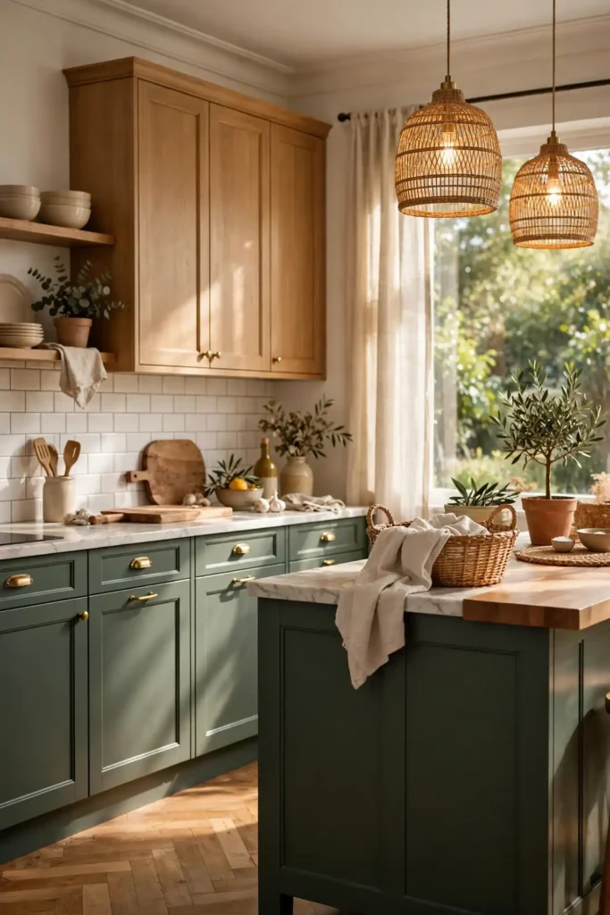
For lasting results, use a bonding primer plus two coats of acrylic cabinet enamel in satin or semi-gloss, and allow two to three weeks of cure time before heavy use. Budget roughly $8 per sample quart, $3 to $12 per hardware piece, and $60 to $90 per square foot for quartz counters if you are replacing them. Repeat each color at least twice in the room, keep bold tones to about one-third of the cabinetry, and coordinate your faucet finish with your hardware. Follow these guidelines and your two-tone kitchen will look intentional, balanced, and professionally designed.
What are the best kitchen cabinet color combinations?
Navy and white, sage and cream, black and oak and green and walnut are popular.
Should upper cabinets be lighter than lowers?
Usually yes, to keep the kitchen bright and grounded.
Can I use three colors on kitchen cabinets?
It is possible but harder; two colors plus wood is usually best.
What hardware works with two-color cabinets?
Brass, matte black or nickel in one consistent finish.
How do I test cabinet colors?
Paint large sample boards and view them in your kitchen light.


Leave a comment