


A gallery wall is one of the most personal ways to decorate. It lets you display art, photos and keepsakes together, turning a blank wall into a story. But getting the arrangement right can be tricky. The secret is choosing a clear gallery wall layout before you pick up a hammer.
These 23 gallery wall layout ideas include simple templates and spacing rules for every room. For related inspiration, see our living room wall decor ideas and these bedroom wall decor above bed ideas.
Basic gallery wall rules:
- Keep 2 to 3 inches between frames.
- Center the grouping at about 57 to 60 inches from the floor.
- Treat the whole gallery as one piece when sizing to furniture.
- Trace frames on paper and tape templates to the wall first.
1. Symmetrical Grid
A symmetrical grid is the most foolproof gallery wall layout: rows of identical frames aligned into a perfect rectangle, like a window of art. It works because visual order feels calming — matching black or natural-wood frames with two to three inches of spacing turn scattered photos into one clean graphic statement. Measure your wall first, then plan six, nine, or twelve frames and outline the outer edges with painter’s tape before you hang anything. IKEA’s RIBBA frames cost just a few dollars each, so a full grid can stay under fifty dollars, while Target’s Studio McGee line suits larger statement walls.
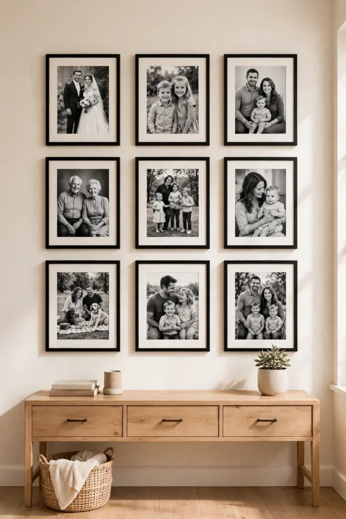
Center the whole arrangement at 57 inches — standard gallery eye level — measuring to the midpoint of the grid, not the center of one frame. Make paper templates for each frame, tape them to the wall, and live with the layout for a day before committing; this saves extra nail holes. Keep two to three inches between frames for a tight, gallery-like feel, or four inches for a breezier look on large walls. This layout shines with black-and-white family photos, matching travel prints, or botanical illustrations from Etsy. Ground a floating grid with a console table, lamp, or potted olive tree underneath.
2. Salon Style
Salon style is the classic, art-packed gallery wall layout idea — frames clustered edge to edge from floor to ceiling, inspired by the crowded walls of nineteenth-century Paris salons. It works because density creates drama: a mix of large and small frames, paintings, photos, and even mirrors becomes a single rich tapestry that pulls the eye across the room. Start with your biggest piece slightly off-center, then build outward and fill gaps with smaller frames until the cluster feels full. This is the layout for collectors — thrift-store finds, vacation souvenirs, and kids’ framed art all belong here.
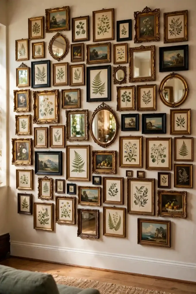
Keep the bottom edge about six inches above your sofa or floor trim and let the top climb as high as your ceiling allows. Spacing can be tight — one to three inches — since the clustered energy is the whole point. Mix frame finishes freely: gilt, black, natural wood, and even a painted vintage frame look intentional when everything hangs close together. A common salon trick is anchoring the display around one hero piece, like a large landscape or statement mirror, then layering smaller pieces around it. Step back every few frames to check the overall shape stays roughly rectangular or oval.
3. Horizontal Line
A horizontal line layout arranges frames in one long row, either aligned along a center line or hung at the same top edge — the perfect gallery wall layout idea for narrow or awkward walls. It works because the eye travels sideways, which makes hallways, stair walls, and the space above a low console feel wider and more intentional. Line up three to seven frames with two to four inches of space between them, keeping the row’s center at 57 inches for comfortable viewing. This layout looks sharp with a travel photo series, a set of botanical prints, or architectural photography.

For the cleanest result, use matching frames and mats so the row reads as one continuous piece — IKEA RIBBA frames or Target’s black gallery frames keep costs under ten dollars per frame. If you prefer mixed frames, anchor the row with the largest piece in the middle and step sizes down symmetrically toward both ends. A laser level is worth its weight here: even a half-inch tilt is obvious when frames sit in a row. Extend the row nearly wall to wall on small walls for maximum impact, but leave at least twelve inches of breathing room at each end on wide walls.
4. Staircase Gallery
A staircase gallery follows the diagonal slope of your stairs, turning a dead wall into a mini museum — one of the most charming gallery wall layout ideas for multi-level homes. It works because the angled arrangement mirrors the architecture, leading the eye upward and making the climb feel shorter and more interesting. Measure the slope by hanging your lowest frame about 57 inches above the nearest stair tread, then step each frame up roughly one tread rise (about seven to eight inches) as you go. Tape paper templates along the diagonal first to audition spacing before you drill.
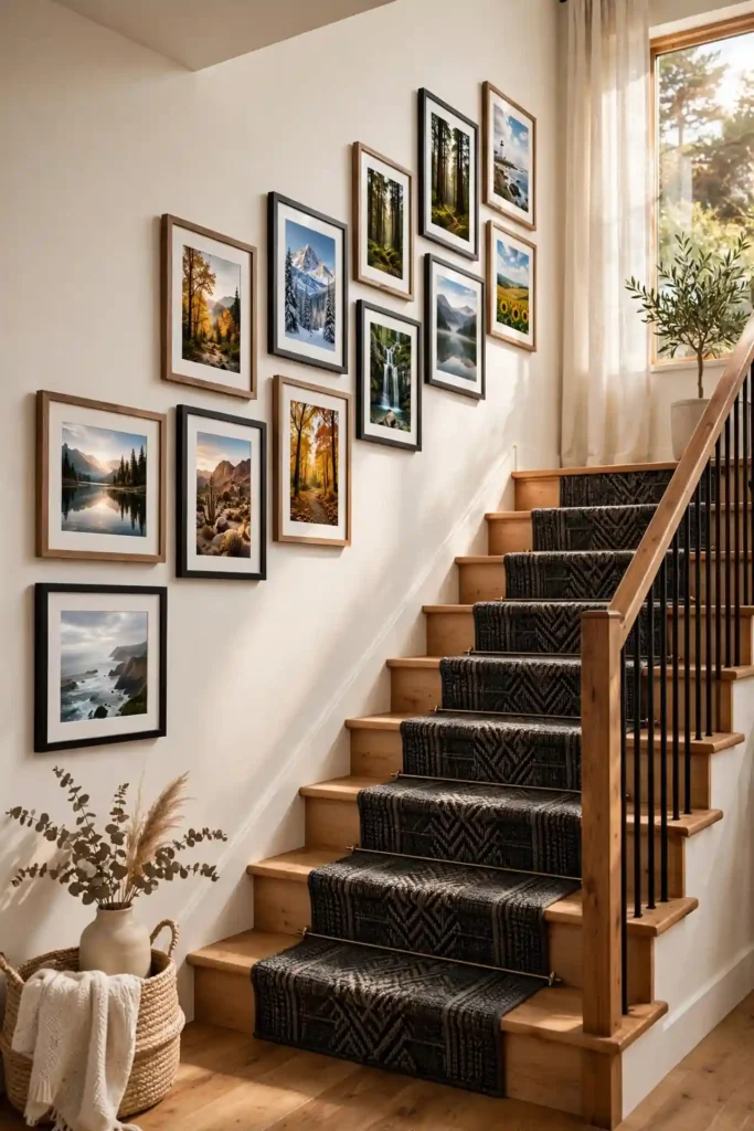
Keep frames parallel to the staircase slope rather than the floor — bottoms should follow the diagonal line for a polished look. Mix frame sizes for a collected feel, but keep a consistent mat color (white or cream) to unify the climb. Family photos, travel snapshots, and kids’ art are perfect here since you pass them daily. In rentals or on tricky plaster walls, command strips rated for your frame weight let you rearrange without damage. Add a battery-operated picture light or two along the run — Amazon sells slim LED art lights for under thirty dollars — to make evening climbs gallery-worthy.
5. Picture Ledge Layout
Picture ledge layouts skip the hammer almost entirely: slim floating shelves let you lean and layer frames, so rearranging takes seconds instead of a patch-and-paint session. This gallery wall layout idea works because the layered depth feels relaxed and styled, like a boutique shelf display, and you can swap seasonal art or holiday photos without new holes. IKEA’s MOSSLANDA ledges cost around ten dollars each and mount with just two screws; install two or three ledges stacked twelve to eighteen inches apart for a full wall effect. Lean larger frames at the back and smaller ones in front for a natural cascade.
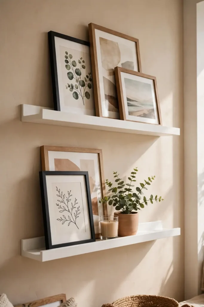
Overlap frames slightly and vary heights so the ledge doesn’t look like a lineup — a small plant, a candle, or a ceramic vase tucked between frames adds styling depth. Center the ledges as one unit at 57 inches, with the lowest ledge roughly at that height. This layout is a renter’s dream and a parent’s secret weapon: update kids’ art monthly without touching the wall. For a polished finish, keep frames in two or three coordinating finishes — black, white, and natural oak play well together. Dust the ledges monthly since horizontal surfaces collect it fast.
6. Centered Anchor Piece
The centered anchor layout builds your gallery wall around one hero piece — a large painting, statement mirror, or oversized family portrait — with smaller frames radiating around it. It works because the anchor gives the eye a clear landing spot, so even a mixed collection of frames feels composed instead of chaotic. Hang the anchor first with its center at 57 inches, then arrange four to eight smaller pieces around it, keeping two to three inches of space between everything. Choose an anchor roughly one-third the width of your wall for proper scale.
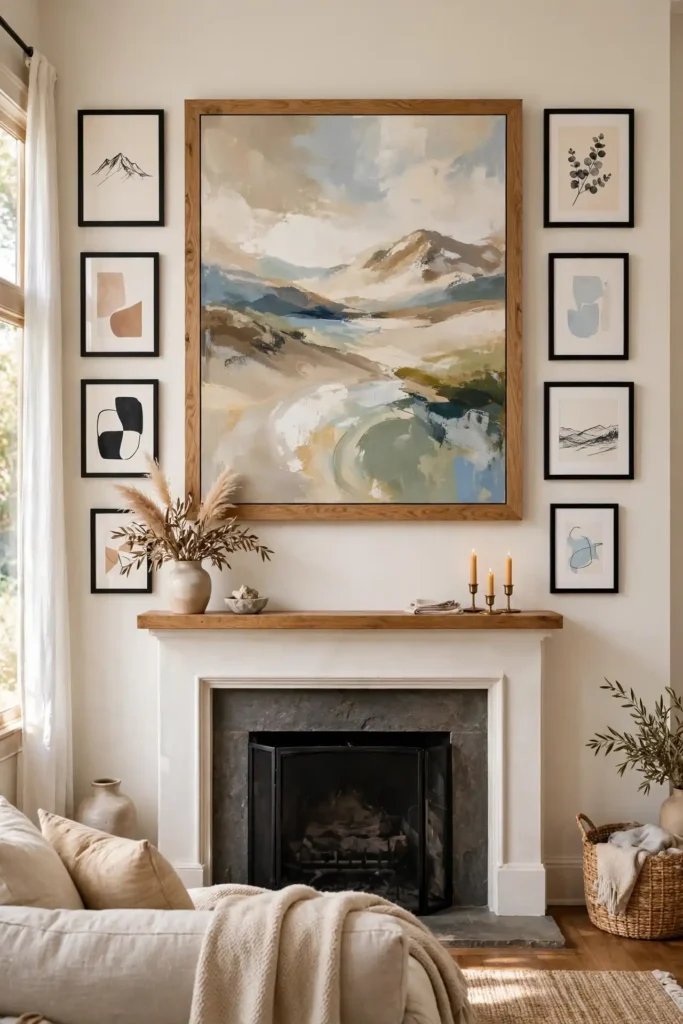
Framebridge or Michaels custom framing can turn a favorite print into a worthy anchor for one to two hundred dollars, while a thrifted large frame with a fresh mat costs under thirty. Keep the surrounding frames smaller than the anchor by at least half, and echo one color or material from the anchor in the supporting frames to tie the group together. This layout is ideal above a fireplace mantel, a bed, or an entryway console where you want one clear focal point. Step back frequently while hanging to make sure the smaller pieces orbit evenly and the composition doesn’t drift lopsided.
7. Vertical Column
A vertical column stacks frames in a single line from floor to ceiling — the slim, space-smart gallery wall layout idea for narrow wall slices between windows, doors, or bookshelves. It works because the vertical rhythm draws the eye upward, making eight-foot ceilings feel taller and skinny walls feel intentional instead of leftover. Stack three to five frames with two to three inches of spacing, sizing them to fit the wall’s width — frames wider than two-thirds of the wall section look crowded. Center the whole column as one unit with its midpoint at 57 inches.
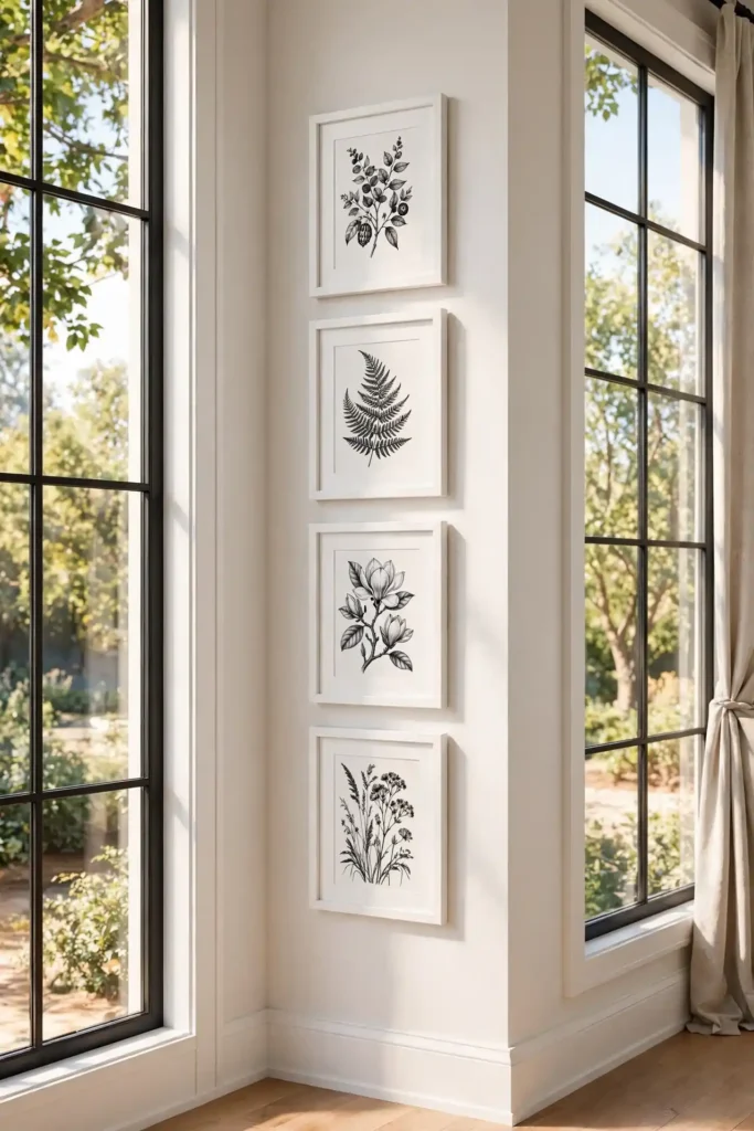
Use matching frames for a sleek, modern column, or alternate two finishes for a playful pattern that still reads as orderly. This layout loves a theme: a vertical series of black-and-white city photos, pressed botanicals, or a child’s yearly school portraits stacked oldest to newest. On very tall walls, extend the column nearly to the crown molding for drama, but keep the bottom frame at least six inches above any furniture. A picture light mounted at the top washes the whole column in warm light — battery LED versions from Amazon run about twenty-five dollars.
8. Corner Wrap
A corner wrap gallery wall turns the trickiest spot in the room into a feature by flowing frames around an inside or outside corner. It works because the continuous display erases the hard corner line, making small rooms feel larger and giving you display space where most people hang nothing. Start on the more visible wall with your largest piece, then wrap two to four smaller frames around the corner, keeping the same two-to-three-inch spacing across the bend. Tape paper templates around the corner first — this is the one layout where you really must preview before hanging.
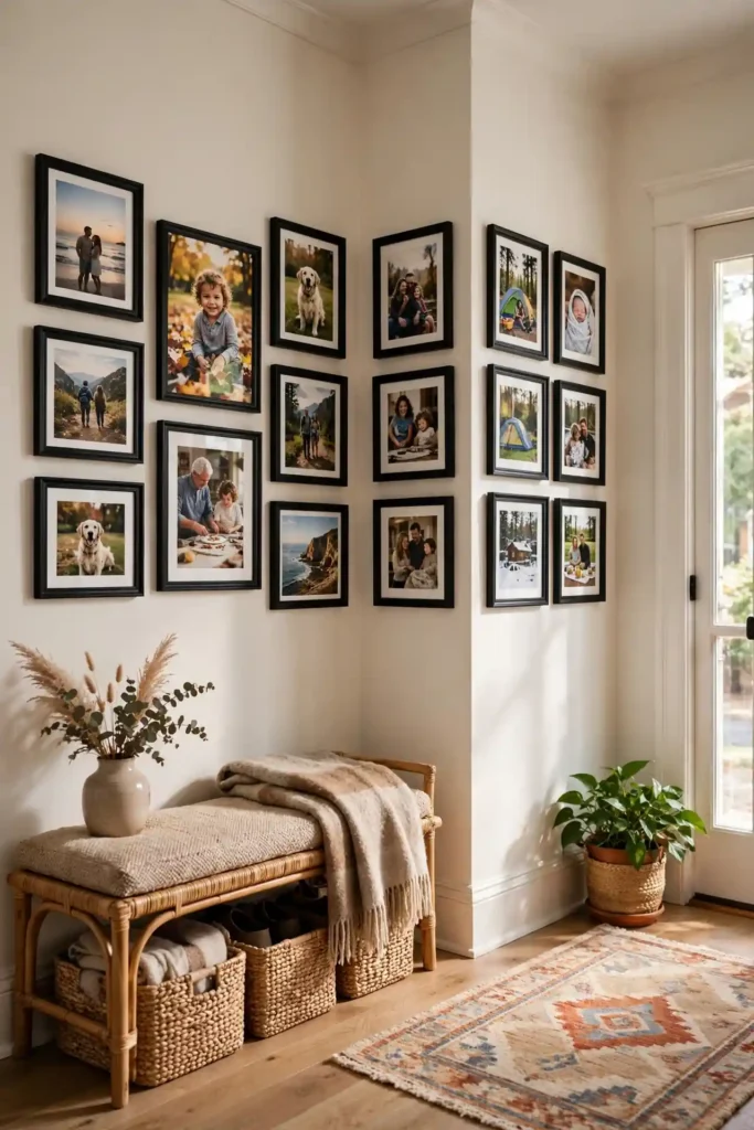
Keep frame sizes modest on the wraparound side so the corner doesn’t feel cluttered; smaller four-by-six and five-by-seven frames navigate the turn best. Match frame finishes across both walls to sell the illusion of one continuous gallery. This layout is perfect for entryways, where a corner near the door often sits bare, or for wrapping a reading nook in art. Mind the sightline: stand at the room’s entrance and check that pieces on both walls read as one composition. In rentals, lean into command strips here — corners are where you’ll most want to adjust after seeing the real thing.
9. Mixed Media Wall
A mixed media gallery wall breaks the frames-only rule by combining art prints, woven baskets, small mirrors, ceramic plates, and even mounted textiles into one eclectic display. It works because varied textures and depths catch light differently, creating a dimensional, collected-over-time feel that flat prints alone can’t achieve. Start with your flattest pieces as the base layer, then add three-dimensional objects — a round jute mirror from Target, brass wall hooks holding a straw hat, or a small floating shelf with a vase — to break the plane. Keep a loose color palette of three to four tones so the variety feels curated.
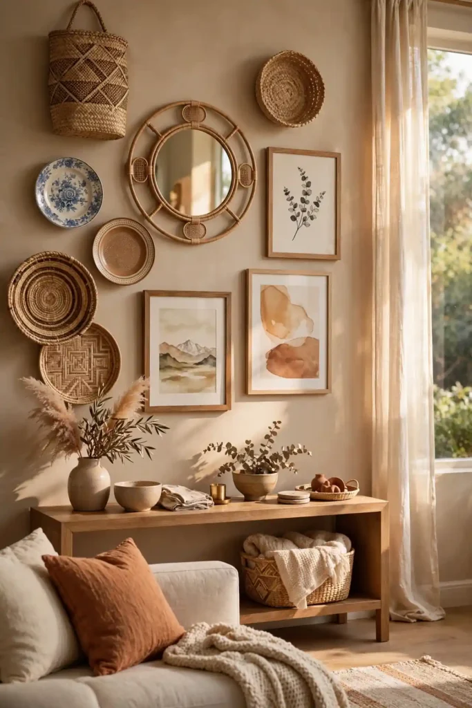
Hang heavier dimensional pieces on studs or with proper drywall anchors rated for the weight; a falling ceramic plate ruins the vibe fast. Space objects two to four inches apart and step back often, since three-dimensional pieces cast shadows that change the composition. This layout shines in boho, farmhouse, and eclectic living rooms, and it’s ideal for displaying travel souvenirs — a woven basket from a market trip or a carved mask becomes art. Balance is key: if one side gets heavy with objects, anchor the other side with a large framed piece to restore equilibrium.
10. Black and White Photos
Black-and-white photography is the timeless gallery wall layout idea — monochrome images in simple frames look expensive, cohesive, and never clash with your decor. It works because removing color unifies everything: decades of family photos, travel shots, and even phone snapshots blend into one elegant series. Convert your favorites to black and white with a free phone app or your printer’s grayscale setting, then print at a local CVS or Walgreens for a few dollars each. Match the frames — thin black gallery frames from Amazon or IKEA — and use white mats for a crisp, museum-like finish.

Vary the photo sizes within the grid or cluster for visual rhythm, but keep the black frames and white mats consistent so the set reads as one collection. This layout is unbeatable for family photo walls, nursery galleries, and hallway displays because it grows gracefully — new photos convert to black and white and slot right in. Hang the collection’s center at 57 inches and keep spacing tight at two inches for a polished look. For extra drama, include one oversized black-and-white print (sixteen by twenty or larger) as the anchor among smaller five-by-sevens.
11. Colorful Eclectic Mix
A colorful eclectic gallery wall throws out the matchy-matchy rule and celebrates bold, joyful art — think vibrant abstract prints, vintage travel posters, and rainbow-hued photography hung side by side. It works because high color energy reads as confident and personal, turning a plain wall into the room’s conversation piece. Pull one to two unifying threads through the chaos: a repeated accent color, consistent white mats, or all-black frames that let the art’s colors do the talking. Source prints from Society6, Etsy, or thrift stores, where original art often costs under twenty dollars.

Start with your boldest, largest piece and build outward, sprinkling smaller colorful pieces to balance the visual weight across the wall. Keep spacing consistent at two to three inches — orderly gaps are what keep a colorful wall from looking messy. This layout loves living rooms, playrooms, and creative home offices, but keep surrounding decor calm: neutral walls and simple furniture let the gallery be the star. If the mix starts feeling chaotic, remove one piece at a time until it clicks — editing is the secret skill of every great eclectic wall.
12. Matching Mats
Matching mats are the designer’s shortcut to a cohesive gallery wall: identical mat boards in white, cream, or soft gray make wildly different art look like a curated collection. It works because the eye registers the repeated mat color before the varied images, so a thrift-store landscape, a kid’s drawing, and a black-and-white photo suddenly belong together. Buy pre-cut mats in bulk from Amazon or Michaels — a ten-pack of eight-by-ten mats costs under twenty dollars — and cut them to fit whatever frames you already own. Keep the mat reveal (the visible border) consistent at two to three inches.
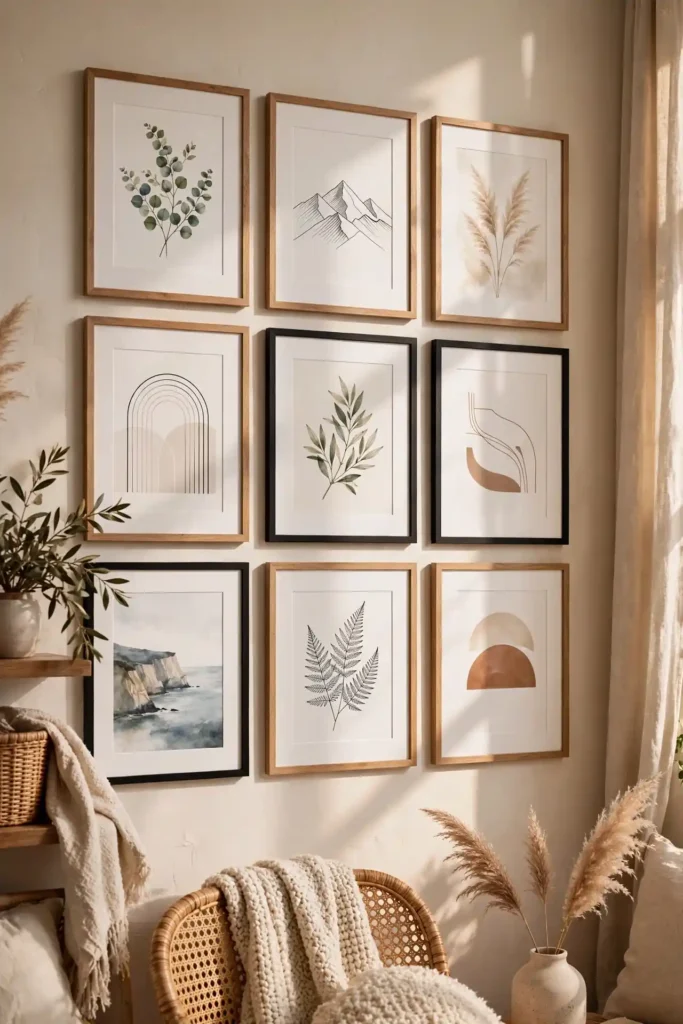
Pair the matching mats with frames in one or two finishes for maximum polish; black frames with white mats are the classic gallery look, while natural oak with cream mats feels warm and modern. This trick rescues odd-sized art too — float a small print on a large mat inside a bigger frame for an instant high-end look. When hanging, treat each matted piece as one unit and keep two to three inches between frames. Refresh the gallery seasonally by swapping just the art inside the mats, leaving your perfectly hung frames exactly where they are.
13. Above-Sofa Gallery
The space above the sofa is the most popular gallery wall spot in American homes — a big, blank wall begging for personality. It works because art above seating sits at natural viewing height and anchors the whole living room arrangement. Size the gallery to span roughly two-thirds the sofa’s width: for a standard eighty-four-inch sofa, aim for a display about fifty-six inches wide. Hang the bottom edge six to ten inches above the sofa back so nobody bumps frames when they lean back. Build the arrangement on the floor first, then transfer it up with paper templates.

Choose art that can handle being looked at daily — family photos, favorite travel prints, or a calm abstract series work better than anything too busy. Keep the overall shape roughly rectangular and wider than tall to echo the sofa’s proportions. If your sofa sits against a very tall wall, extend the gallery upward with smaller frames rather than leaving a gap to the ceiling. A pair of matching frames flanking a central anchor is the easiest above-sofa formula for beginners. Finish with a throw pillow or two that picks up a color from the art to tie the seating area together.
14. Above-Bed Gallery
An above-bed gallery turns your bedroom’s biggest blank wall into a personal retreat — the first thing you see in the morning and the last at night. It works because art above the headboard creates a headboard-like focal point, making the bed feel grander and the room more finished. Center the display over the bed (not the wall) and span about two-thirds of the headboard’s width. Hang the bottom edge six to twelve inches above the headboard, or center at 57 inches if there’s no headboard. Choose calming imagery — soft landscapes, botanicals, or abstract washes in restful tones.
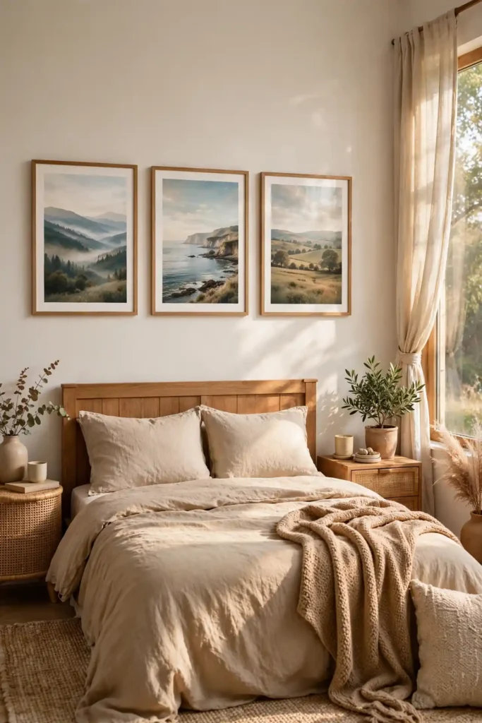
Keep frames secure: use two hangers per wide frame or museum putty on the bottom corners so nothing shifts or falls while you sleep. A symmetrical pair or trio above the bed feels serene and is nearly impossible to get wrong — matching frames with serene prints flanking a center piece is the classic formula. Avoid heavy three-dimensional objects or glass-heavy frames directly above pillows; lighter canvas prints are the safer choice. For renters, a single large canvas on command strips or a picture ledge with leaned frames gives the look with zero holes above the bed.
15. Kids Art Gallery
A kids’ art gallery wall celebrates your children’s creativity front and center — and it’s the gallery wall layout idea they’ll actually notice and love. It works because displaying their work at their eye level tells them their creations matter, turning a hallway or playroom into a rotating museum of childhood. Dedicate one wall or a staircase run to the cause, and frame the best pieces simply: IKEA RIBBA frames or clipboards from Target make swaps easy and cost just a few dollars each. Rotate the art monthly or seasonally so the wall stays fresh and every child gets featured.

Mix in a few family photos or a fun quote print so the wall feels designed, not just pinned up — matching frames and white mats are what elevate finger paintings to gallery status. Hang the center of the display lower than standard, around forty to forty-eight inches, so little ones can see their work up close. For zero-damage swapping, use magnetic poster hangers or washi tape frames that peel off cleanly. Photograph each piece before retiring it to a keepsake box or digital album; the wall stays current while the memories are preserved forever.
16. Travel Memories Wall
A travel memories wall turns your adventures into daily decor — maps, ticket stubs, foreign currency, and vacation photos arranged as one wanderlust-fueled gallery. It works because every piece carries a story, making the wall a conversation starter that beats any store-bought art for personal meaning. Start with a large anchor like a framed world map or a favorite landscape photo from your best trip, then cluster smaller memories around it: shadow-box a handful of ticket stubs, frame a vintage-style map print from Etsy, or pin a cork-board section for rotating postcards.

Organize by trip or by region so the wall reads as a journey rather than a jumble — one cluster per memorable vacation keeps it coherent. Use consistent frames and mats to unify wildly different mementos, from a black-and-white Eiffel Tower shot to a colorful market photo. Leave intentional blank space for future adventures; a travel wall should grow with you. Add small brass label holders or handwritten tags noting the place, year, and story behind each piece — they turn pretty pictures into a personal travelogue guests will actually stop to read.
17. Botanical Gallery
A botanical gallery wall brings the outdoors in with pressed flowers, leaf prints, and garden-inspired art — a fresh, calming gallery wall layout idea that suits nearly every room. It works because green tones and organic shapes are universally soothing, pairing effortlessly with wood furniture, white walls, and natural textiles. Build the collection from vintage botanical prints (widely available on Etsy as downloads for under ten dollars), real pressed flowers in floating frames, or your own garden photography. Keep frames light — white, natural oak, or thin brass — to preserve the airy feel.

Arrange six to twelve pieces in a grid or loose cluster with two to three inches of spacing, centering the group at 57 inches. Mix print styles for depth: pair detailed vintage illustrations with simple modern leaf silhouettes and one real pressed-flower piece for texture. This layout thrives in sunrooms, kitchens, bathrooms, and bedrooms — anywhere you want a breath of nature. Echo the theme with a real plant beneath the gallery; a potted fern or eucalyptus stems in a vase complete the indoor-garden effect. Refresh seasonally by swapping in autumn leaves or spring blossoms.
18. Family Photo Timeline
A family photo timeline arranges pictures chronologically — wedding day to first home to kids growing up — turning your wall into a visual family history. It works because the left-to-right (or top-to-bottom) progression tells a story guests naturally follow, making it the most meaningful gallery wall layout idea for hallways and staircases. Choose one standout photo per year or per milestone, convert them to a consistent finish (all black-and-white or all color), and use matching frames so the timeline reads as one narrative. Start the timeline at the most-viewed end of the hallway.

Keep frame sizes consistent — five-by-seven or eight-by-ten prints in identical frames — and space them evenly at two to three inches so the progression feels orderly. Add small date labels beneath key photos with a label maker or handwritten tags for a museum-archive feel. On staircases, let the timeline climb with the steps, oldest at the bottom and newest at the top, for a lovely metaphor. Update the timeline yearly with the new family photo; the tradition becomes as meaningful as the wall itself. Digital frames mixed in can even play slideshow updates between the prints.
19. Hallway Gallery
Hallways are gallery wall gold — long, narrow, and passed through daily, they’re the perfect spot for art you’d otherwise never see. It works because a hallway gallery turns transitional dead space into a destination, making your home feel curated from the moment guests walk in. Treat the hallway as one long horizontal composition: a single row or a loose salon cluster running its length, centered at 57 inches. Keep frames slim-profiled so they don’t snag shoulders in tight hallways — canvas prints or frames under two inches deep are ideal.
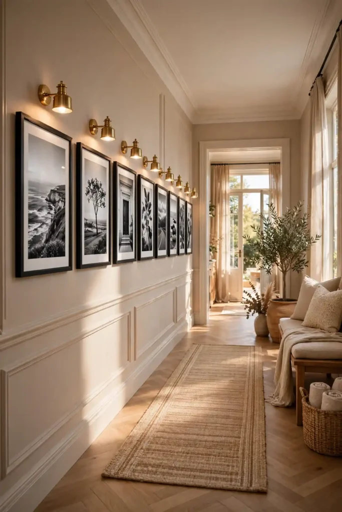
Light the hallway well, since corridors often lack windows: warm LED picture lights or simple plug-in sconces roughly every six to eight feet keep art visible and inviting. Stick to one unifying element — matching black frames, all black-and-white photos, or a single color story — because hallways read fast and cohesion matters. Family photo timelines, travel series, and kids’ art rotations all thrive beautifully here. Leave the last few feet near bedroom doors unadorned for a visual breather, and make sure nothing protrudes into the walking path at shoulder height.
20. Diamond Layout
A diamond layout arranges frames in a rotated square — one piece at top, one at bottom, and wider rows through the middle — for a gallery wall with geometric flair. It works because the unexpected diamond silhouette breaks the boxy monotony of most walls, creating a jewel-like focal point that feels designed rather than default. Plan it on the floor first: start with the top and bottom anchor frames, then build the widest middle row of three, keeping two to three inches between every piece. Paper templates on the wall are essential here since the angles are unforgiving.

This layout demands visual balance — place your boldest piece dead center, then mirror frame sizes and colors on the left and right sides so the diamond stays symmetrical. It suits square-ish wall sections, like the wall between two windows or above a small console, better than long wide walls. Keep frames in one or two finishes; too much variety fights the geometry. A diamond of nine black-and-white photos makes a stunning dining room statement, while colorful art in a diamond reads playful and modern. Measure twice, hang once — this is not the layout to eyeball.
21. Asymmetrical Balance
Asymmetrical balance is the art of looking effortless — frames of different sizes arranged off-center yet visually even, like a well-styled shelf. It works because the relaxed composition feels modern and organic, avoiding the formality of grids while still holding together. The trick is balancing visual weight: a large piece on one side gets countered by two or three smaller pieces on the other, with the group’s overall center of gravity landing near the middle. Start with your largest frame placed off-center, then fill in around it until both sides feel equally weighted.
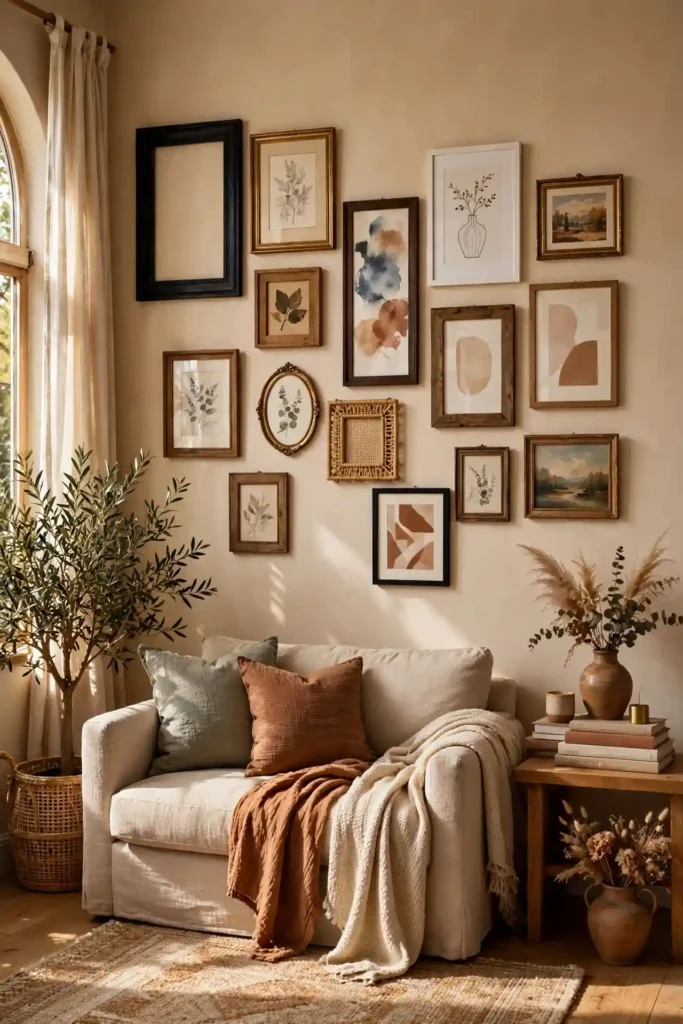
Unify the apparent chaos with one consistent element — same frame color, same mat color, or a shared color palette in the art — so the asymmetry reads as intentional. Keep spacing consistent at two to three inches; even gaps are the invisible glue of asymmetrical layouts. This is the designer’s favorite for eclectic living rooms and creative offices because it accommodates odd collections gracefully. Photograph the arrangement and squint at the thumbnail: if one side looks heavy, shift a small frame over. Trust your eye over the ruler here, but keep that center of gravity in mind.
22. Frame Color Consistency
Keeping one frame color across your entire gallery wall is the simplest way to make any layout look professionally designed. It works because a single finish — classic black, crisp white, warm oak, or brushed brass — creates instant visual rhythm, letting varied art hang together without competing. Black frames suit modern and traditional rooms alike and make colors pop; white frames keep small rooms airy; natural wood warms up neutral spaces. Buy in multi-packs from Amazon, IKEA, or Michaels to keep every frame truly matching and the per-frame cost under ten dollars.

If one finish feels too rigid, allow exactly one accent — say, all black frames plus one gold vintage frame as a deliberate focal point — but resist adding a third finish. Match the frame color to something else in the room, like black curtain rods or oak furniture, for a pulled-together feel. When mixing old frames you already own, a ten-dollar can of spray paint unifies them in an afternoon; matte black or soft white covers almost anything. Consistent frame color also future-proofs your wall: new art in the same frames slots in seamlessly for years.
23. Leave Room to Grow
Leave room to grow means planning your gallery wall with intentional blank space for future pieces — because the best galleries evolve. It works because a wall that can accept new art stays fresh for years instead of feeling finished and frozen, and it takes the pressure off finding every piece before you hang the first one. Start with sixty to seventy percent of your planned frames, clustering them toward the center or one side, and mentally reserve the edges for later additions. Mark your reserved spots with small pieces of painter’s tape as a reminder.

This approach is perfect for family photo walls, travel collections, and kids’ art displays that naturally expand over time. Keep your frame style and mat color consistent from the start so future additions blend in — buying a few extra matching frames now (IKEA and Target restock popular lines, but styles do retire) saves future headaches. Revisit the wall yearly: add the new pieces, then step back and rebalance spacing to two to three inches throughout. A growing wall tells your family’s ongoing story better than any complete display ever could.
How to Plan a Gallery Wall Layout
Planning is what separates a stunning gallery wall from a nail-hole disaster, and it starts on the floor, not the wall. Gather every frame you plan to use, lay them out on a large rug or taped-off floor area matching your wall’s dimensions, and shuffle until the composition clicks — this is where you test spacing, balance, and the overall shape. Photograph each arrangement from above so you can compare options objectively. Once you love a layout, trace each frame onto kraft paper or newspaper, cut out the templates, and tape them to the wall with painter’s tape.

Live with the paper templates for at least a day, checking the layout in morning and evening light and from every angle you’ll actually view it. Measure twice: confirm the arrangement’s center sits at 57 inches, spacing stays consistent at two to three inches, and the total width suits the wall (about two-thirds of the furniture below it). Number the back of each frame and its template so hanging day is foolproof. Gather your tools in advance — hammer, level, picture-hanging hooks rated for each frame’s weight, and a step stool — so the actual hanging takes under an hour.
This method prevents extra holes and lets you see the scale of the gallery before committing. It also makes it easy for two people to agree on the layout.
Choosing Frames for a Gallery Wall
The right frames make or break your gallery wall, and the good news is you don’t need expensive ones — you need consistent ones. Start by choosing one to two finishes for the whole wall: matte black is the most versatile, natural oak warms modern spaces, and white keeps things bright and airy. For budget-friendly matching sets, IKEA’s RIBBA and LOMVIKEN lines, Target’s Studio McGee collection, and Amazon multi-packs all deliver solid frames for five to fifteen dollars each. Check that each frame includes real glass or quality acrylic — cheap plastic glare ruins good art.

Match frame width to art scale: thin-profile frames suit photography and modern prints, while wider, chunkier frames give presence to large statement pieces. Always use mats for art smaller than the frame — a two-to-three-inch mat reveal makes a five-by-seven print look gallery-grade in an eleven-by-fourteen frame. For oversized pieces over twenty-four inches, invest in one quality frame from Framebridge or a local frame shop (expect one to two hundred dollars) rather than a flimsy big-box frame that warps. Buy all your frames before hanging day so finishes match exactly across dye lots.
Common Gallery Wall Mistakes
The number-one gallery wall mistake is hanging art too high — frames stranded near the ceiling with a chasm of empty wall below the sofa. Fix it by centering every arrangement at 57 inches (museum eye level) and keeping the bottom edge six to ten inches above furniture. The second classic error is spacing frames too far apart: gaps over four inches make pieces look like unrelated strangers instead of one collection, so keep two to three inches between frames. Tiny frames on a huge wall is mistake three — scale your art to the wall, aiming for the display to cover roughly two-thirds of the available width.

Other pitfalls include mixing too many frame finishes (stick to one or two), skipping the paper-template step and ending up with a wall of patch-filled holes, and using flimsy hanging hardware that lets frames tilt or fall. Don’t hang heavy frames with a single nail — use two hooks or a French cleat for anything over ten pounds. And resist the urge to fill every inch: negative space is part of the design. If your wall feels off, the culprit is usually height, spacing, or scale — adjust those three and most galleries snap into place.
When it comes to gallery wall layout, the best results come from balancing style, comfort and everyday function.
How to Hang a Gallery Wall Layout Step by Step
Hanging day goes smoothly with a system: start by taping your numbered paper templates to the wall in the final arrangement, double-checking the center hits 57 inches and spacing is even. Mark each nail spot through the paper with a pencil, then remove the template and hammer in your hooks — picture-hanging hooks rated for the frame’s weight, or a nail driven at a slight upward angle for lighter pieces. Hang the center or anchor piece first, then work outward, checking with a level as you go. For drywall without a stud, use self-drilling anchors rated for at least twice the frame’s weight.

After every frame is up, step back at least ten feet and assess the whole composition before making tweaks — small tilts invisible up close can throw off the overall lines. Press small adhesive bumper pads on the bottom back corners of each frame to keep them level and protect your walls. For brick, plaster, or concrete walls, switch to masonry nails or a hammer drill with proper anchors rather than forcing standard hooks. Clean the glass with a microfiber cloth once everything hangs, then photograph your finished gallery wall — you’ll want the before-and-after for inspiration, and it helps when adding future pieces.
- Gather art and frames.
- Arrange on the floor and photograph the layout.
- Trace and cut paper templates.
- Tape templates to the wall and adjust.
- Hang frames and remove templates.
Final Thoughts on Gallery Wall Layout Ideas
The best gallery wall layout ideas share one secret: they’re personal. A perfectly planned grid of art you love will always outshine a trend-chasing arrangement of prints that mean nothing to you. Start with the pieces that matter — family photos, travel memories, your kids’ masterpieces, that flea-market find you couldn’t leave behind — and choose the layout that serves them, whether that’s a tidy symmetrical grid or a free-spirited salon wall. Give yourself permission to start small: three well-chosen frames hung at the right height beat twenty rushed ones every time.

Remember the fundamentals and you’ll never go wrong: center arrangements at 57 inches, keep two to three inches between frames, scale the display to about two-thirds of your wall or furniture width, and stick to one or two frame finishes. Your gallery wall doesn’t need to be finished in a weekend — the most beautiful walls grow over years, collecting stories as they collect art. So tape up those paper templates, hang that first frame, and enjoy the process. Your walls are waiting to tell your story, one frame at a time.
Save these ideas and follow along for more wall decor inspiration.
Frequently Asked Questions About Gallery Wall Layout Ideas
How high should a gallery wall be hung? Center the entire arrangement at 57 inches from the floor — the museum standard for eye level — measuring to the midpoint of the whole display, not individual frames. Above furniture, keep the bottom edge six to ten inches above the sofa, headboard, or console. How far apart should frames be? Two to three inches is the sweet spot for most layouts; tighter spacing looks intentional and gallery-like, while gaps over four inches make pieces feel disconnected. For staircases, align the lowest frame’s center about 57 inches above the nearest tread.

Can you mix frame styles in a gallery wall? Yes — limit yourself to one or two finishes and unify the collection with matching mat colors for a cohesive look. What’s the cheapest way to build a gallery wall? Shop IKEA RIBBA frames, Target multi-packs, or thrift stores (often under five dollars per frame), print photos at CVS or Walgreens, and download affordable art from Etsy. How do renters hang gallery walls without damage? Use command strips rated for each frame’s weight, picture ledges that need only a few screws, or lean large frames on furniture — all removable with no patching required.
How far apart should frames be on a gallery wall?
About 2 to 3 inches apart.
How high should a gallery wall be hung?
Center it around 57 to 60 inches from the floor.
How do I plan a gallery wall layout?
Arrange frames on the floor, trace paper templates and tape them to the wall.
Should gallery wall frames match?
They can match for a calm look or mix for an eclectic look.
How big should a gallery wall be above a sofa?
About two-thirds the width of the sofa.





Leave a comment