

Two tone painted walls are the fastest way to give any room a custom, designer look without hiring a pro. Two tone painted walls use two complementary shades divided by a crisp line, instantly adding depth, contrast, and personality. This technique works in every style, from modern farmhouse to sleek contemporary, and it costs a fraction of wallpaper or paneling. All you need is a weekend, two paint colors, and painter’s tape to transform flat, boring walls into a layered feature. The look is endlessly customizable: split walls horizontally at chair-rail height, go bold with dramatic color blocking, or keep it subtle with two close shades of the same color family for quiet texture.
The beauty of two tone painted walls is how forgiving and flexible they are. Unlike full-wall color changes, this approach lets you introduce bold hues without committing an entire room to them. A deep navy below and crisp white above feels anchored yet airy, while two warm neutrals create a cozy cocoon. These two tone painted walls ideas also solve real design problems: the darker tone grounds heavy furniture, the lighter tone bounces natural light, and the dividing line itself creates architectural interest in boxy rooms. You can even use the split to fake higher ceilings or make a narrow hallway feel wider with clever placement.
In this guide, you will find 22 stylish two tone painted walls ideas packed with practical details like exact paint shades, brand names, prices, and where to buy them in the US. Each idea includes the dimensions that matter, the divider style to use, and a pro tip from real painters. Whether you want a dramatic moody kitchen, a calm sage bedroom, or a playful terracotta dining room, there is a pairing here for you. Most projects take one weekend and cost under $150 in paint and supplies. Grab your favorite shades from Sherwin-Williams, Benjamin Moore, or Behr at Home Depot or Lowe’s, and let’s get rolling.
1. Navy Lower, White Upper Kitchen Walls
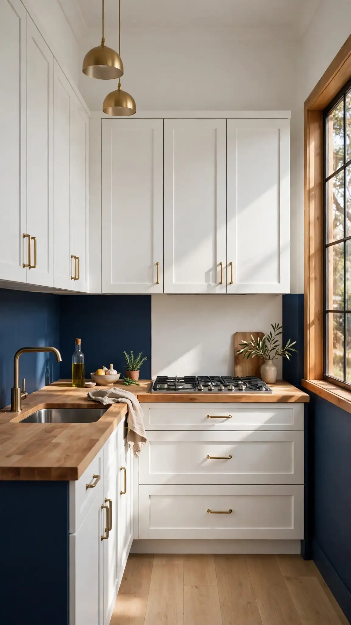
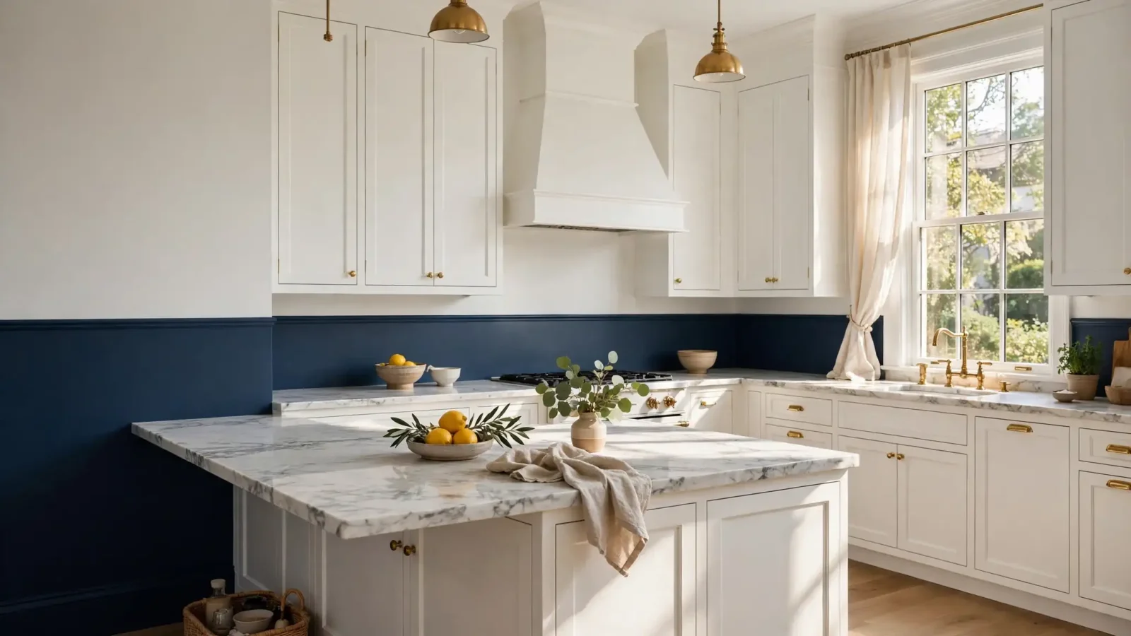
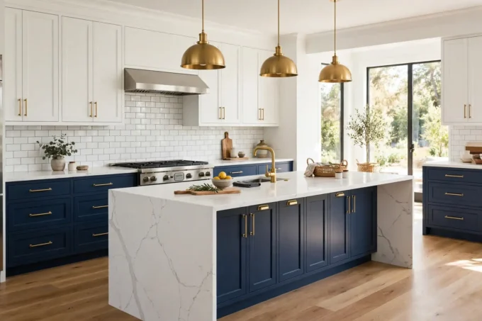
A deep navy lower half paired with a crisp white upper is the classic two tone painted walls look for kitchens, and it never goes out of style. Try Sherwin-Williams Naval SW 6244 on the bottom and Benjamin Moore White Dove OC-17 up top for a rich, grounded feeling that still reflects plenty of light. A gallon of Sherwin-Williams Emerald interior paint runs about $75 at Lowe’s, while Behr Marquee at Home Depot costs around $55 per gallon, so an average 10-by-12-foot kitchen needs roughly two gallons total. Place the dividing line at about 54 inches from the floor, just above counter height, for a tailored look that mimics wainscoting without the carpentry.
Start by painting the lighter color across the whole wall, then measure and mark your dividing line with a laser level or a long straightedge. Apply FrogTape Delicate Surface tape (about $9 per roll) along the line, then paint the navy lower section with two thin coats for even coverage. Dark colors can show lap marks, so maintain a wet edge and work in three-foot sections. Once dry, pull the tape at a 45-degree angle while the paint is still slightly tacky for the sharpest edge. Pro tip: two tone painted walls hide scuffs best when the darker color sits below countertop height, where hands and chairs make contact.
2. Chair Rail Two Tone Painted Walls
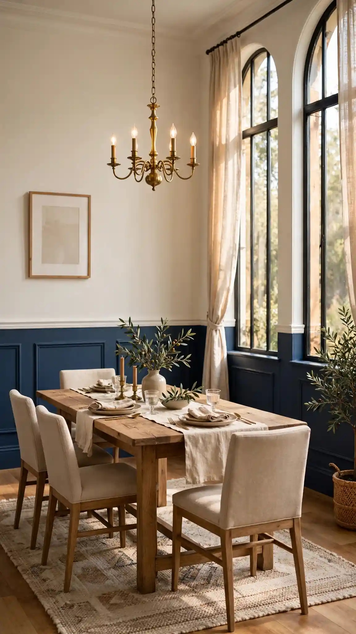
Adding a real chair rail molding strip takes two tone painted walls from a painted line to a finished architectural feature. Paint the lower wall a rich shade like Benjamin Moore Hale Navy HC-154 and the upper a warm off-white such as Simply White OC-117, then install a slim 2-inch poplar chair rail on the dividing line. The trim costs about $1.50 to $3 per linear foot at Home Depot, and a nail gun or construction adhesive will hold it in an afternoon. This treatment suits dining rooms, hallways, and traditional kitchens beautifully, giving builder-basic rooms the feel of a historic home. Choose a satin or semi-gloss finish on the trim for durability and subtle contrast against eggshell walls.
Install the chair rail at 36 inches from the floor in most rooms, or 54 inches in kitchens to clear the counters. Caulk every seam with paintable caulk ($6 per tube) and fill nail holes before painting the trim to match your upper wall color. Two gallons of paint usually cover a standard dining room with two coats, keeping the total project under $130. For a modern twist, paint the rail itself the darker lower color instead of matching the top. Pro tip: two tone painted walls look most professional when the trim line is perfectly level, so double-check with a laser level before the first nail goes in.
3. Half-Wall Sage Green Two Tone Painted Walls
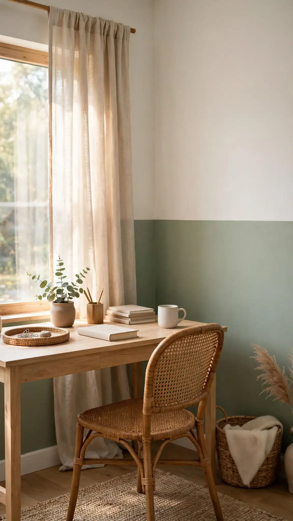
A half-wall split in soft sage green below and warm white above creates a calm, organic feel that works in bedrooms, home offices, and breakfast nooks. Try Behr Back to Nature S340-4 on the lower half with Behr Ultra Pure White above; both are under $55 per gallon at Home Depot. Run the dividing line at roughly 48 inches, about doorknob height, which feels natural and proportionate in most rooms. Sage green pairs beautifully with light wood furniture, rattan accents, and linen textiles, making this one of the most pinned color combinations in modern farmhouse and cottage styling. The muted green reads as a neutral, so it plays well with almost any decor you already own.
Because sage is a mid-tone color, it typically covers in two coats over white walls, but use a tinted primer like Kilz 2 ($25 per gallon) if you are painting over a dark or saturated color. Tape the line, then paint the sage section first if your upper wall is already white, touching up only where needed. For extra polish, add a thin pencil molding at the split for about $0.75 per linear foot. This palette photographs beautifully in natural light, which is why designers love it for home offices. Pro tip: sample two tone painted walls combinations on poster board first and move them around the room to see how the colors shift between morning and evening light.
4. Bold Black and Beige Two Tone Walls
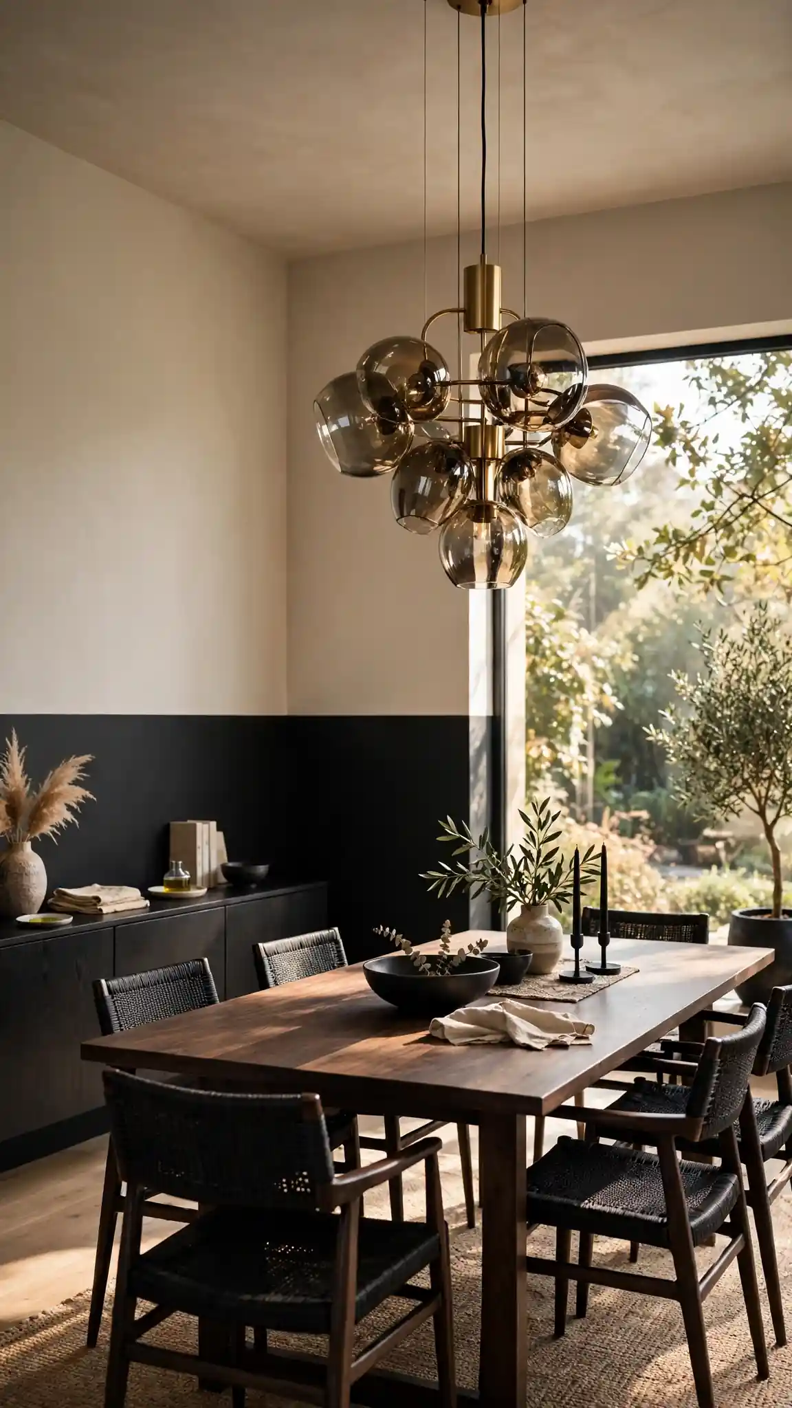
Black on the bottom and warm beige on top sounds daring, but this high-contrast pairing creates some of the most striking two tone painted walls in modern interiors. Use Benjamin Moore Onyx 2133-10 or Sherwin-Williams Tricorn Black SW 6258 for the lower section with a warm beige like Accessible Beige SW 7036 above. The dark base anchors the room and hides dirt and scuffs, while the beige upper keeps the ceiling feeling high and the light bouncing. This combination shines in dining rooms with statement lighting and in home offices where you want focus and drama. Black paint costs the same as any premium interior gallon, roughly $55 to $75, so drama does not require a bigger budget.
Black paint shows every imperfection, so prep is everything: fill holes, sand glossy areas, and apply a gray-tinted primer to cut the number of topcoats. Plan on three thin coats of black for full opacity, using a high-quality roller like the Purdy White Dove 3/8-inch nap (about $12). Divide the wall at about one-third from the floor for a dramatic low split, or at standard chair-rail height for a safer classic look. Let each coat dry fully, since dark paint stays tacky longer. Pro tip: use an eggshell or matte finish on black two tone painted walls to minimize sheen and fingerprints, saving semi-gloss only for trim.
5. Charcoal and Cream Kitchen Two Tone Walls
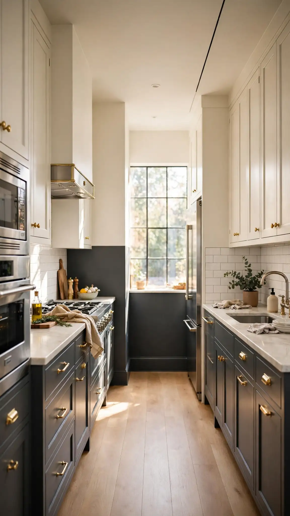
Charcoal gray below and creamy white above gives kitchens a sophisticated, restaurant-inspired look without the starkness of pure black. Pair Sherwin-Williams Iron Ore SW 7069 on the lower half with Alabaster SW 7008 above for a warm, layered palette that flatters both stainless steel appliances and butcher-block counters. This pairing is especially forgiving in busy family kitchens because the charcoal half camouflages splatters and fingerprints near the counters. At roughly $60 to $75 per gallon for premium interior paint at Lowe’s, a standard galley kitchen takes about two gallons and a weekend. Add brass or matte-black hardware to echo the charcoal tone and pull the whole scheme together.
Run the split line just above the backsplash tile or at 54 inches if you have open wall space, keeping the visual line continuous around the room. Use FrogTape ($9) for the dividing line and paint the cream upper first so any charcoal drips can be covered easily. A satin finish on the charcoal half wipes clean with a damp cloth, which matters behind a stove. Extend the charcoal onto any island base or pantry door for a built-in, custom look. Pro tip: two tone painted walls in charcoal photograph best with warm under-cabinet lighting, so swap cool LEDs for 2700K bulbs before your reveal photos.
6. Terracotta and Warm White Walls
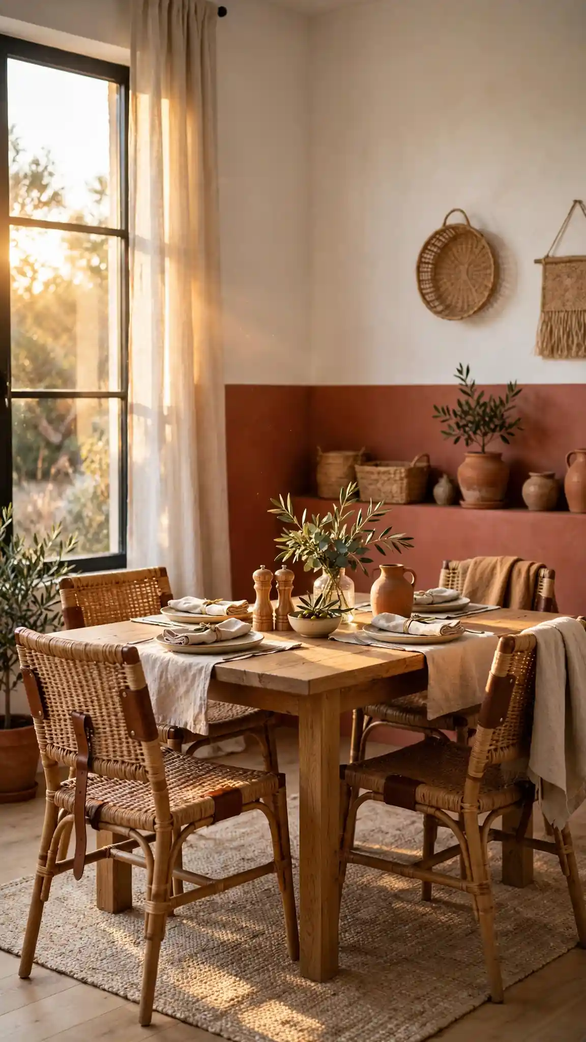
Terracotta below and warm white above wraps a room in sun-baked warmth, perfect for dining rooms, sunrooms, and kitchens with southwestern or Mediterranean leanings. Try Sherwin-Williams Cavern Clay SW 7701 or Behr Terra Cotta S210-4 paired with a soft white like Swiss Coffee OC-45. Terracotta brings instant coziness and makes wood tones, leather, and woven textures look richer, so it is ideal if your furniture leans earthy. A gallon of Behr Premium Plus runs about $45 at Home Depot, keeping this inviting look budget-friendly. The white upper half keeps the ceiling bright and prevents the warm color from feeling heavy or cave-like.
Terracotta covers well in two coats over light walls thanks to its strong pigment. Set the dividing line at 60 inches for a slightly higher split that shows off the warm color, or keep it at classic chair-rail height for balance. If your terracotta dries pinker than expected, it is the undertones: look for shades labeled orange-brown rather than pink-brown on the swatch. Balance the palette with matte black or oil-rubbed bronze fixtures. Pro tip: two tone painted walls in warm earthy tones glow in golden-hour light, so plan your dividing-line photos for late afternoon when the color looks its richest.
7. Forest Green and Ivory Dining Walls
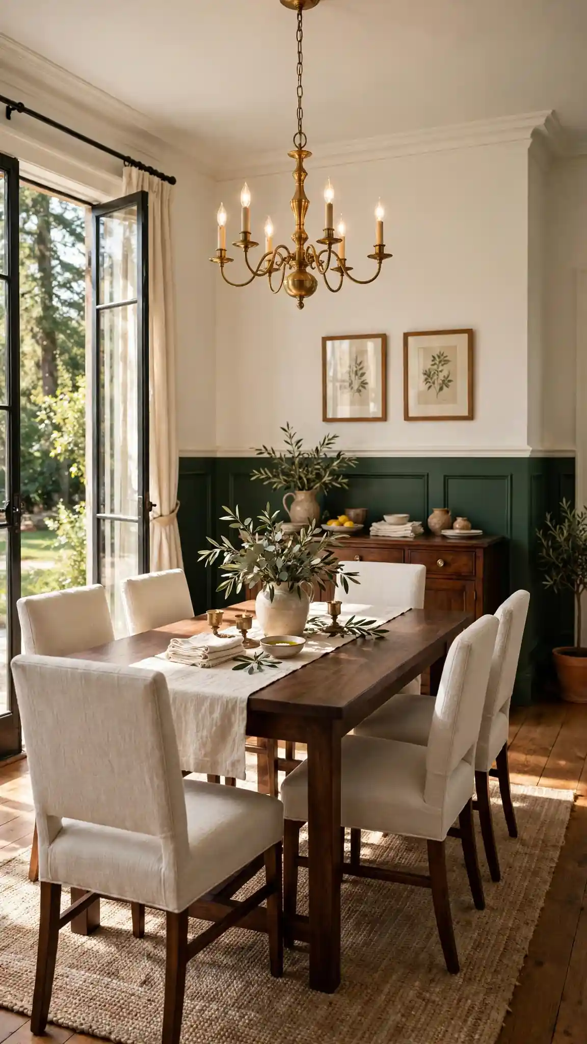
Forest green lower walls with ivory above give dining rooms a timeless, library-like richness that makes evening dinners feel special. Paint the bottom with Benjamin Moore Essex Green HC-188 or Sherwin-Williams Rookwood Dark Green SW 2816, and use Ivory Tusk SW 9146 or Linen White above. The deep green reads elegant rather than trendy, and it pairs beautifully with brass chandeliers, dark wood tables, and cream linen upholstery. A 12-by-14-foot dining room needs about two gallons of premium paint, roughly $110 to $150 total from Sherwin-Williams or Lowe’s. Run the split at 36 inches to echo traditional wainscoting proportions and let the green frame your furniture like a gallery wall.
Deep greens achieve full coverage in two coats over primer, but skip the cheap roller sleeves that shed lint into dark paint. Invest in a $12 to $15 quality roller and 2.5-inch angled brush for cutting in along the ceiling line. Mark your dividing line with painter’s tape, then seal the tape edge by painting over it with the ivory color first so any bleed matches the upper wall. Remove the tape while the green is still slightly damp for razor-sharp lines. Pro tip: deep green two tone painted walls look their best with warm 2700K dining lighting, which brings out the color’s richness instead of flattening it.
8. Arched Accent Two Tone Painted Walls
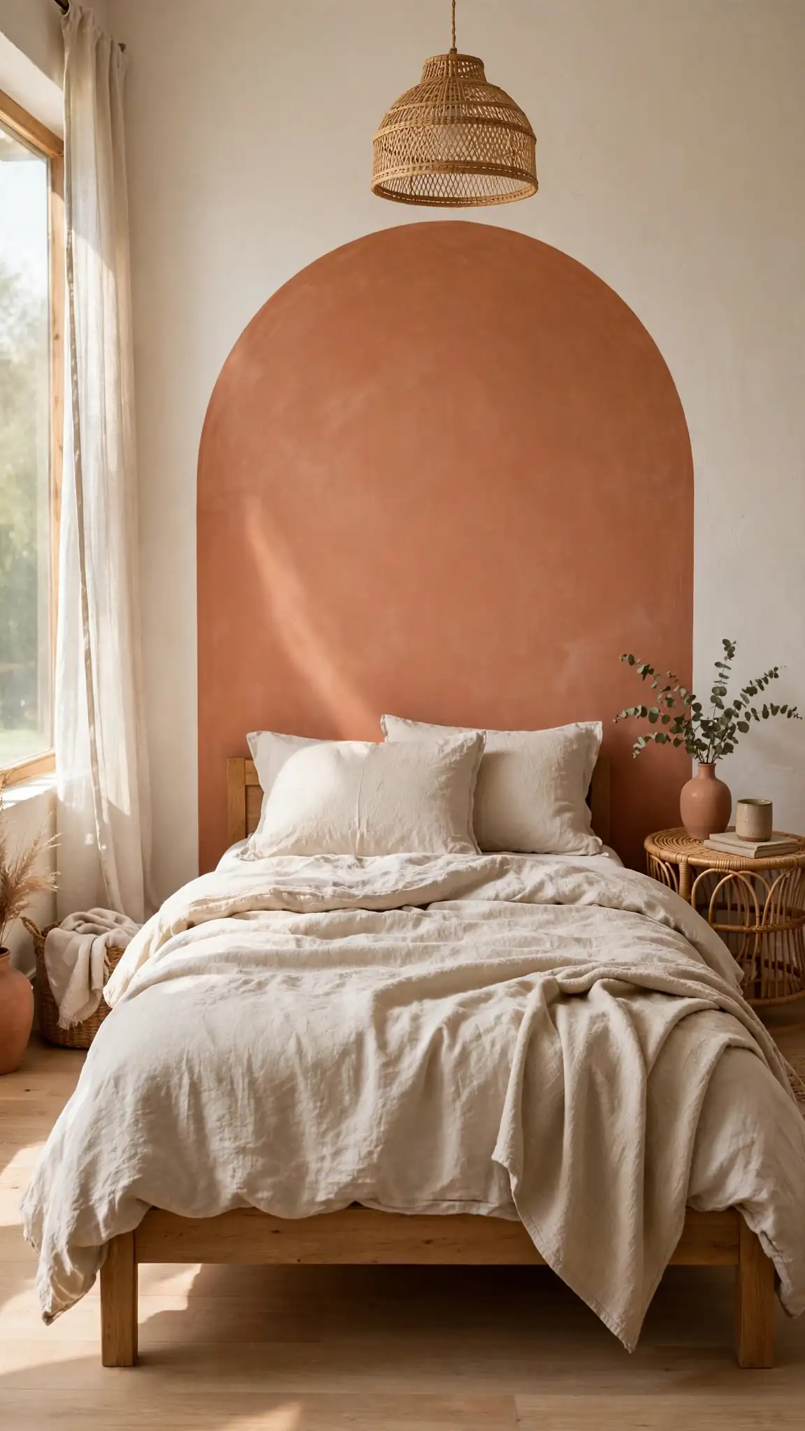
Instead of a straight dividing line, paint an arch shape in your accent color over a neutral base for two tone painted walls with artistic, Mediterranean flair. Fill a large arch in clay, sage, or dusty rose across one wall, keeping the surrounding wall warm white. The arch can frame a bed headboard, a console table, or a reading chair, creating a built-in focal point without furniture. Trace the arch with a pencil tied to a string pinned at the center point, or use a large round object like a hula hoop as a guide. This technique needs only a quart of accent paint (about $15 to $25), making it the cheapest dramatic upgrade on this list.
For a crisp arch edge, cut in carefully with a small 1.5-inch angled brush rather than relying on tape, since curved tape can wrinkle and bleed. Paint two coats, letting each dry completely, and touch up the outer edge with the base wall color for a flawless curve. Arches look best when the shape is generous: make it at least 48 inches wide so it reads as intentional rather than a blob. Center the arch over your furniture, leaving 6 to 8 inches of white space above the headboard or table. Pro tip: arched two tone painted walls photograph like custom murals, so this single accent can carry an entire bedroom or nursery design.
9. Striped Two Tone Walls for Hallways
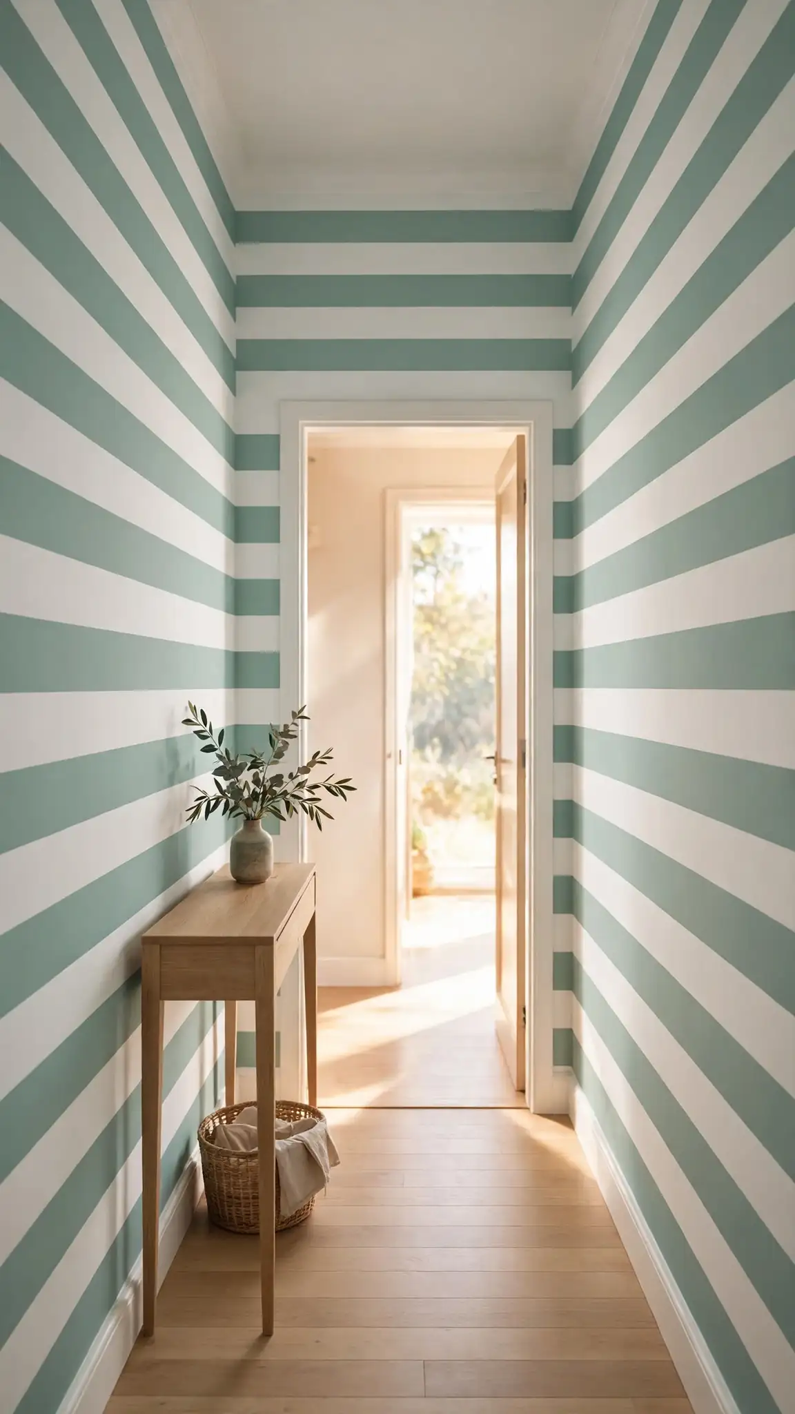
Wide horizontal stripes in two complementary colors stretch narrow hallways visually and add playful energy to entryways. Alternate 12-inch bands of a soft color like Sherwin-Williams Sea Salt SW 6204 with crisp white, or go bold with 18-inch navy and gray stripes for a nautical feel. Stripes require patience but only basic tools: a laser level, FrogTape, and two gallons of paint for most hallways at about $110 total. The horizontal lines trick the eye into seeing more width, which is exactly what tight corridors need. Keep furniture minimal in striped hallways so the pattern stays the star, and choose an eggshell finish that resists scuffing in high-traffic zones.
Measure and tape all stripes before painting anything, stepping back to confirm the spacing looks even. Paint the lighter color across the entire wall first, let it cure 24 hours, then tape off and fill the darker bands. Use a small 4-inch roller for stripes to keep edges tight and reduce drips. Pull tape as soon as the second coat is touch-dry to avoid peeling. For a softer look, use two close shades of one color family instead of high contrast. Pro tip: striped two tone painted walls hide wall imperfections better than solid colors, since the eye reads the pattern before any bumps.
10. Ombre Fade Two Tone Painted Walls
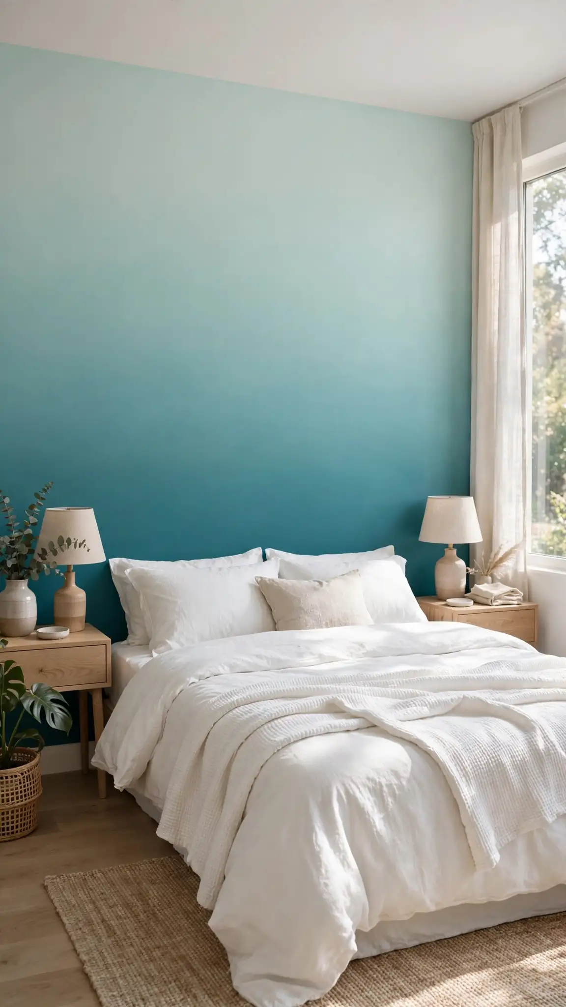
An ombre fade blends one color into another with a soft gradient, giving two tone painted walls a dreamy, hand-painted quality. Choose two shades of the same color family, like Sherwin-Williams Rainwashed SW 6211 fading into Topsail SW 6217, or go dramatic with deep teal melting into pale aqua. The technique works best on a single accent wall in bedrooms and bathrooms, where the soft transition feels spa-like. You will need both colors plus a large dry brush or sponge for blending, and the paint cost stays around $60 to $80 for quarts. The ombre effect disguises itself as art, so it suits renters who want impact without committing to wallpaper.
Paint the lighter shade on top and the darker shade on bottom with a two-foot overlap zone left unblended. While the paint is still wet, use a clean dry 4-inch brush in X-shaped strokes to feather the two colors together in the middle band. Work quickly in three-foot-wide vertical sections so edges never dry before blending. A spray bottle of water on a mister setting extends your working time by several minutes. Mistakes blend in easily, which makes ombre forgiving for beginners. Pro tip: ombre two tone painted walls need consistent indoor lighting to read well, so place yours opposite a window rather than beside one.
11. Dusty Blue and White Bedroom Walls
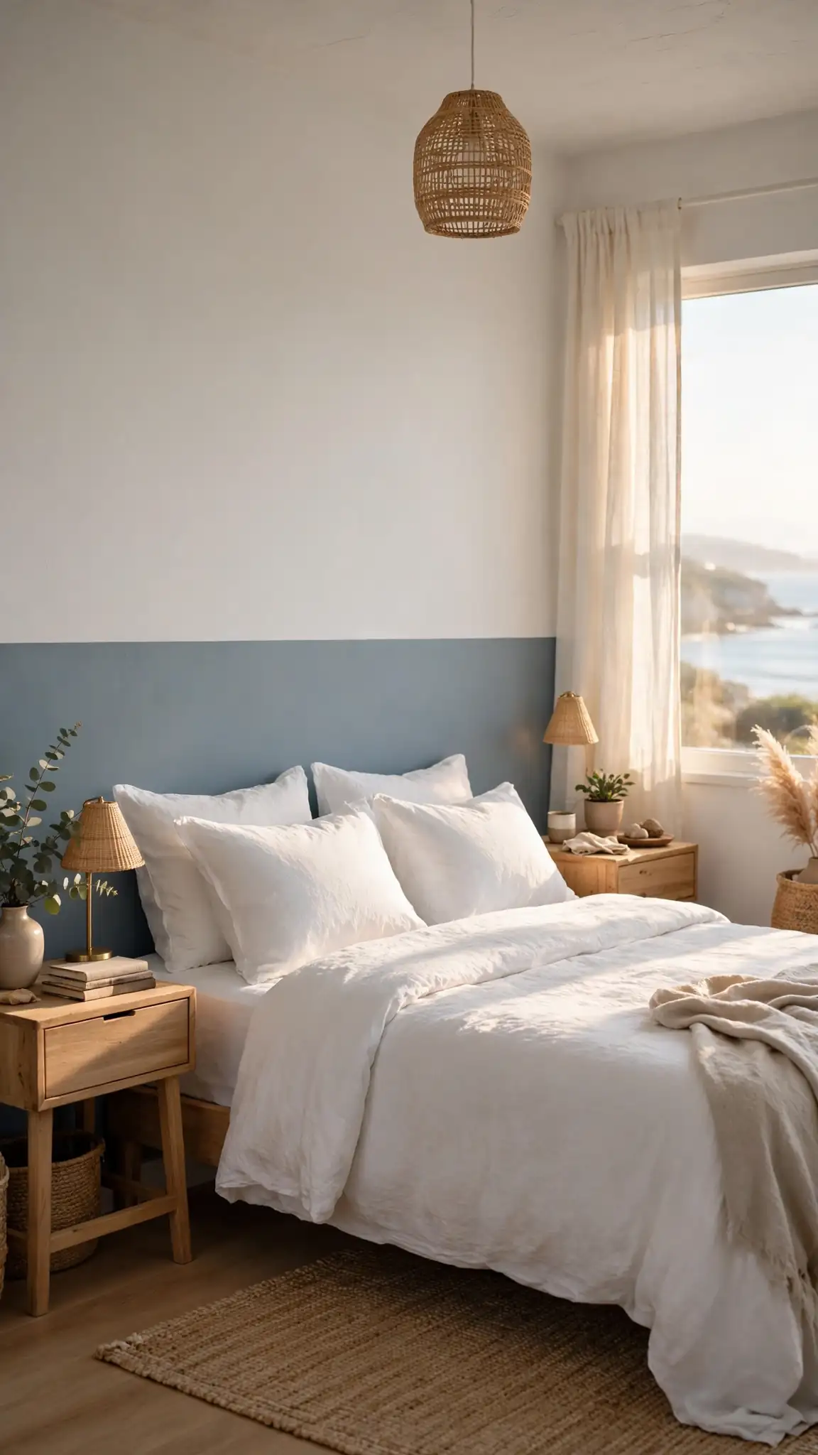
Dusty blue on the lower half and soft white above creates a serene, sleep-friendly bedroom that feels like a coastal retreat. Try Benjamin Moore Boothbay Gray HC-165 or Sherwin-Williams Misty SW 6232 with White Dove OC-17 up top. The blue-gray lower wall tucks bedding and nightstands into a cozy embrace, while the white upper half keeps morning light bouncing around the room. This palette hides dust and works with white, gray, or natural bedding, so you can refresh linens seasonally without repainting. A standard 12-by-12 bedroom needs about two gallons total, roughly $110 to $150 for premium paint at Lowe’s or Home Depot.
Split the wall at about 48 inches, just below typical nightstand height, so the color change sits behind your lamps and creates a layered backdrop. Use a matte or flat finish on the blue lower half to deepen its chalky softness, and eggshell above for easy cleaning. If your room gets strong afternoon sun, the dusty blue may read brighter than the swatch, so test a large sample board first. Add simple white trim at the dividing line for a cottage feel, or leave the line crisp for modern styling. Pro tip: blue two tone painted walls lower perceived room temperature, so pair them with warm wood tones and brass accents to keep the bedroom feeling cozy.
12. Greige and White Modern Living Walls
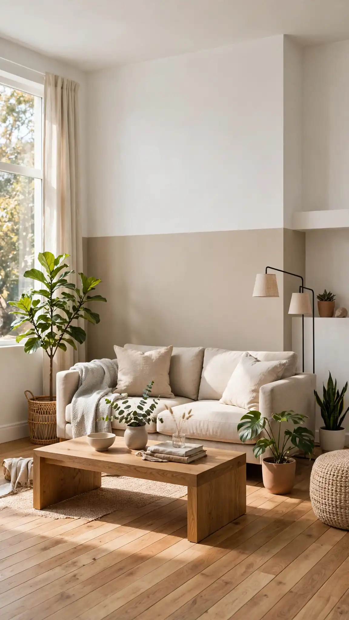
Greige, that perfect blend of gray and beige, paired with bright white delivers the clean, modern look that dominates current living room design. Paint the lower walls Sherwin-Williams Agreeable Gray SW 7029 or Benjamin Moore Revere Pewter HC-172, with Chantilly Lace OC-65 or Extra White SW 7006 above. The greige base hides everyday wear from kids and pets while looking far more interesting than plain beige. This neutral pairing lets your furniture, art, and textiles do the talking, making it the safest choice for open-concept spaces that flow into kitchens and dining areas. Two gallons of mid-range paint cover most living rooms for about $100 to $130.
Divide living room walls at 42 to 48 inches for a contemporary proportion that feels fresh rather than traditional. Because greige is so light-sensitive, paint a test swatch on each wall and check it morning, noon, and night before committing; north-facing rooms can push it toward gray while southern light warms it up. Cut in carefully at the ceiling since white-on-white edges show every wobble. Use the greige on an adjacent accent wall’s full height to tie the scheme together. Pro tip: greige two tone painted walls act as a neutral backdrop for bold seasonal decor, so one paint job supports endless pillow and throw swaps.
13. Horizontal Split Dining Room Walls
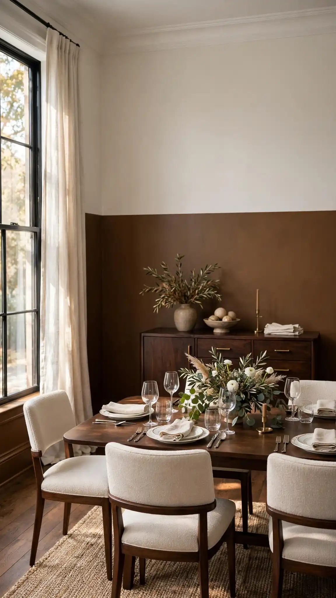
A horizontal split with a deep accent color below and pale neutral above gives dining rooms formal polish without expensive millwork. Try Sherwin-Williams Urbane Bronze SW 7048 on the lower half with Shoji White SW 7042 above for a warm, modern pairing that flatters both candlelight and overhead fixtures. The dark base makes sideboards and dining chairs look intentional and expensive, while the pale upper wall lifts the ceiling visually. Divide at 36 inches for traditional proportions, or raise the line to 60 inches for a contemporary look that shows off more of the dramatic color. A standard dining room needs about two gallons total, keeping material costs around $120 to $150.
For the crispest line, apply painter’s tape over the fully dried upper color, then brush a thin coat of the upper color along the tape’s bottom edge to seal it. Once that seal coat dries, paint the lower color with two full coats, then remove the tape immediately after the second coat. Dark bronze tones may need a gray primer underneath for even coverage in two coats. Keep the same dividing height on all walls, measuring from the floor at multiple points since floors are rarely level. Pro tip: horizontal two tone painted walls make low ceilings feel higher when the lighter color occupies at least the top two-thirds of the wall.
14. Vertical Color Block Two Tone Walls
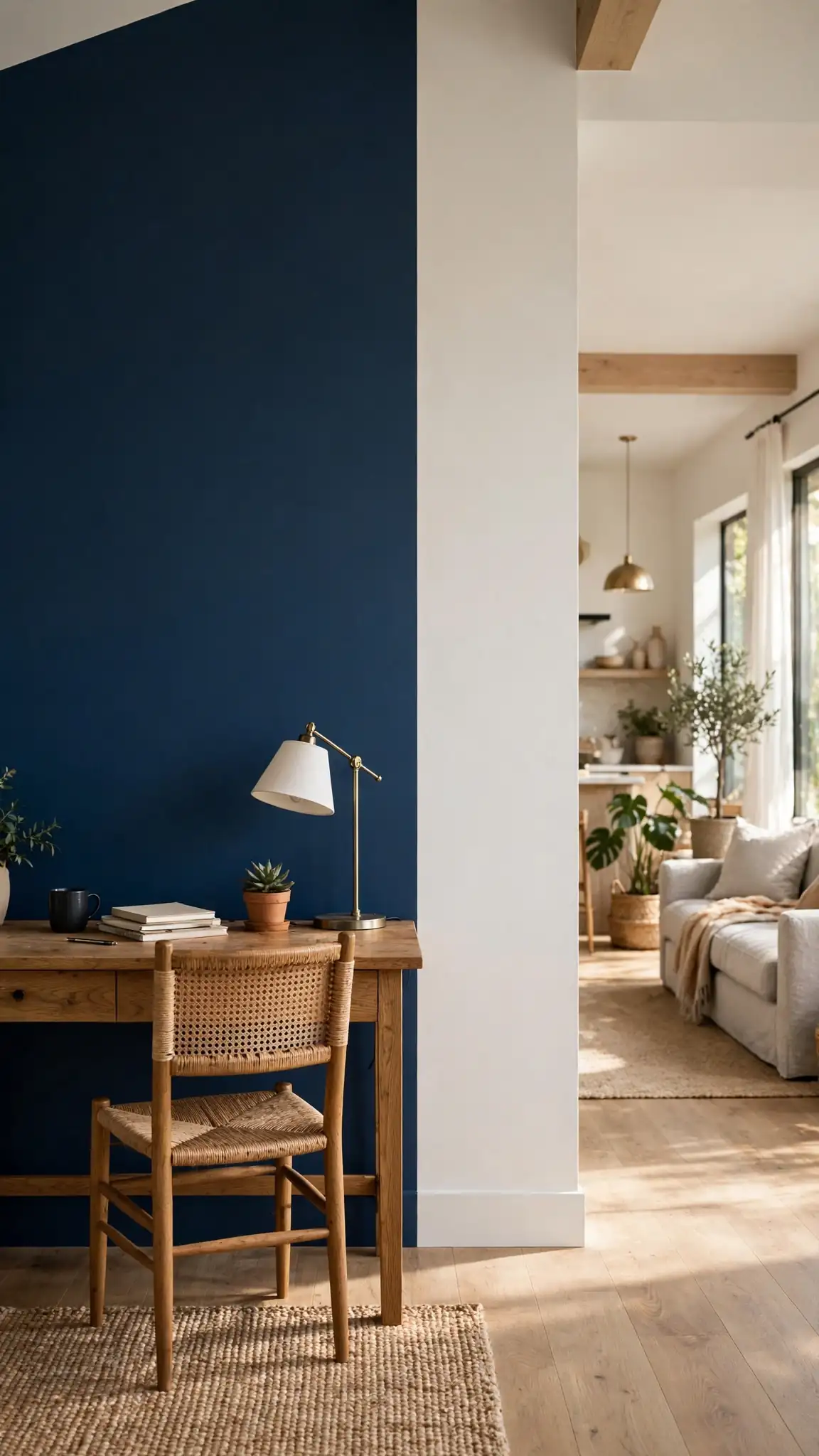
Vertical color blocking splits a wall into side-by-side color fields instead of top and bottom, creating two tone painted walls with bold, graphic energy. Paint two-thirds of a wall in a deep shade like Benjamin Moore Newburyport Blue HC-155 and the remaining third in warm white, or divide evenly for symmetry. This technique defines zones in open-plan spaces: the colored section can anchor a desk nook, a reading corner, or a dining area within a larger room. The vertical line draws the eye upward, which subtly increases perceived ceiling height. You will need about one gallon of each color for a single accent wall, roughly $110 to $140 total.
Use a laser level or plumb bob to mark a vertical dividing line, since even a slight lean will be obvious. Tape the line with FrogTape and seal the edge with the base color, as you would for a horizontal split. Paint the accent color first, then the white, overlapping the tape slightly for full coverage. Vertical blocks look most deliberate when the color field aligns with furniture: center the desk, bed, or shelving unit inside it. Leave a few inches of white margin at the ceiling if your line wavers up high. Pro tip: vertical two tone painted walls double as art, so skip hanging pictures on the color-blocked section and let the paint carry it.
15. Dark Teal and Soft White Walls
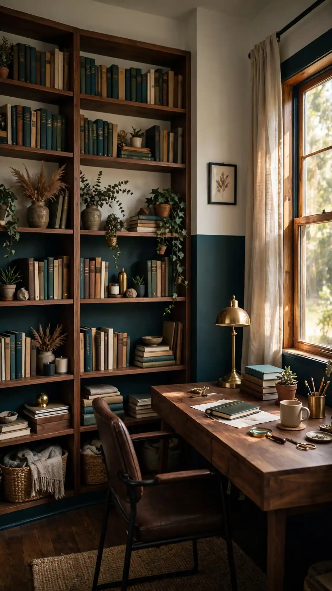
Dark teal below and soft white above brings jewel-box richness to home offices, libraries, and moody bedrooms. Choose Sherwin-Williams Still Water SW 6223 or Benjamin Moore Newburg Green HC-158 paired with a gentle white like White Heron OC-57. Teal sits between blue and green, so it feels both calming and sophisticated, and it makes brass, gold, and warm wood accents glow. The dark lower half concentrates color where the eye rests on furniture, while the white top keeps the room from feeling closed in. Two gallons of premium interior paint cover most rooms for about $110 to $150 at Sherwin-Williams or Lowe’s.
Teal is a heavily pigmented color, so start with a gray-tinted primer to reach full depth in two coats instead of three. Split at 54 inches in offices to clear desk height, or at 36 inches in bedrooms for classic proportions. Use a satin finish on the teal half for wipeability in workspaces, and matte on the white upper to avoid glare under bright lights. Dark colors absorb light, so add a floor lamp or picture lights to keep the lower wall from going flat. Pro tip: teal two tone painted walls pair beautifully with emerald or mustard textiles, so repeat the accent color in pillows or curtains for a designer finish.
16. Mustard Yellow and Cream Walls
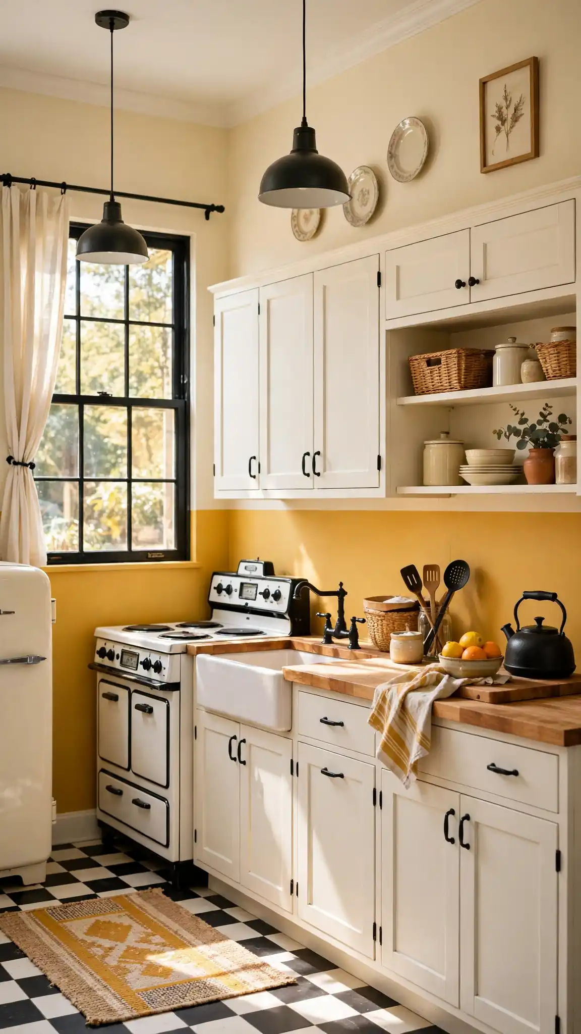
Mustard yellow below and warm cream above injects cheerful, retro energy into kitchens, mudrooms, and kids’ spaces. Try Behr Golden Hour S300-4 or Sherwin-Williams Compatible Cream SW 6387 as the accent with a soft cream like Navajo White OC-95 above. Mustard is bold without being neon, and it plays wonderfully with white cabinets, butcher block, and black hardware for a playful vintage-kitchen vibe. The cream upper half tempers the yellow so the room feels sunny rather than overwhelming. A gallon of Behr Premium Plus costs about $45 at Home Depot, making this one of the most affordable transformations on the list at under $100 for most rooms.
Yellow paint is notoriously sheer, so plan on three thin coats over a white primer for even, rich coverage. Split the wall at 48 inches so the cheerful color wraps the lower half where it energizes the space without dominating sightlines. Cut in carefully where yellow meets cream, since contrast makes wobbles visible; a steady hand and a quality 2.5-inch angled brush are worth the $15 investment. Let each coat dry fully, as yellow can look streaky when rushed. Pro tip: mustard two tone painted walls look richer with warm white trim rather than stark white, which can make the yellow appear harsh by comparison.
17. Blush Pink and Charcoal Walls
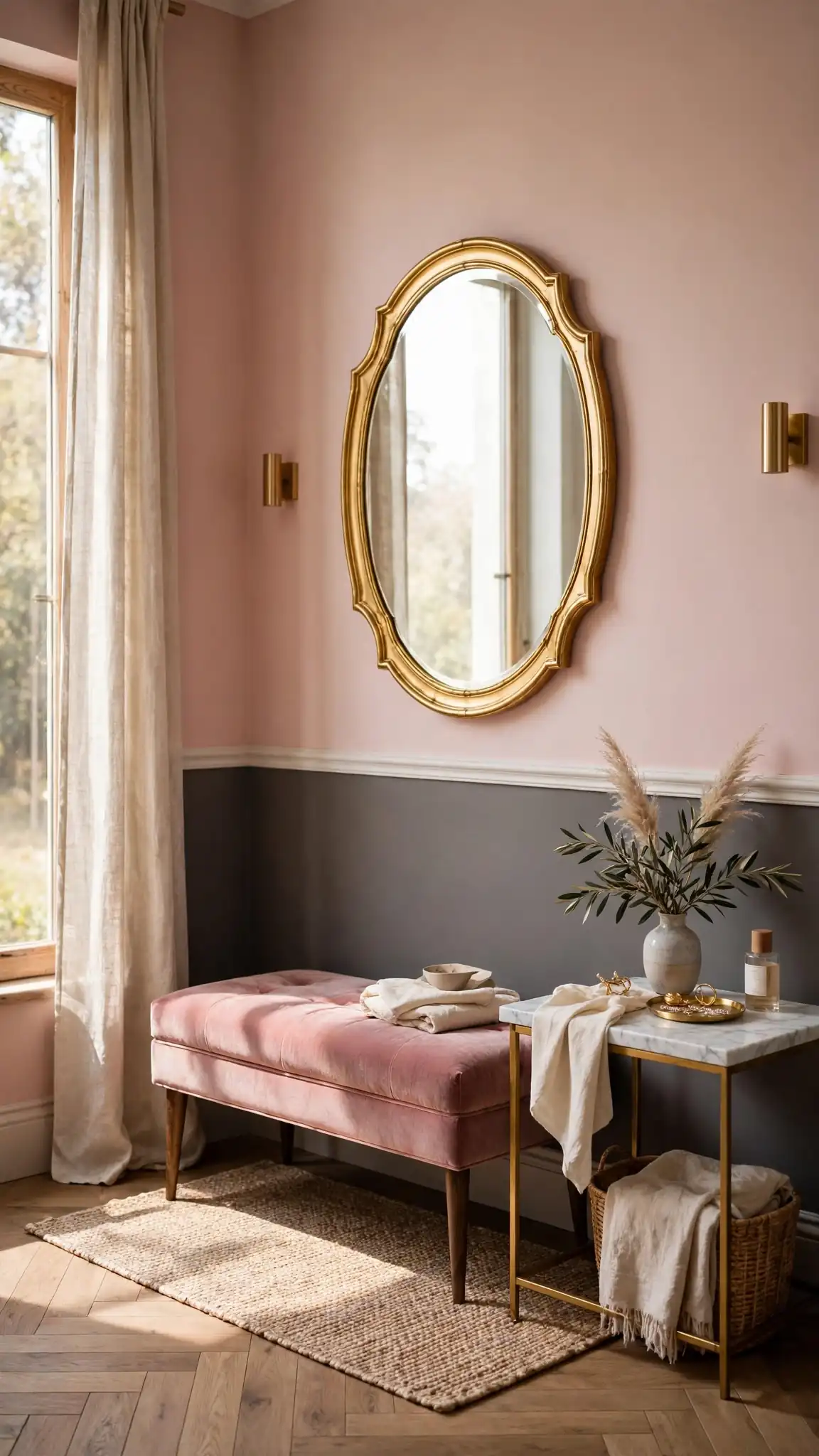
Blush pink above and charcoal below creates an unexpectedly chic pairing that works in bedrooms, dressing areas, and creative studios. Paint the upper wall Benjamin Moore First Light 2102-70 or Sherwin-Williams Intimate White SW 6322, with the lower in a soft charcoal like Kendall Charcoal HC-166. The charcoal base grounds the sweetness of the blush, keeping the room sophisticated rather than sugary. This combination flatters gold mirrors, velvet upholstery, and marble surfaces, giving boutique-hotel vibes on a DIY budget. Two gallons of premium paint run about $110 to $150, and the split at 48 inches keeps the dark tone at furniture level where it hides scuffs.
Blush pinks can shift under different lighting, so test your sample in both daylight and lamplight before committing to gallons. Paint the blush upper first since it is lighter, then tape and apply the charcoal below with two coats over gray primer. A matte finish on both colors keeps the pairing soft and modern, while satin on the charcoal adds subtle depth. Keep bedding and curtains in the blush family with charcoal accents to echo the wall split. Pro tip: blush and charcoal two tone painted walls photograph with a flattering glow, making this pairing a favorite for home offices that appear on video calls.
18. Two Tone Painted Walls Behind Open Shelving
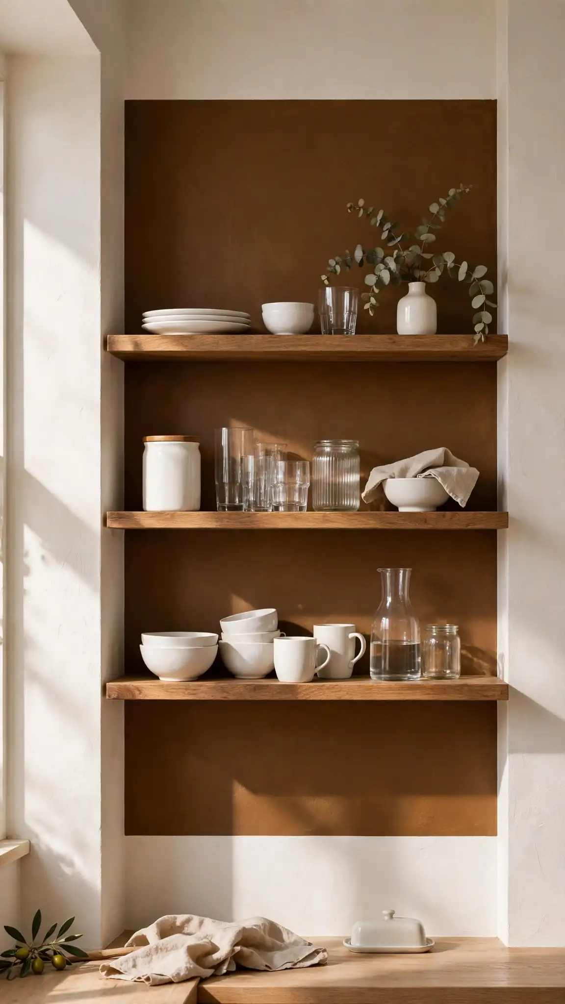
Painting a bold color block behind open kitchen shelving turns your dishes and glassware into a styled display against two tone painted walls. Use a deep shade like Sherwin-Williams Urbane Bronze SW 7048 or Inkwell SW 6992 on the shelving wall section, keeping surrounding walls warm white. The dark backdrop makes white ceramics, clear glass, and wood cutting boards pop like a curated shop display. Mark the color block to extend 6 inches beyond the shelves on each side and 12 inches above the top shelf for a framed effect. A single quart of premium paint ($15 to $25) covers most shelving walls, making this the highest-impact upgrade per dollar in the kitchen.
Remove the shelves and brackets before painting so you get clean coverage with no hardware shadows. Patch and sand the wall first, since a dark backdrop shows every bump. Use a satin or semi-gloss finish behind shelving so the wall wipes clean of cooking splatter. Reinstall shelves with a level, and style them with the rule of thirds: group items in odd numbers with breathing room between. Keep everyday dishes within reach and decorative pieces up high. Pro tip: dark two tone painted walls behind open shelving make even mismatched dishes look intentional, so this trick rescues rental kitchens with random hand-me-downs.
19. Scalloped Edge Two Tone Painted Walls
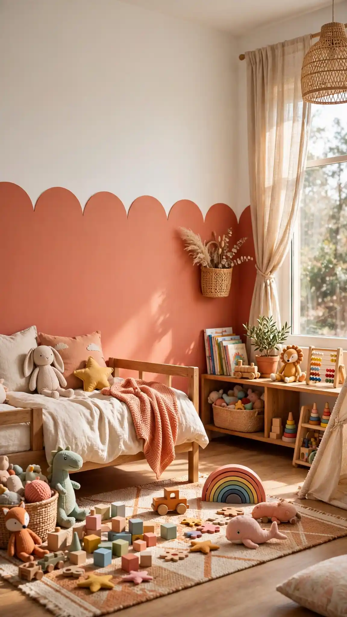
A scalloped dividing edge replaces the straight line with a row of playful half-circles, giving two tone painted walls a whimsical, hand-crafted feel. This treatment shines in kids’ rooms, nurseries, and creative studios: paint the lower half a fun color like Behr Coral Clay MQ4-25 with white scallops dipping down from the upper wall, or invert it for bolder drama. Trace the scallops with a round template like a mixing bowl or a large lid, spacing them evenly with a level line as your guide. The technique needs only basic supplies plus patience, with paint costs around $60 to $90 for a single accent wall.
Draw the full scallop row in pencil first and step back to check the rhythm before painting anything. Fill each scallop with a small 2-inch brush, keeping edges smooth, then touch up the background color along the curves for crisp lines. Scallops read best at 8 to 12 inches wide; smaller scallops look busy and take much longer. Use the accent color at about one-third wall height so the pattern stays a charming detail rather than overwhelming the room. Pro tip: scalloped two tone painted walls hide imperfect wall texture, since the eye follows the curves instead of scanning for bumps.
20. Olive Green and Warm Gray Walls
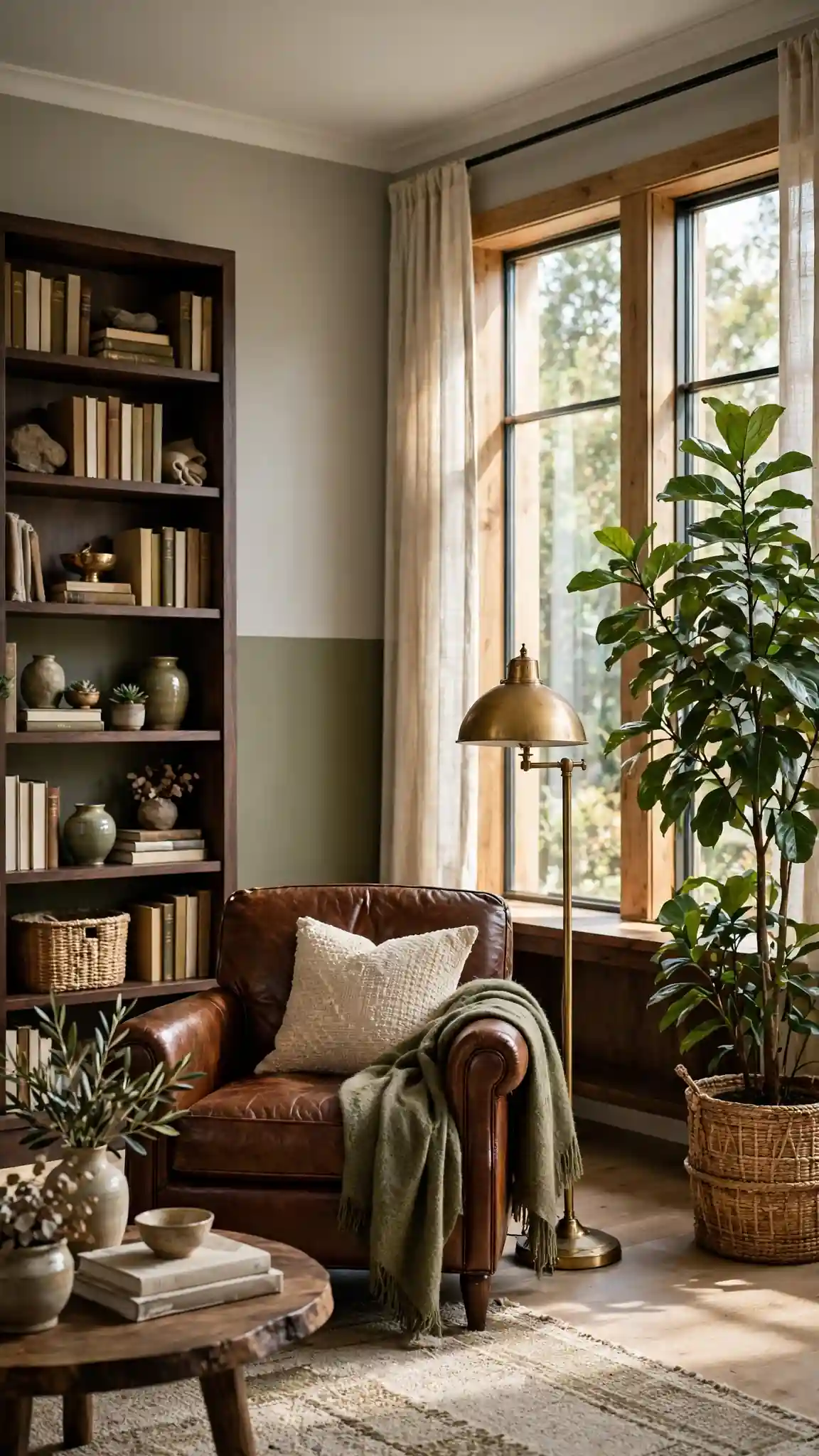
Olive green below and warm gray above creates an earthy, sophisticated pairing that suits living rooms, dens, and home offices. Try Sherwin-Williams Retreat SW 6207 on the lower half with Agreeable Gray SW 7029 above for a layered neutral scheme with real personality. Olive brings nature indoors and pairs beautifully with leather, dark wood, and brass, while the warm gray upper keeps the palette calm and cohesive. This combination works in both traditional and modern settings, making it one of the most versatile ideas on this list. Two gallons of premium interior paint cost about $120 to $150 and cover a standard living room with two coats.
Split olive-and-gray walls at 48 inches for balanced proportions, and consider adding a thin wood trim at the dividing line for extra polish. Olive can look muddy under cool lighting, so use warm 2700K to 3000K bulbs to bring out its richness. Paint the gray upper first, then tape and apply the olive below with two coats over primer for even coverage. Echo the olive in throw pillows or an area rug to make the scheme feel intentional. Pro tip: olive green two tone painted walls make houseplants look spectacular, so place your fiddle-leaf fig or monstera against the green half for a magazine-worthy vignette.
21. Chocolate Brown and Cream Two Tone Walls
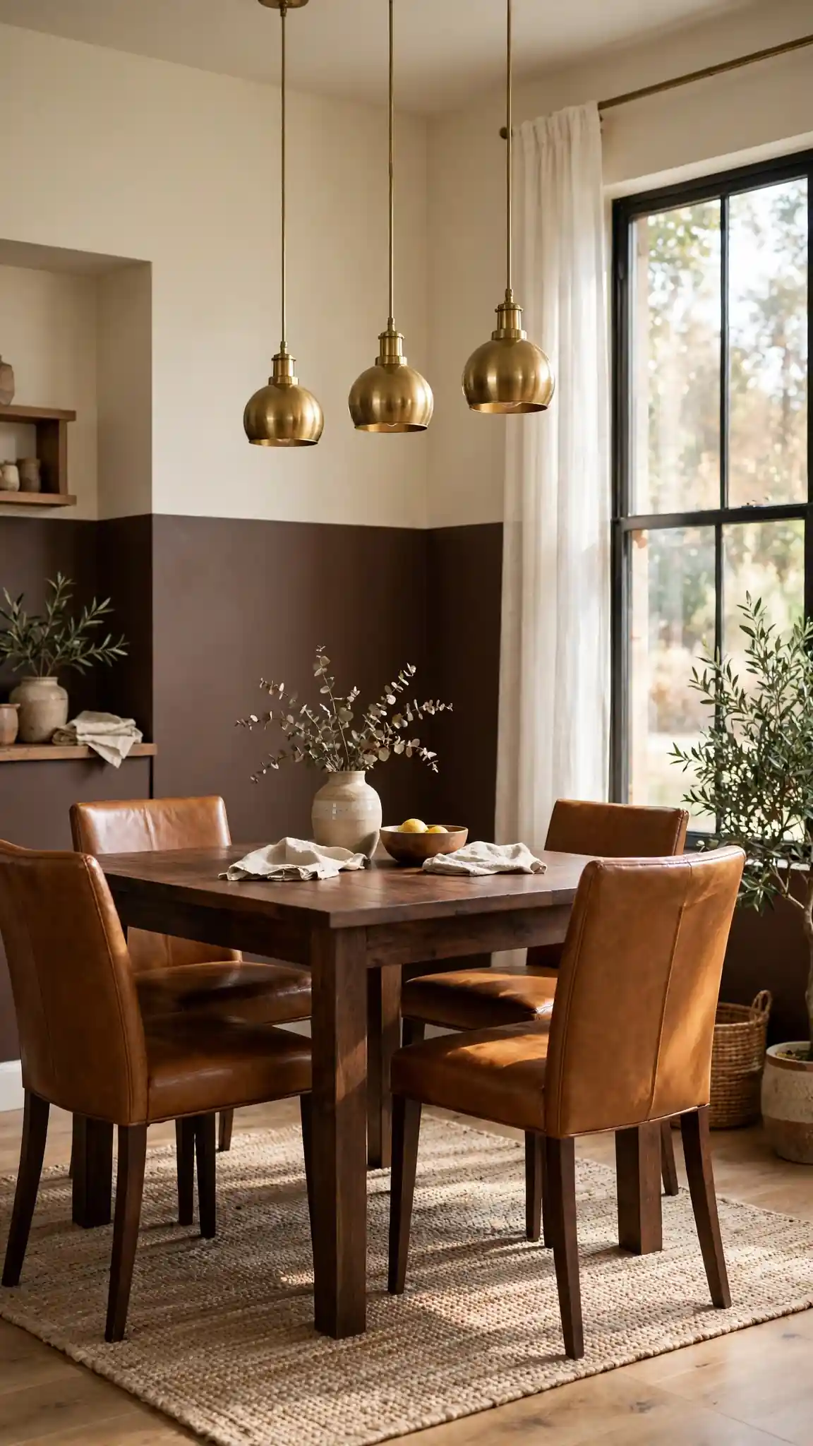
Chocolate brown lower walls with cream above wrap a room in rich, cozy warmth that feels like a favorite coffee shop. Paint the bottom with Benjamin Moore Chocolate Sundae 2113-10 or Sherwin-Williams Turkish Coffee SW 6076, and use a soft cream like Muslin OC-12 above. The deep brown grounds heavy furniture and hides wear beautifully, while the cream upper prevents the room from feeling dark. This pairing excels in dining rooms, libraries, and dens where you want intimate, conversation-friendly atmosphere. Brown paint costs the same as any premium gallon, about $55 to $75, so two gallons keep the project around $120 to $150 total.
Dark brown needs a gray-tinted primer and two to three thin coats for full, even coverage, so do not skip prep. Divide the wall at 36 inches for a classic look that suits the richness of the color. Use a satin finish on the brown half for subtle sheen and easy cleaning, and eggshell on the cream upper. Brass or gold lighting fixtures and warm wood furniture amplify the cozy factor. Keep textiles in cream, caramel, and rust tones to build a tonal, layered look. Pro tip: chocolate brown two tone painted walls look most luxurious with layered lighting, so add a table lamp or wall sconces rather than relying on a single overhead light.
22. Deep Plum and Off-White Two Tone Walls
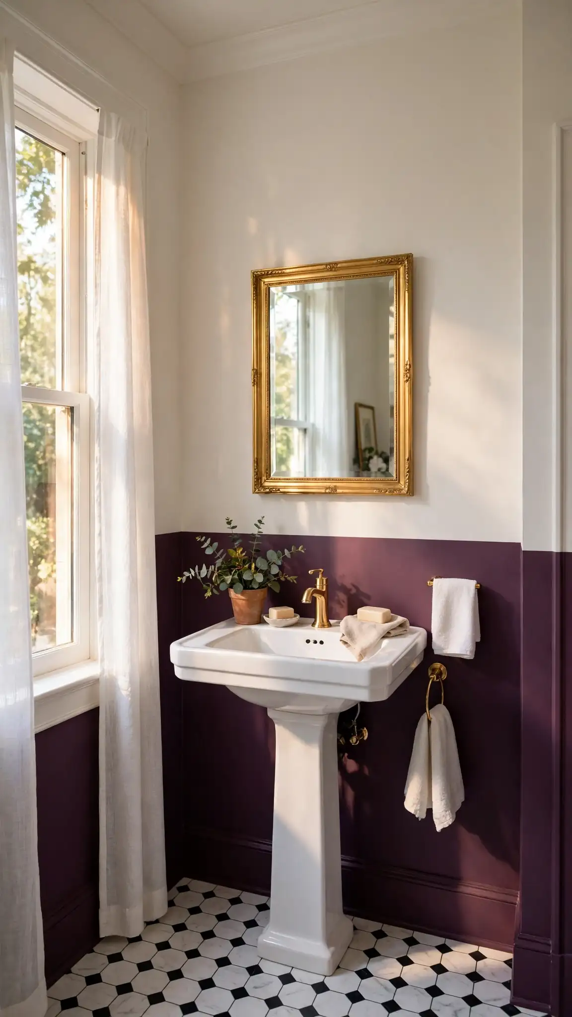
Deep plum below and off-white above delivers dramatic, jewel-toned elegance for bedrooms, powder rooms, and dining rooms. Choose Benjamin Moore Shadow 2117-30 or Sherwin-Williams Expressive Plum SW 6271 paired with a gentle off-white like White Dove OC-17. Plum reads as luxurious rather than girly, especially when balanced with brass, marble, and dark wood accents. The dark lower half creates intimacy while the off-white upper keeps the ceiling feeling lofty. A powder room needs only a quart or two of each color ($30 to $50 total), while a bedroom takes about two gallons at roughly $110 to $150. This is the boldest pairing on the list and the most rewarding.
Plum is a complex color that shifts between purple and brown under different lights, so sample it on all four walls before buying gallons. Use a gray primer underneath and plan on two full coats, cutting in carefully where the plum meets the off-white. Split at 48 inches in bedrooms or take the plum higher, to 60 inches, in powder rooms for extra drama in a small space. A matte finish deepens the color’s velvety richness. Balance the palette with plenty of white and metallic accents so the room feels glamorous, not heavy. Pro tip: plum two tone painted walls make the perfect backdrop for a gallery wall, since the dark tone makes white mats and gold frames pop dramatically.
Final Thoughts
Two tone painted walls prove that the biggest design impact often comes from the simplest techniques. With just two paint colors, some painter’s tape, and a free weekend, you can add architectural character, correct awkward proportions, and introduce rich color without overwhelming a room. The 22 ideas above cover every style from calm sage bedrooms to dramatic plum dining rooms, and each one costs far less than wallpaper, paneling, or new furniture. Start with a small room like a powder room or hallway to build confidence, then take on the kitchen or living room once you have your technique down. The dividing line is your design signature, so place it thoughtfully.
Remember that the best two tone painted walls look intentional, so always test your colors on large sample boards and check them in morning and evening light before buying gallons. Invest in quality tape and a laser level, because crisp lines are what separate a designer look from a DIY disappointment. Keep your paint finishes practical: washable satin or eggshell where hands touch, and matte where you want depth. Most importantly, have fun with the process. Repainting is always an option, which makes two tone painted walls one of the lowest-risk, highest-reward projects in home decor. Pick your pairing, grab your brushes, and transform your space this weekend.
FAQs
Two tone painted walls look simple, but getting crisp lines and the right color balance takes some know-how. These are the questions readers ask most often before picking up a brush, covering everything from where to place the dividing line to which paint finishes work best. Read through these answers to avoid the common mistakes that turn a promising project into a weekend of touch-ups.
Whether you are painting your first accent wall or refreshing a whole kitchen, the fundamentals stay the same: good prep, quality tape, and the right color pairing. The answers below draw on professional painter techniques and real product recommendations from Sherwin-Williams, Benjamin Moore, and Behr. Keep this section handy while you shop for supplies at Home Depot or Lowe’s.
What are two tone painted walls?
Two tone painted walls use two different paint colors on the same wall, divided by a crisp horizontal, vertical, or shaped line. The most common style splits the wall horizontally, with a darker color below and a lighter color above, mimicking traditional wainscoting. This technique adds depth, contrast, and architectural interest without the cost of wallpaper or trim work.
Where should I place the dividing line on two tone painted walls?
The classic placement is 36 inches from the floor, matching traditional chair-rail height. For a modern look, try 48 to 54 inches, or split at one-third from the floor for drama. In kitchens, run the line just above counter height at about 54 inches. Always measure from the floor at several points, since floors are rarely perfectly level.
Which paint finish is best for two tone walls?
Use eggshell or satin on the lower half since it gets more contact and needs to wipe clean. Matte or flat finishes work beautifully on the upper half, adding depth without glare. For trim at the dividing line, choose semi-gloss for durability and subtle contrast. Avoid high-gloss on large wall areas, as it highlights every imperfection.
How much does it cost to paint two tone walls?
Most single rooms cost $100 to $150 in paint and supplies using premium brands like Sherwin-Williams, Benjamin Moore, or Behr. You will need about two gallons total for an average 12-by-12 room, plus painter's tape ($9), a quality roller ($12), and primer if covering dark colors. Accent walls can cost as little as $30 to $50 using quarts.
Do two tone painted walls make a room look smaller?
Not when done right. A lighter color on the upper two-thirds keeps ceilings feeling high, while the darker lower half grounds the space. Vertical color blocking can even make ceilings look taller. The key is keeping the lighter shade dominant and choosing a dividing height that suits your ceiling, typically 36 to 54 inches in standard 8-foot rooms.
Can I do two tone painted walls in a rental?
Yes, especially with landlord-friendly approaches. Arched accents and color blocks need only a quart of paint and repaint easily. Stick to one accent wall to minimize reversal work, and always check your lease first. When you move out, two coats of the original white or neutral will cover most two tone designs completely.


Leave a comment