

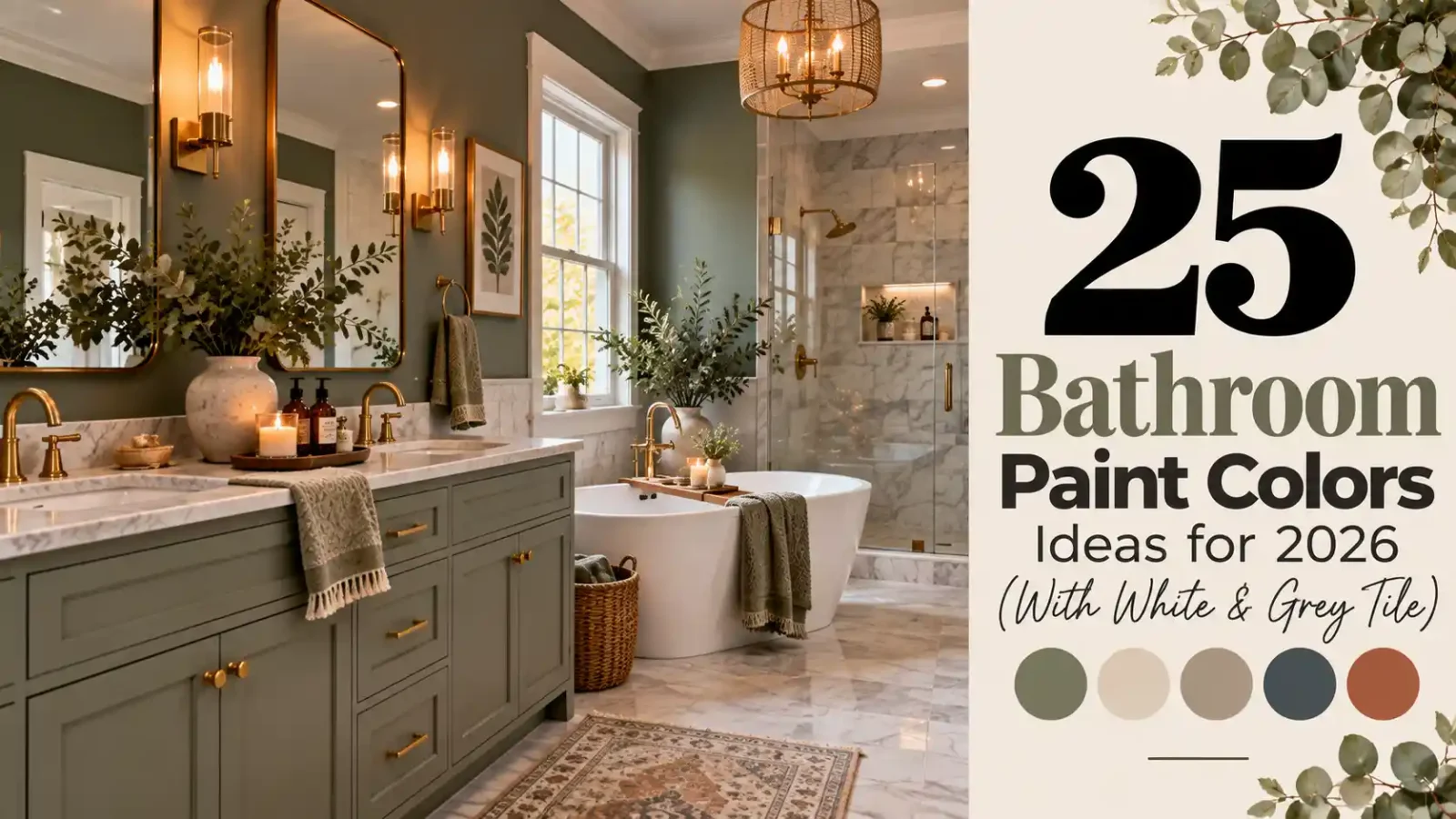
Bathroom paint color ideas are the cheapest way to transform a tired bathroom — a single gallon can cover the whole room. The trick is choosing shades that handle humidity and low light while flattering the tile you already have. These 25 colors are picked to pair beautifully with white and grey tile, with notes on finishes and lighting for small spaces.
These 25 bathroom paint colors ideas for 2026 include soft neutrals, calming blues and greens, and bold, moody hues, with specific tips for white and grey tile. For more bathroom inspiration, explore our gray shower ideas and these mid-century modern bathroom ideas.
Keep these practical points in mind:
- Use a satin or semi-gloss finish designed for bathrooms to resist moisture.
- Check your tile undertone: warm, cool or neutral.
- Test swatches under your actual vanity lights.
- Consider the ceiling color too, since it reflects onto walls.
Great bathroom paint ideas start with how the room actually gets used — steamy showers, bright morning light, and small square footage all change how a color reads on the wall. The right shade can make a cramped bath feel airy or turn a plain one into a calm retreat. Below, you will find bathroom color ideas for every layout and budget, from soft neutrals that never date to bolder tones that hold up beautifully in humid rooms.
1. Soft Sage Green
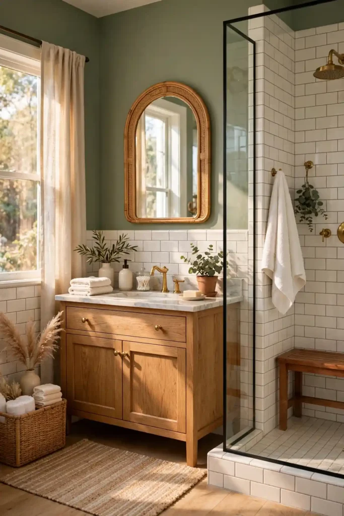
Soft sage green gives your bathroom the calm of a spa without tipping into cold or clinical territory. Its gray-green undertone flatters both white subway tile and grey porcelain, softening the crispness of white while warming up cool concrete-look surfaces. Because sage sits mid-tone on the value scale, it adds real color without closing in a small bath, and it forgives minor water spots far better than stark white. Brushed brass fixtures, oak or walnut vanities, and creamy linen towels all look richer against it. In morning light it feels fresh and airy; under warm evening bulbs it turns cozy and enveloping.
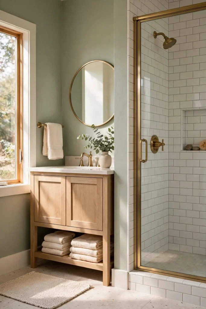
Start with proven sages: Sherwin-Williams Evergreen Fog (SW 9130), Benjamin Moore Guilford Green (HC-116), or a color-matched sage in Behr Marquee at Home Depot. Pick a satin or eggshell finish built for humidity, since bathroom paint needs moisture resistance more than sheen. Sherwin-Williams Emerald Interior costs about $90–$95 per gallon at Sherwin-Williams stores, while Behr Marquee runs roughly $55–$65 per gallon at Home Depot. Test large swatches on poster board for two full days, checking them against your tile in daylight and lamplight. Keep the ceiling bright white, caulk tub and shower edges, and run the exhaust fan for thirty minutes after showers.
2. Warm Crisp White
Warm crisp white is the safest color with the biggest payoff: it bounces light around windowless bathrooms, makes white tile look intentional instead of builder-basic, and keeps grey tile from feeling gloomy. Unlike cool, blue-tinged whites, a warm white with a whisper of yellow or pink undertone feels clean without turning sterile. It also gives you total freedom with accessories, letting you swap towels, art, and hardware seasonally without repainting. Small powder rooms instantly feel larger, and the color photographs beautifully, which matters if you ever list your home. Warmth comes from the undertone, not the brightness, so the room still reads bright and fresh.
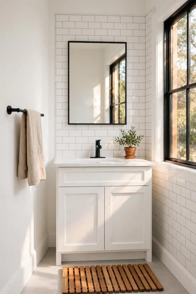
Shop Benjamin Moore White Dove (OC-17), Sherwin-Williams Alabaster (SW 7008), or Behr Blank Canvas (BDC-23), all beloved warm whites that never look dingy. A satin finish on walls resists steam and wipes clean; expect $55–$95 per gallon depending on brand and line. Buy a quart first, about $15–$25, and paint a two-foot square near the tile, since whites shift dramatically under bathroom lighting. Use semi-gloss on trim and the vanity for contrast and durability. Pair with matte black or champagne bronze hardware, add one natural texture like a teak bath mat, and your all-white bath feels designed, not default.
3. Pale Blue
Pale blue reads as clean water and open sky, which makes it a natural fit for bathrooms. It cools down a warm-toned space, flatters white tile by echoing its freshness, and gives grey tile a soft, coastal lift. Light blues also recede visually, so a narrow bath feels a touch wider, a handy optical trick for hall bathrooms and powder rooms. The color calms without sedating, pairing well with chrome fixtures, white oak, and crisp white linens. If your bathroom gets harsh afternoon sun, pale blue absorbs the glare instead of bouncing it back, keeping the room comfortable at every hour.
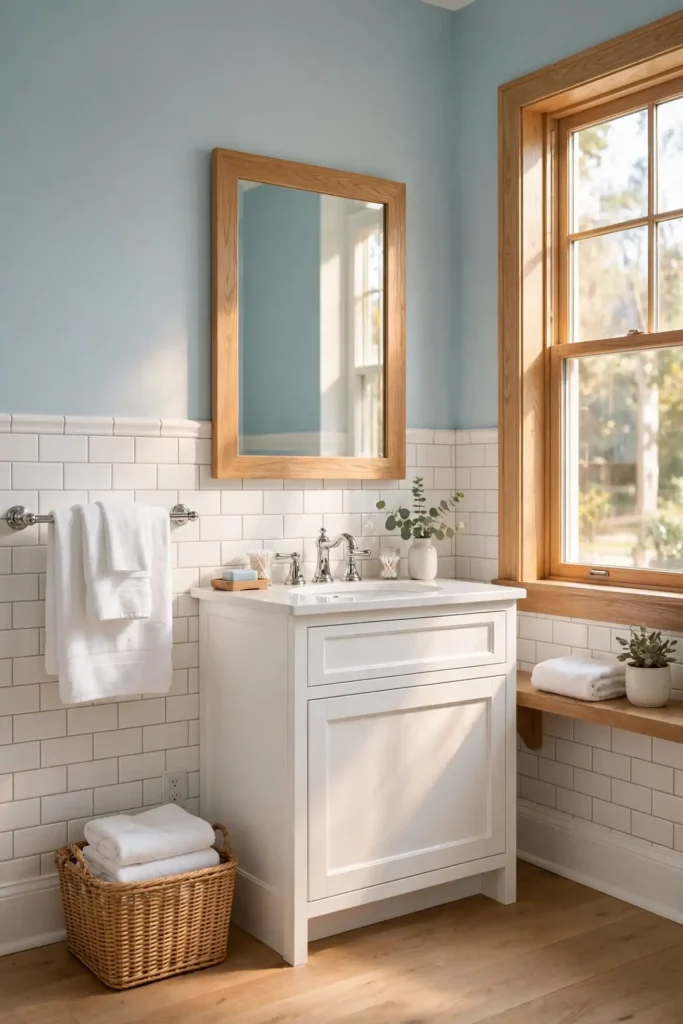
Look at Benjamin Moore Quiet Moments (1563), Sherwin-Williams Sea Salt (SW 6204), or a color-matched equivalent in Behr Marquee at Home Depot for blues that stay soft, not babyish. Satin sheen is the bathroom sweet spot, about $55–$95 per gallon for quality lines at Home Depot, Lowe’s, or paint stores. Test swatches next to your grout, because grey grout can push pale blue toward green. Keep ceilings and trim bright white to preserve the airy feel, and ground the scheme with a navy or charcoal bath mat so the palette does not float away. Two coats over a quality primer give even, streak-free coverage.
4. Navy Blue
Navy blue turns a bathroom into a jewel box: dramatic, confident, and surprisingly flattering to both white and grey tile. Against white subway tile, navy delivers crisp nautical contrast; against grey porcelain, it creates a moody, layered depth that feels expensive. Dark walls also make mirrors and chrome fixtures pop, and they hide splashes and scuffs in busy family baths. In a powder room with no shower steam to fight, navy feels like a cocktail lounge; in a full bath, balance it with plenty of white above the tile line. The key is committing fully, since timid navy just looks murky.
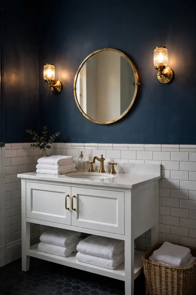
The classics are Benjamin Moore Hale Navy (HC-154) and Sherwin-Williams Naval (SW 6244), both rich without going purple. Use satin or semi-gloss so the dark color resists moisture and reflects enough light; budget roughly $70–$95 per gallon. Because dark colors show every flaw, spend time on prep: fill, sand, and prime with a tinted primer. Brass or gold hardware glows against navy, while white towels and a light rug keep it balanced. Sample on the darkest wall first, and if the room feels too cave-like, paint the ceiling white to lift it.
5. Charcoal Gray With Grey Tile
Charcoal gray layered over grey tile sounds risky, but done right it reads as sleek and spa-modern rather than gloomy. The trick is contrast: keep the grey tile on the lighter side, think large-format concrete-look porcelain, and let the charcoal walls add depth and definition. The combination hides water spots and soap scum better than any light color, a real win for high-traffic family bathrooms. Dark walls also make white fixtures, mirrors, and metallic accents stand out crisply. Under warm lighting, charcoal feels cocooning; with good daylight, it stays sophisticated and never flat.
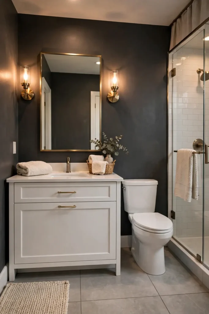
Try Sherwin-Williams Iron Ore (SW 7069) or Benjamin Moore Chelsea Gray (HC-168) for charcoals with balanced undertones. A satin or semi-gloss finish is non-negotiable here, since dark flat paint marks easily and resists moisture poorly. Expect $70–$95 per gallon for premium interior lines. Paint the ceiling bright white and add strong layered lighting: a vanity sconce pair plus overhead light prevents the cave effect. Warm up the scheme with wood tones, brushed brass, and textured towels in cream or rust. Test a full wall before committing, since charcoal shifts with every change of light.
6. Greige for Warmth
Greige, the beloved blend of gray and beige, warms up a bathroom without committing to either camp. It softens the coolness of grey tile, adds subtle warmth to white tile, and works with virtually every metal finish from chrome to oil-rubbed bronze. Because it sits in the neutral middle, greige lets statement pieces like a patterned floor tile or a walnut vanity take center stage. It also forgives the mixed undertones common in rental-grade bathrooms, bridging pink-beige tile and grey vanities gracefully. The result feels calm, current, and quietly upscale rather than trendy.
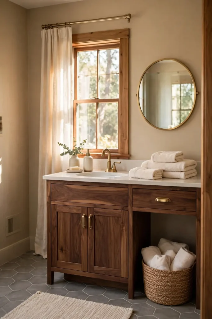
The go-tos are Sherwin-Williams Accessible Beige (SW 7036) and Agreeable Gray (SW 7029), plus Benjamin Moore Edgecomb Gray (HC-173). Stick with satin or eggshell for moisture resistance; quality gallons run $55–$95 at Lowe’s, Home Depot, or Sherwin-Williams stores. Greige undertones are sneaky, so compare swatches directly against your tile: pink-leaning greiges fight grey tile, while green-leaning ones turn muddy. Buy sample quarts for $15–$25 and live with them for two days. Finish with warm white trim, soft layered lighting, and one organic texture like seagrass or rattan to complete the warmth.
7. Blush Pink
Blush pink brings a soft, flattering glow that makes everyone look good in the mirror, the most underrated benefit of any bathroom color. It warms up cool white tile, plays beautifully against grey marble-look porcelain, and feels romantic without turning juvenile when you keep the tone dusty rather than bubblegum. Blush pairs gorgeously with brass fixtures, white oak, and crisp white linens, and it softens harsh overhead lighting into something almost candlelit. In a powder room it feels like a boutique hotel; in a primary bath it adds a gentle, spa-like warmth that never overwhelms.
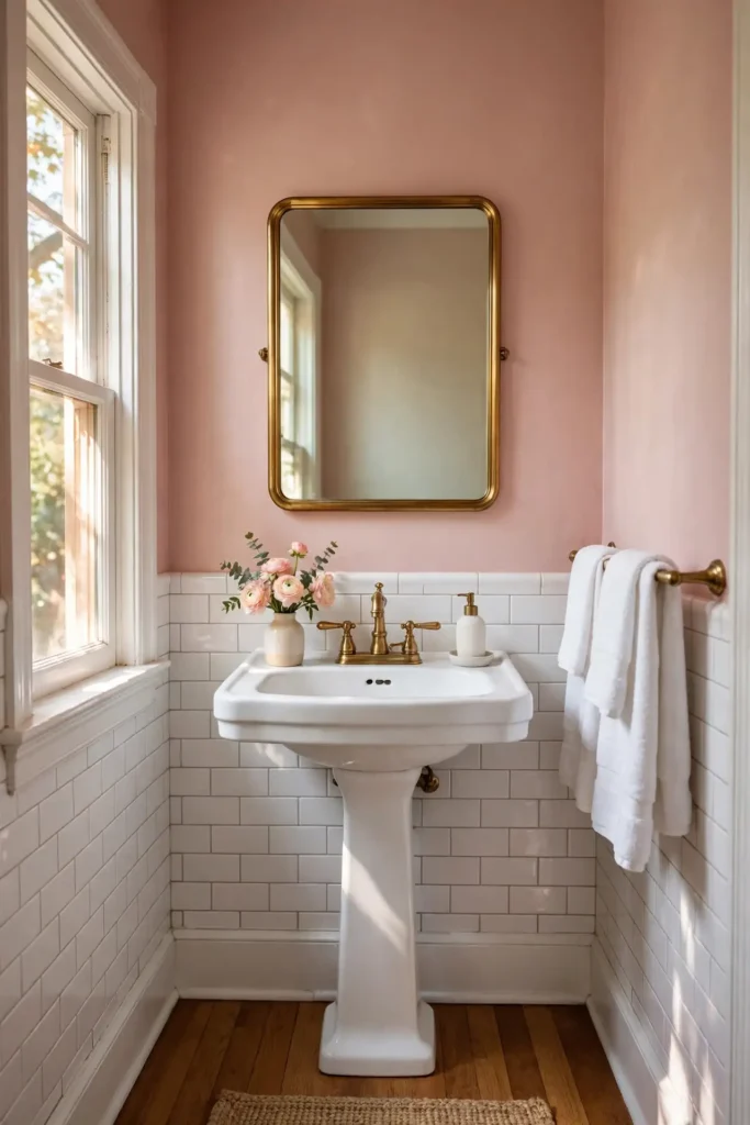
Choose dusty, muted pinks like Benjamin Moore First Light (2102-70) or Sherwin-Williams Intimate White (SW 6322), or have a similar tone color-matched in Behr Marquee at Home Depot. A satin finish keeps the color wipeable in steamy baths; budget $55–$95 per gallon. Test swatches against your tile at night, since pink undertones intensify under warm bulbs. Balance the sweetness with matte black hardware or dark-stained wood so the room feels grown-up. Two coats over primer give full, even coverage, and a bright white ceiling keeps the glow airy rather than heavy.
8. Forest Green
Forest green wraps a bathroom in rich, woodsy depth that feels both luxurious and grounding. It makes white tile pop with crisp contrast, gives grey tile an earthy, sophisticated partner, and turns brass or gold fixtures into jewelry. Deep greens also flatter skin tones in mirror light better than cool grays, and they disguise everyday splashes in busy households. In a powder room, forest green feels like a private club; in a primary bath, pair it with plenty of white tile and good lighting so the depth reads intentional, not dark. The color rewards commitment, since half measures look muddy.
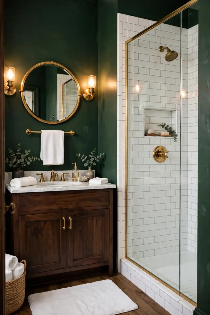
Go with Sherwin-Williams Retreat (SW 6207) or Benjamin Moore Essex Green (HC-188), or have a deep green color-matched in Behr Marquee at Home Depot. Use satin or semi-gloss for moisture resistance; expect $55–$95 per gallon. Dark greens demand thorough prep: fill nail holes, sand smooth, and use a tinted primer so the color covers in two coats. Add warm white trim, layered lighting with sconces and overhead, and natural wood to keep the room inviting. Sample on the wall opposite the mirror first, where you will see it most. Keep the exhaust fan running after every shower so the rich color stays flawless for years.
9. Terracotta
Terracotta brings sun-baked warmth that instantly cures a cold, sterile bathroom. Its earthy orange-pink tone flatters white tile with Mediterranean charm and gives grey tile a warm, grounding counterpoint. The color pairs beautifully with handmade-look zellige tile, rattan, travertine, and aged brass, all textures trending in 2026 bathrooms. Terracotta also forgives hard water spots and reads cozy under warm lighting, making it ideal for windowless baths. Keep the tone muted and clay-like rather than bright orange, and the result feels earthy and sophisticated, not kitschy. It also flatters wood vanities and woven textures, creating a relaxed, resort-like atmosphere you’ll love every morning.
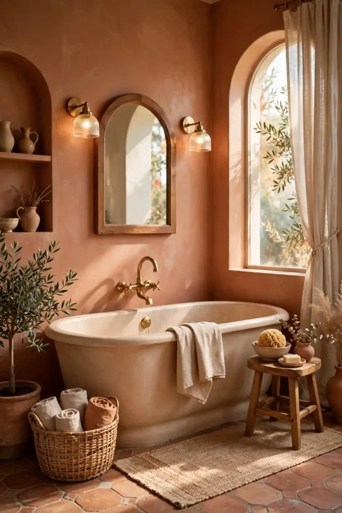
Look at Sherwin-Williams Cavern Clay (SW 7701), its 2019 Color of the Year, or have a muted clay tone color-matched in Behr Marquee at Home Depot. A satin finish handles bathroom humidity well; budget $55–$95 per gallon. Balance the warmth with plenty of white: white tile, white ceiling, and white linens keep terracotta from overwhelming the room. Matte black fixtures add modern edge, while a vintage rug softens the floor. Test a large swatch for 48 hours, since terracotta shifts dramatically between daylight and warm bulbs. Run the exhaust fan after showers and touch up caulk yearly to keep the warm color looking fresh.
10. Soft Lavender
Soft lavender gives a bathroom a dreamy, spa-like calm that neither blue nor pink achieves alone. It flatters white tile with a gentle, luminous contrast and softens grey tile’s coolness into something serene. Lavender reads clean without feeling cold, making it a smart pick for north-facing baths that get cool, bluish daylight. It pairs beautifully with chrome or polished nickel, white linens, and eucalyptus sprigs, and the subtle purple undertone flatters most skin tones in the mirror. Keep it pale and grayed-out; too saturated and it tips into nursery territory.

Try Benjamin Moore Lavender Mist (2070-60) or Sherwin-Williams Languid Lavender (SW 6549), both soft enough for small baths. A satin or eggshell finish resists moisture; expect $55–$95 per gallon. Test at different times of day, since lavender shifts with light more than most neutrals. Pair with bright white trim and ceiling, and add one deeper accent like a plum bath mat or dark wood mirror frame for contrast. Keep metals cool-toned: chrome and polished nickel harmonize, while warm brass can clash with lavender’s cool base. Two coats over primer give smooth, even coverage that holds up to daily steam.
11. Black for Drama
Black walls turn even a basic bathroom into a high-drama showpiece. The color makes white tile look gallery-crisp, gives grey tile a sleek, tailored edge, and makes mirrors, chrome, and marble veining pop with gallery intensity. Black also hides scuffs and water spots better than any light paint, and in a small powder room it creates an intimate, jewel-box effect guests remember. The trick is lighting: black absorbs light, so you need strong vanity lighting and a bright ceiling to keep the room from feeling like a cave. Done right, it reads bold and expensive, never gloomy.
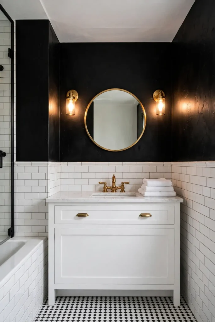
Use Sherwin-Williams Tricorn Black (SW 6258), Benjamin Moore Onyx (2133-10), or Behr Cracked Pepper for a true-to-soft black. Semi-gloss or satin keeps it wipeable; budget $55–$95 per gallon. Prep meticulously, since black shows every flaw: fill, sand, and use a dark-tinted primer. Keep the ceiling bright white, add brass or chrome fixtures, and layer your lighting with sconces plus overhead. If four black walls feel like too much, start with one black accent wall behind the vanity and live with it first. Finish with plush white towels and a light bath mat so the drama stays balanced and inviting.
12. Seafoam Green
Seafoam green is the breezy middle ground between blue and green: fresh, coastal, and endlessly flattering to white tile. It gives grey tile a soft, beachy lift and makes chrome fixtures sparkle. The color feels clean without sterility, evoking ocean air in a way that suits both vintage clawfoot tubs and modern walk-in showers. Seafoam also plays well with natural textures: white oak, rattan, jute, and crisp cotton. In small baths it keeps things light and open; in larger ones it delivers a relaxed, resort-like calm. Avoid neon-leaning mints; true seafoam has a soft, grayed calm.
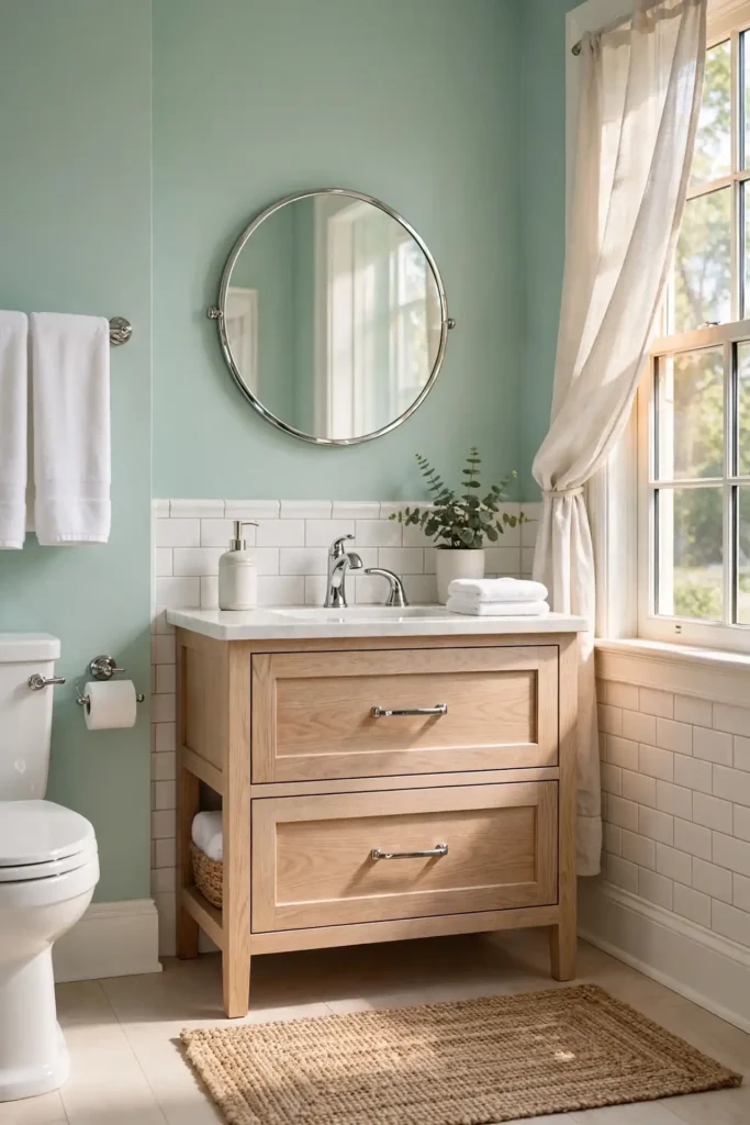
Try Sherwin-Williams Sea Salt (SW 6204) or Benjamin Moore Beach Glass (1564) for authentic seafoam tones. A satin finish suits bathroom humidity; expect $55–$95 per gallon at Home Depot, Lowe’s, or paint stores. Test against your grout, since grey grout can push seafoam toward blue. White ceilings and trim keep it airy, while navy or natural fiber accents ground the palette. Two coats over primer deliver even coverage, and a woven jute rug plus white towels complete the coastal look without theme-park excess. Keep the exhaust fan running after showers to protect the soft finish from moisture damage.
13. Warm Beige
Warm beige wraps a bathroom in quiet comfort: never stark, never cold, always welcoming. It softens the contrast of white tile into something creamy and cohesive, and it warms up grey tile without fighting its coolness. Beige forgives the mixed undertones of builder-grade finishes, bridging almond tubs and chrome fixtures gracefully. The color pairs beautifully with natural wood, travertine, and brushed brass, creating a spa-like warmth that feels timeless rather than dated. Today’s warm beiges are cleaner and lighter than the heavy Tuscan beiges of the 2000s, so the room reads fresh, not heavy.
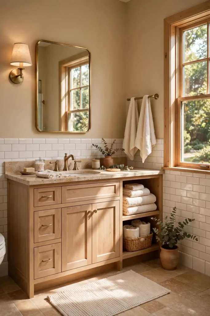
Start with Sherwin-Williams Accessible Beige (SW 7036) or Benjamin Moore Manchester Tan (HC-81), both warm without going yellow. A satin or eggshell finish resists bathroom moisture; budget $55–$95 per gallon. Compare swatches against your tile’s undertone in daylight, since beige can clash with pink-beige tile or turn flat beside cool grey. Keep trim and ceiling bright white for crispness, then layer in wood tones, woven textures, and greenery. Sample quarts cost $15–$25 and save you from a whole-room mistake. Two coats over a quality primer deliver rich, even color that stands up to daily steam and splashes.
14. Light Gray With White Tile
Light gray with white tile is the classic modern pairing: crisp, clean, and endlessly versatile. The gray walls add subtle depth that keeps white tile from looking flat or builder-basic, while the white tile reflects light and keeps the room bright. This combo flatters every fixture finish, from chrome to matte black, and gives you a neutral backdrop for colorful towels and art. Light gray also hides minor imperfections better than white paint and feels calm without going cold, as long as you choose a gray with a warm or neutral undertone. It is the definition of timeless.
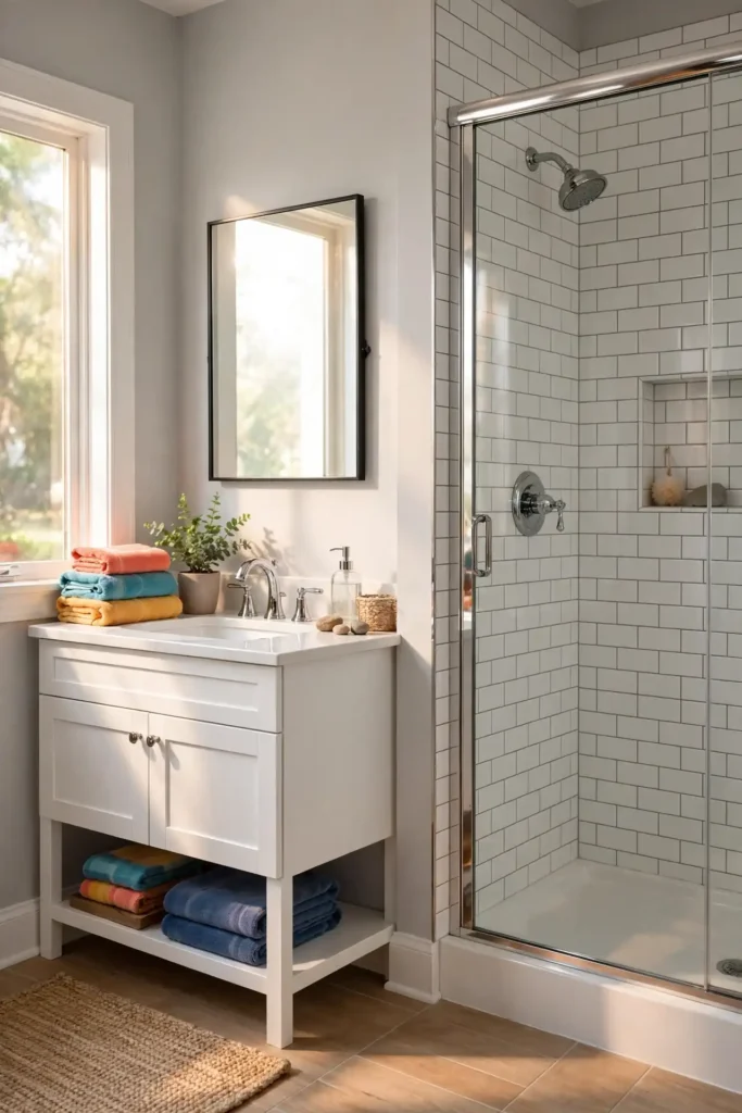
Try Sherwin-Williams Repose Gray (SW 7015), Benjamin Moore Gray Owl (OC-52), or Behr Silver Drop (790C-2), all proven light grays. A satin finish handles humidity; expect $55–$95 per gallon. Watch undertones carefully: blue-grays can feel chilly in north-facing light, while greige-leaning grays stay cozy. Test large swatches on poster board for two days before committing. Bright white trim and ceiling sharpen the look, and colorful accessories pop beautifully against the neutral base. Two coats over primer give smooth, even coverage. Run the exhaust fan after every shower to keep the finish fresh and mildew-free for years.
15. Olive Green
Olive green brings an earthy, sophisticated richness that feels straight out of a European boutique hotel. Its warm yellow-green undertone flatters white tile with organic contrast and gives grey tile a grounded, natural partner. Olive pairs beautifully with aged brass, walnut wood, and creamy stone, and it looks stunning against white subway tile with dark grout. The color feels calm and collected: bolder than sage, softer than forest green. In a powder room it feels intimate and chic; in a primary bath, balance it with light tile and good lighting.
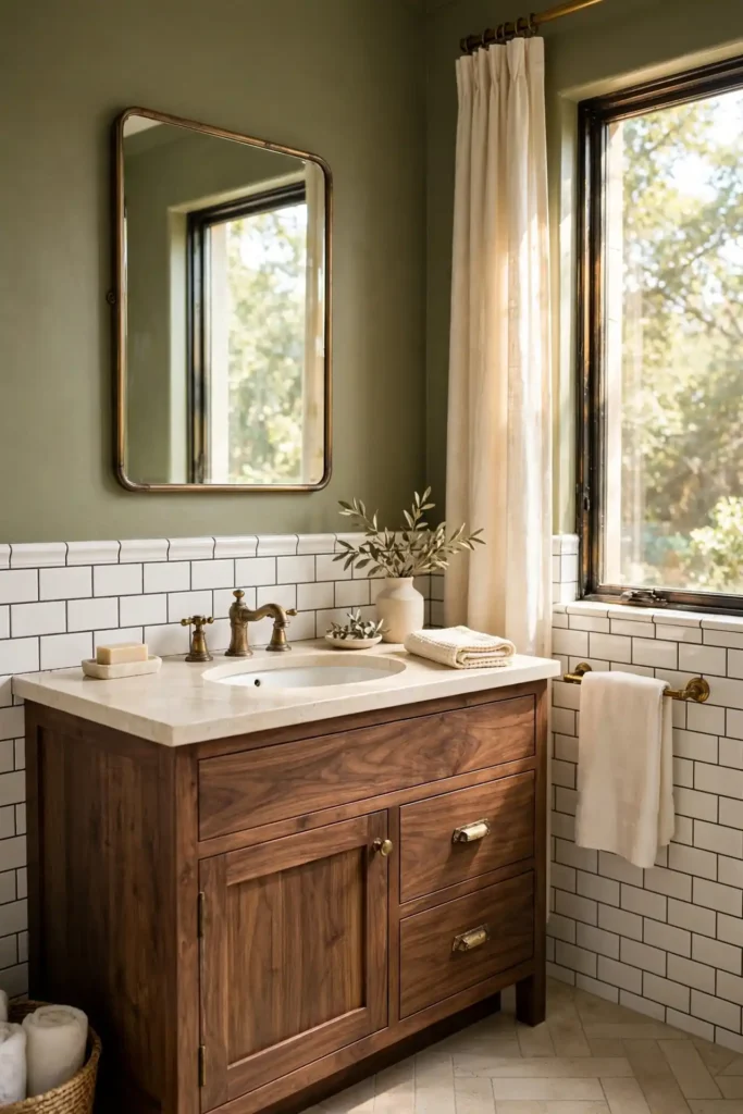
Look at Sherwin-Williams Dried Thyme (SW 6186) or Benjamin Moore Saybrook Sage (HC-114) for true olive tones. Use satin or semi-gloss for moisture resistance; budget $55–$95 per gallon. Olive’s yellow undertone can intensify under warm bulbs, so test swatches at night as well as day. Brass fixtures and warm white trim are its best friends, while chrome can feel disconnected. Add natural textures like linen, rattan, and wood to complete the organic feel, and keep the ceiling bright white to preserve airiness. Two coats over primer give full, even coverage that resists moisture and daily wear.
16. Butter Yellow
Butter yellow is sunshine in a can: the happiest bathroom color that still feels sophisticated. Its soft, creamy warmth flatters white tile beautifully and takes the chill off grey tile. Yellow reflects warm light around the room, making windowless baths feel brighter and skin tones glow in the mirror. It pairs charmingly with white beadboard, chrome fixtures, and vintage-style details, and it reads cheerful without the intensity of primary yellow. Keep the tone buttery and muted, softened by cream, and the result is warm, welcoming, and timeless. In small powder rooms it feels joyful and sunny, turning even the tiniest space into a happy retreat.
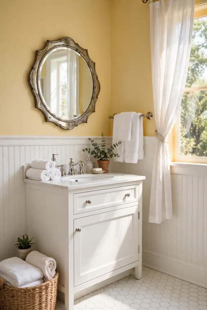
Try Sherwin-Williams Butter Up (SW 6681) or Benjamin Moore Hawthorne Yellow (HC-4), both soft without going neon. A satin finish resists steam; expect $55–$95 per gallon. White trim is essential to keep yellow crisp rather than muddy, and grey or navy accents prevent the room from feeling too sweet. Test in your actual bathroom, since yellow shifts strongly with light temperature. Pair with white linens, a vintage-style mirror, and one natural texture like a woven hamper for a cheerful, collected look. Two coats over primer ensure even, sunny coverage that brightens the room for years.
17. Dusty Rose
Dusty rose is blush pink’s moodier sister: romantic, sophisticated, and surprisingly versatile. Its grayed, muted tone flatters white marble-look tile and softens grey porcelain into something warm and inviting. Dusty rose pairs beautifully with brass, dark wood, and black accents, creating a vintage-glam feel that suits both powder rooms and primary baths. The color flatters skin tones in mirror light and softens harsh fluorescents. Keep it dusty, not bright, and it reads as an elegant neutral-with-warmth rather than a statement pink. It also hides minor imperfections well, making it a forgiving choice for older bathrooms with character.
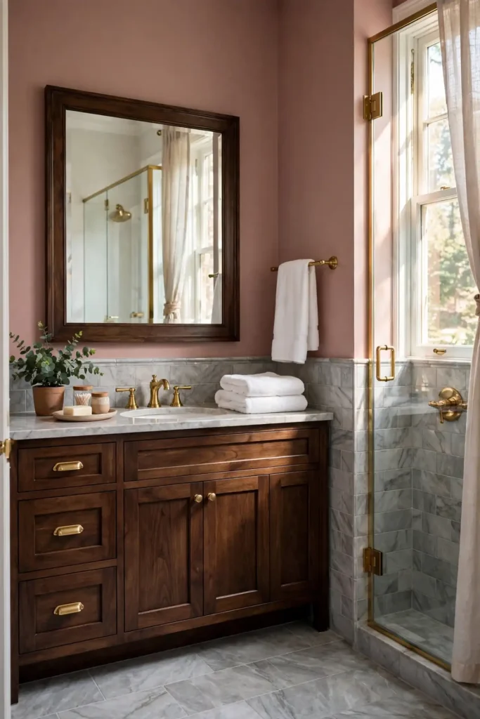
Look at Sherwin-Williams Abalone Shell (SW 6050) or have a dusty rose color-matched in Behr Marquee at Home Depot. A satin finish handles bathroom humidity; budget $55–$95 per gallon. Balance the romance with dark accents: matte black hardware, a walnut frame, or charcoal textiles keep it grown-up. Test swatches at night, since rose undertones deepen under warm bulbs. Bright white ceilings and trim keep the look airy, and one metallic accent in brass or gold adds quiet glamour. Two coats over primer deliver smooth, even coverage, and the exhaust fan protects the finish from steam.
18. Teal
Teal delivers the drama of navy with the freshness of green: a rich blue-green that makes bathrooms feel both bold and serene. It creates stunning contrast with white tile, gives grey tile a jewel-toned partner, and makes brass fixtures glow. Teal flatters most skin tones and hides water spots well. In a powder room it is unforgettable; in a full bath, use it on the vanity wall or wainscot with white tile above. The color feels current yet classic, pairing with natural wood, white linens, and black accents. It also photographs beautifully, giving your bathroom a designer look that guests will remember.
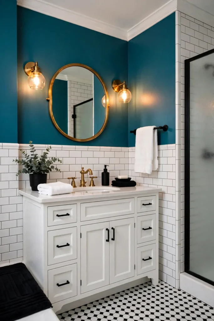
The standouts are Sherwin-Williams Oceanside (SW 6496), its 2018 Color of the Year, and Benjamin Moore Newburg Green (HC-158). Use satin or semi-gloss for moisture resistance; budget $55–$95 per gallon. Teal absorbs light, so invest in strong vanity lighting and keep the ceiling white. Brass or gold hardware glows against it, while crisp white towels keep the look fresh. Because teal shows roller marks, use quality tools and maintain a wet edge; two coats over a tinted primer give rich, even color. Run the exhaust fan after showers so the bold finish stays flawless through years of steam.
19. Mushroom Brown
Mushroom brown, the soft grayed taupe trending in 2026, brings organic warmth without the heaviness of dark brown. It flatters white tile with creamy contrast, warms up grey tile beautifully, and pairs with travertine, oak, and brushed brass for a serene, nature-inspired bath. The color feels calm and grounding, hiding imperfections better than light neutrals. It works in both modern and traditional bathrooms, bridging warm and cool elements gracefully. Keep it light-to-mid tone and the room stays airy; go deeper for a cocooning powder room. It also flatters every metal finish, from chrome to matte black, making fixture choices effortless.
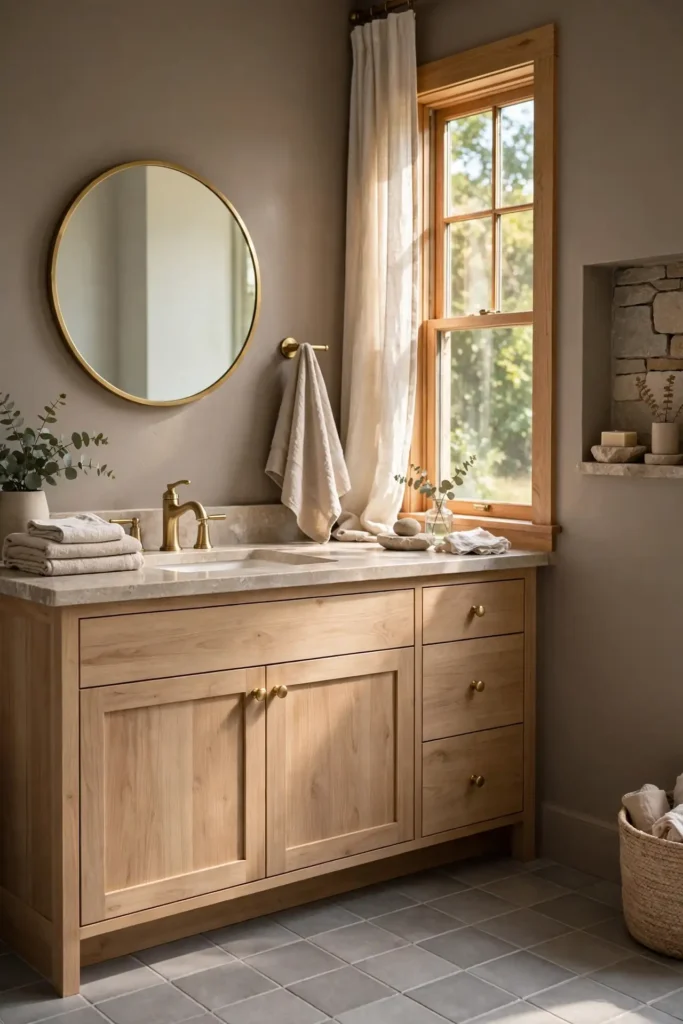
Try Sherwin-Williams Mega Greige (SW 7031) or Benjamin Moore Pashmina (AF-93) for true mushroom tones. A satin finish resists bathroom moisture; budget $55–$95 per gallon. Mushroom undertones are subtle, so compare swatches directly against your tile: pink-leaning mushrooms fight grey tile, green-leaning ones turn muddy. Keep trim and ceiling bright white, then layer natural textures like linen, oak, and stone. Sample quarts at $15–$25 let you test for two days before committing to the whole room. Two coats over primer give even, durable coverage, and running the exhaust fan after showers protects your work.
20. Two-Tone Walls
Two-tone walls, typically a darker color below the chair rail or tile line and a lighter one above, add architectural interest that single-color baths lack. The technique flatters both white and grey tile: paint below the tile line to complement it, and keep the upper wall light for airiness. Two-tone schemes make low ceilings feel higher when the lighter color goes on top, and they let you enjoy a bold hue without committing all four walls. The crisp dividing line, whether a chair rail or a clean painted edge, reads custom and considered.

Pair Sherwin-Williams Naval (SW 6244) below with Pure White (SW 7005) above, or Accessible Beige (SW 7036) below with Alabaster (SW 7008) above. Use satin on both for moisture resistance; budget $55–$95 per gallon. Place the division 32–36 inches high or at the tile’s top edge, using painter’s tape and a level for a razor-sharp line. Paint the lighter color first, then the darker; caulk the seam for a professional finish. Beadboard or wainscot below adds texture, and consistent hardware across both tones ties the scheme together. Step back often as you work to check the line reads straight and the balance feels right.
21. Color-Drenched Bathroom
Color drenching, painting walls, trim, and ceiling in one saturated hue, turns a bathroom into an immersive, designer-level statement. The monochrome envelope makes small baths feel larger by blurring boundaries, and it gives white tile a gallery-like frame or grey tile a seamless, tonal backdrop. Deep greens, navies, and even warm terracottas drench beautifully. The technique hides awkward angles and dated trim by unifying everything. It demands confidence, but the payoff is a bathroom that feels intentional, cocooning, and utterly current. Guests will notice the boldness immediately, and the enveloping color makes everyday routines feel a little luxurious.
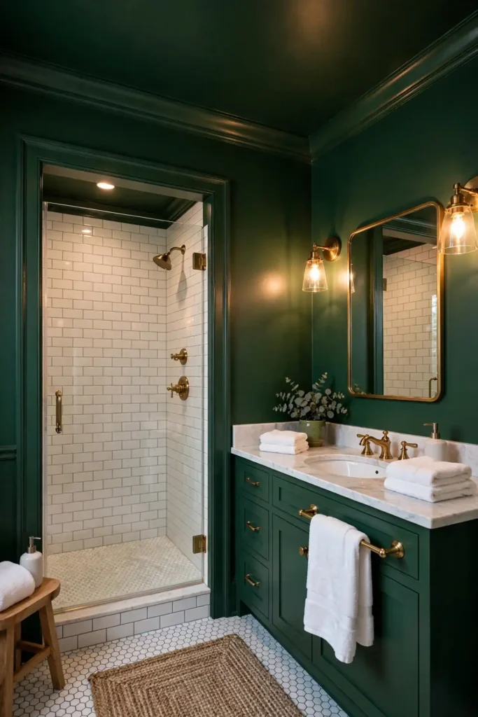
Choose Sherwin-Williams Evergreen Fog (SW 9130), Naval (SW 6244), or Retreat (SW 6207), all saturated enough to carry trim and ceiling. Use satin on walls and semi-gloss on trim in the same color, varying sheen rather than hue for subtle definition. Budget $70–$95 per gallon, and expect to need about three gallons for an average bath. Strong layered lighting is essential, since one color absorbs light. Test the full drench on one wall first: color intensifies dramatically when it covers every surface. Keep the exhaust fan running after showers to protect the immersive finish from moisture damage.
22. Painted Ceiling
A painted ceiling, the so-called fifth wall, adds instant character to a bathroom for the cost of a single quart. A soft color overhead makes white tile feel curated and grey tile feel intentional, while a deep tone creates cozy intimacy in powder rooms. Painted ceilings draw the eye up, making standard eight-foot ceilings feel designed rather than default. In steamy baths, the ceiling takes the most moisture abuse, so this is also the smartest place to invest in quality mildew-resistant paint. Even a whisper of color transforms the room’s feel.

Try a pale blue like Benjamin Moore Quiet Moments (1563), a soft sage like Sea Salt (SW 6204), or go bold with Hale Navy (HC-154) in a powder room. Use a satin or semi-gloss bathroom-specific paint for maximum moisture resistance; a quart at $15–$25 often covers the whole ceiling. Cut in carefully with an angled brush, roll in one direction, and protect walls with tape. Pair a colored ceiling with bright white walls, or match it to the wall color for a fully drenched look. Two thin coats beat one thick coat, and good ventilation while painting speeds drying and reduces fumes.
23. Soft Aqua
Soft aqua is water made paint: fresh, clean, and endlessly calming in a bathroom. It flatters white tile with a crisp, coastal brightness and gives grey tile a breezy, spa-like lift. Aqua reflects light beautifully, making small or windowless baths feel more open. The color pairs with chrome, white, and natural textures like jute and driftwood, and it flatters skin tones in the mirror. Keep it soft and slightly grayed: too bright and it reads tropical, too pale and it washes out. The sweet spot feels like a deep breath.
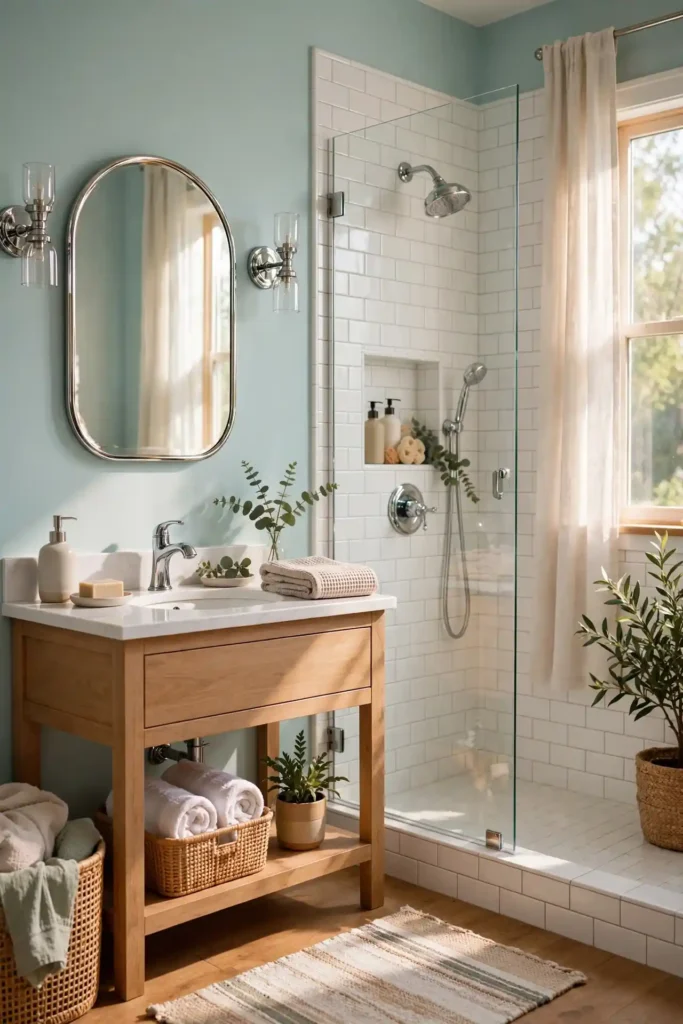
Look at Sherwin-Williams Watery (SW 6478) or have a soft aqua color-matched in Behr Marquee at Home Depot. A satin finish suits bathroom humidity; expect $55–$95 per gallon. Test swatches against your grout, since grey grout can push aqua toward blue. White trim and ceilings keep it airy, while navy or coral accents add personality without overwhelming the calm. Two coats over primer give even coverage, and a woven rug plus white towels complete the fresh, coastal feel. Run the exhaust fan after every shower so the soft color stays crisp and mildew-free for years.
24. Burgundy for a Powder Room
Burgundy turns a powder room into a moody, memorable jewel box, the one room where guests will actually comment on your paint. Its deep wine-red tone flatters white tile with dramatic contrast and gives grey tile a rich, sophisticated warmth. Burgundy pairs stunningly with brass fixtures, dark wood, and candlelight, creating an intimate, restaurant-powder-room vibe. Because powder rooms have no shower steam, you can use any quality finish without moisture worries. The color feels bold yet timeless, especially in homes with traditional or transitional style. It also makes artwork and mirrors pop, turning a small powder room into a tiny gallery.

Try Sherwin-Williams Fine Wine (SW 6307) or Benjamin Moore New London Burgundy (HC-61), both deep without going purple. Satin or eggshell works fine with no shower steam; budget $55–$95 per gallon. A dark-tinted primer is essential for rich, even coverage in two coats. Brass hardware and warm lighting are its best friends, while cream or white accents keep the depth balanced. Sample on the wall behind the mirror first, and keep the ceiling bright white so the small room still feels open. Finish with a vintage-style mirror and candlelight for a powder room guests will talk about.
25. Classic Greige With Grey Tile
Classic greige with grey tile is the pairing that launched a thousand bathroom remodels: warm enough to feel inviting, neutral enough to never date. The greige walls soften grey porcelain’s coolness while letting the tile’s texture and veining take center stage. This combination flatters every metal finish, hides dust and water spots, and provides a calm backdrop for wood vanities, patterned floors, or black accents. It is the safest way to get a designer look without risk: timeless, versatile, and endlessly photographable for listings or social sharing. Whether your style is modern farmhouse or sleek contemporary, this pairing simply works.
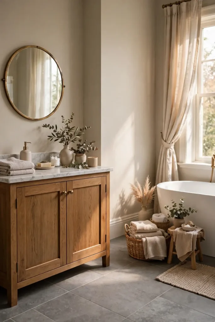
Use Sherwin-Williams Agreeable Gray (SW 7029) or Accessible Beige (SW 7036) over mid-tone grey tile, or Benjamin Moore Edgecomb Gray (HC-173) for a slightly cooler take. A satin finish resists moisture; budget $55–$95 per gallon. Match undertones carefully: warm greige with warm-grey tile, cooler greige with blue-grey tile. Hold swatches directly against the tile in daylight to read them accurately. White trim and ceiling keep it fresh, while wood tones, brass, and greenery add life. Sample quarts at $15–$25 prevent an expensive undertone mismatch. Two coats over primer give lasting, even coverage that handles daily steam with ease.
Best Bathroom Paint Colors Ideas for White Tile
White tile is the ultimate blank canvas: it works with virtually any wall color, which makes choosing harder, not easier. The best strategy is deciding what mood you want first. Crisp contrast comes from navy, forest green, or black; soft serenity from sage, pale blue, or seafoam; warm balance from greige, warm beige, or terracotta. White tile reflects your wall color back at you, so bold choices feel bolder and soft choices feel softer. Because the tile stays bright, you can go darker on walls than you might dare elsewhere, since the white keeps the room luminous.

For contrast, try Benjamin Moore Hale Navy (HC-154) or Sherwin-Williams Retreat (SW 6207); for serenity, Evergreen Fog (SW 9130) or Sea Salt (SW 6204); for warmth, Accessible Beige (SW 7036) or Cavern Clay (SW 7701). Use satin finish across the board, $55–$95 per gallon at Home Depot, Lowe’s, or Sherwin-Williams stores. Always test swatches against your specific tile, since white tile ranges from blue-white to cream. Keep the ceiling bright white, choose hardware that echoes your mood, brass for warm or chrome for crisp, and refresh accessories seasonally for a new look without repainting.
If your white tile has a warm, creamy tone, avoid very cool colors that make it look yellow by comparison. Instead, choose warm neutrals, terracotta, olive or blush. If the tile is bright, cool white, blues, grays and crisp whites will look fresh and cohesive.
Best Bathroom Paint Colors Ideas for Grey Tile
Grey tile needs wall colors that either warm it up or lean into its cool sophistication; muddy middle-ground colors fall flat. Warm it with greige, warm beige, sage, or terracotta, and the contrast makes grey porcelain look intentional and rich. Or embrace the cool with navy, charcoal, or soft aqua for a sleek, modern spa feel. Grey tile’s undertone matters enormously: blue-grey tile loves crisp whites and navies, while warm-grey greige tile pairs with beiges and olives. Get the undertone pairing right and the whole bathroom clicks into place. When in doubt, test one warm and one cool option side by side before deciding.

For warmth, try Accessible Beige (SW 7036), Evergreen Fog (SW 9130), or Cavern Clay (SW 7701). For cool drama, choose Naval (SW 6244), Iron Ore (SW 7069), or Watery (SW 6478). Satin or semi-gloss handles moisture; budget $55–$95 per gallon. Hold paint swatches directly against the tile in daylight to read undertones accurately, since store lighting lies. Bright white trim sharpens the look, while wood tones and brass warm it. If your grey tile reads cold and repainting is off the table, warm textiles and 2700K lighting rebalance the room cheaply.
To avoid a flat, monochrome look, choose a wall color either noticeably lighter or darker than the tile. Add warmth with wood accents, brass fixtures and soft towels. These small details keep a grey-tiled bathroom looking modern and inviting.
When it comes to bathroom paint colors ideas, the best results come from balancing style, comfort and everyday function. Use this list as your go-to guide for bathroom paint colors ideas, and start with the ideas that fit your space best. Save this guide on bathroom paint colors ideas so you can come back to it when you are ready to update your home. Good bathroom paint colors ideas choices work in homes of every size and budget. Planning your bathroom paint colors ideas one step at a time keeps the project simple and affordable. Revisit these tips on bathroom paint colors ideas each season to keep your home feeling fresh.
How to Choose Bathroom Paint Colors Ideas Step by Step
Choosing a bathroom paint color feels overwhelming because lighting, tile, and moisture all pull in different directions, but a simple process cuts through the noise. Start with your tile: identify whether it reads warm or cool, light or dark, since the tile is the one element you will not repaint. Next, note your lighting: north-facing daylight runs cool and blue, south-facing runs warm, and most bathrooms rely on artificial light that skews warm. Then decide your mood, serene spa, bold statement, or timeless neutral, which narrows hundreds of swatches to a handful.

Buy sample quarts at $15–$25 each of your top three contenders, and paint large swatches on poster board rather than the wall so the boards move around the room. Live with them for 48 hours, checking morning, noon, and night against tile, grout, and fixtures. Choose a satin or semi-gloss finish labeled for bathrooms or kitchens for mildew and moisture resistance. Budget $55–$95 per gallon for quality paint, plus primer. Finally, paint the ceiling bright white or drench it intentionally, caulk wet-area edges, and run the exhaust fan after every shower to protect your work.
- Identify the undertone of your tile, vanity and countertops.
- Decide on a mood: calm, bright, bold or moody.
- Test three samples on different walls.
- View them in daylight and under vanity lights.
- Use a moisture-resistant satin or semi-gloss finish.
Final Thoughts on Bathroom Paint Colors Ideas
The right bathroom paint color does more than decorate: it sets how the room feels at 6 a.m. and how it photographs if you ever sell. Whether you choose calming sage, dramatic navy, or timeless greige, the winners all share three traits. They respect the tile’s undertone, they suit the room’s light, and they are applied in a moisture-resistant finish that lasts. Do not fear color in small baths: deep hues often make them feel larger and more intentional, while thoughtful neutrals keep busy family bathrooms calm and collected. A thoughtful color choice pays off every single day, quietly improving how the whole room feels.
Start with samples, trust the 48-hour test, and invest in quality paint; the $30-per-gallon difference pays for itself in durability and coverage. Remember that lighting transforms color, so judge swatches in your actual bathroom, not under store fluorescents. Keep the exhaust fan running, touch up caulk yearly, and your paint will look fresh for five to seven years. Most importantly, pick the color that makes you happy every morning. Trends fade, but a bathroom you love never does. With the right prep and paint, your bathroom color will reward you with years of beautiful mornings.
Save these ideas and follow along for more bathroom design inspiration.
Frequently Asked Questions About Bathroom Paint Colors Ideas
Readers ask the same smart questions about bathroom paint colors again and again: which finish survives steam, whether dark colors work in small baths, how to match paint to existing tile, and what the most timeless choices are. The answers below tackle the practical concerns, moisture resistance, undertones, lighting, and budget, so you can choose with confidence instead of crossing your fingers. Every recommendation draws on how these colors actually perform in real American bathrooms, from humid Florida powder rooms to dry Arizona primaries. You’ll find clear, practical guidance for every budget and bathroom size in the answers ahead.

Use these answers as a final checklist before you buy. If you are still torn between two colors, the sampling method above, poster boards, 48 hours, all light conditions, resolves nearly every debate. And remember that paint is the cheapest, most reversible change in any bathroom: a gallon and a weekend transform the room more than any other single update. Read on for the specific answers, then grab your samples and get painting. With these tips in hand, you’re ready to choose a bathroom color you’ll love for years to come.
What color paint goes best with white tile?
Almost any color works with white tile. Sage, soft blue, navy, warm white and blush are especially popular.
What paint color goes with grey tile in a bathroom?
Match the tile undertone: soft blue or navy for cool grey, sage for green-grey and greige or warm white for warm grey.
What paint finish is best for bathrooms?
Satin or semi-gloss finishes resist moisture and are easy to clean. Some brands offer paints made specifically for bathrooms.
What are trending bathroom paint colors ideas for 2026?
Sage, forest green, terracotta, mushroom brown, dusty blue and color-drenched rooms are trending.
Can I paint a small bathroom a dark color?
Yes. Dark colors can make small bathrooms feel cozy and dramatic. Use good lighting and light-colored fixtures for balance.





4 Comments